 Adobe Community
- Home
- Muse (read-only)
- Discussions
- Re: How many breakpoints is enough?
- Re: How many breakpoints is enough?

Copy link to clipboard
Copied
Could somebody tell me how many breakpoints they typically use on an average website. I'm currently using eight breakpoints and I am starting to wonder if I really need all these.
Any advice would be welcome


 1 Correct answer

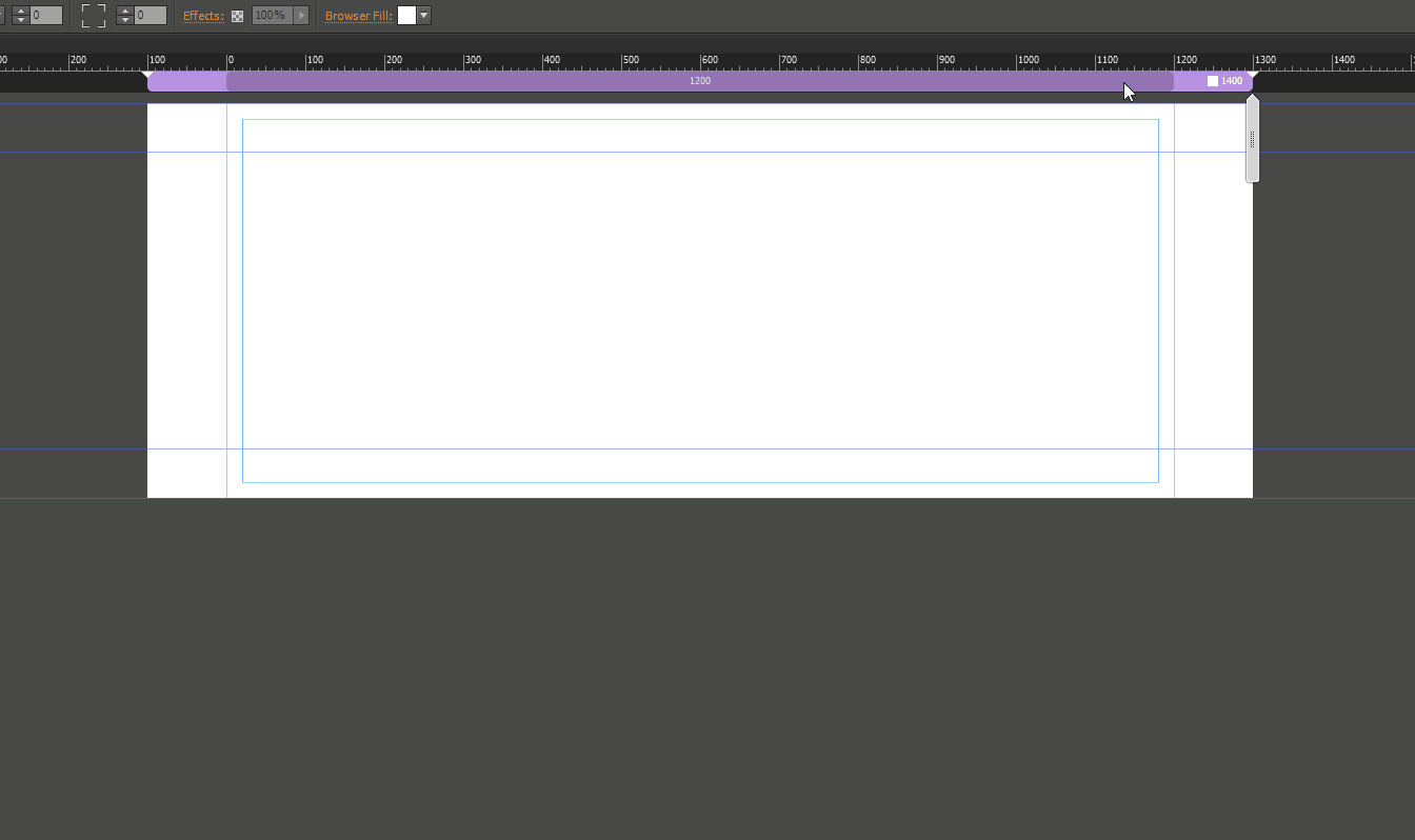
"Normal" you start with fixed width site 1200, so your site/page starts with 1400 with its first breakpoint at 1200.
You add a breakpoint at 960 fixed width (you get automatically the 1200 "breakpoint", add a breakpoint at 768 fixed width, add a breakpoint at 768 fluid width with a minimum width of 320.
bd814a9775.gif Thanks to Pavel Homeriki you can watch this.
So it is 4 breakpoints. If you want o show bigger, add as much as you need.
Does this help?
Uwe
 12
Replies
12
12
Replies
12
Copy link to clipboard
Copied
"Normal" you start with fixed width site 1200, so your site/page starts with 1400 with its first breakpoint at 1200.
You add a breakpoint at 960 fixed width (you get automatically the 1200 "breakpoint", add a breakpoint at 768 fixed width, add a breakpoint at 768 fluid width with a minimum width of 320.
bd814a9775.gif Thanks to Pavel Homeriki you can watch this.
So it is 4 breakpoints. If you want o show bigger, add as much as you need.
Does this help?
Uwe
Copy link to clipboard
Copied
Yes thanks! do you cater for tablet sizes i.e. 600 PX wide or do you just cater for the primary tablet sizes i.e. 768 and 960? I have got breakpoints at 1920, 1440, 1200, 1024, 768, 600, 480 and 320 and it's doing my head in!
Also how do you get around the problem of scaling text if you don't have a breakpoint i.e. if you have a breakpoint at 768 with a minimum width of 320 how to you scale the text in between those two points? This how I have ended up with so many breakpoints!

Copy link to clipboard
Copied
That is a matter of creativity! You have to find a solution for text elements, what normally isn’t that difficult, because elements below are pushed down by growing text boxes. Scaling text is no alternative at all, because you end up with unreadable font sizes at smaller breakpoints.
It you don’t like dynamic reacting pages, or if it is to heavy to control (for a beginner), just create a fixed width page with fixed width breakpoints.
Copy link to clipboard
Copied
Thanks very much for the tips!
Copy link to clipboard
Copied
You give yourself the right answer? Well done  .
.
Copy link to clipboard
Copied


Copy link to clipboard
Copied
Hello Günter,
Interesting point about a fixed width site with breakpoints – I didn't know that was an option. I thought a flexible site was all about breakpoints?
I'm tempted to try this. I accept the logic of having a site you can view on multiple devices, but I find I'm spending too much time making things fit and work, and not enough time on how it looks, or whether it serves its purpose.
I'm new to Muse and this responsive aspect, but it's like standing on shifting sands at times.
Copy link to clipboard
Copied
Ha! Fishing for points and awards, fotoroeder! 
Copy link to clipboard
Copied
Was quite easy though. Could have been your points as well with no hazzle .
Copy link to clipboard
Copied
I want no points, I want MONEY!
Copy link to clipboard
Copied
Like my daughter and my wive. Isn`t it all too materialistic?
Copy link to clipboard
Copied
No, fotoroeder, because I intend to buy only idealistic things! Promised!
 AdChoices