 Adobe Community
- Home
- Muse (read-only)
- Discussions
- Re: How to fit Element to Browser Width but keep a...
- Re: How to fit Element to Browser Width but keep a...

Copy link to clipboard
Copied
Hi
How can I keep an Element scaled to the Browser Width but with an individual fix space on the left and on the right side of the Element ?
Kind regards
Alain


 1 Correct answer

Look into the „Text“ panel, not into the „Spacing“ panel. 
Your other question: What you want to create is a fixed width sidebar menu. Since responsiveness in Muse always is calculated on base on the page/breakpoint/browser width, this isn’t possible out of the box. If you have a sidebar of, let’s say 300 px fixed widht, Muse would have to perform its calculations based on [breakpoint width – [sidebar width] = [responsive area]|, what is actually not possible. There are workarounds for a coupke o
...
 11
Replies
11
11
Replies
11

Copy link to clipboard
Copied
Decide wether you want to have it scaled/fit to browser width or if you want space on either sides.
Space on either sides: simply set it to either responsive in width only or responsive in width and height.
Best Regards,
Uwe
Copy link to clipboard
Copied
It does not work the way I need it.
I can align it to the left with a fix space from the left, but when I minimize the width of the Browserwindows, then the right side the Element always minimize it space from the right side as well but I need a fix space from the right side too.
How can I set fix spaces on the left / right side (for example left space 100px and right space 30px) ?
Kind regards
Alain
Copy link to clipboard
Copied
Simply spoken: You can’t, because responsive measures always change in relation to the page/breakpoint width. What means, that the paddings grow/shrink relatively to the page width.
There are tricky ways to achieve, what you want for some elements, for example:
- Two (or more) responsive, equally coloured rectangles of equal height overlapping each other, one pinned to the left, one pinned to the right (one pinned to the middle.
or
- a text frame, set to browser width, using left and right margin in the size you want.
or
- a slideshow or a rectangle, set to browser width, with a right and left stroke with appropriate pixel values.
Here an example .muse file, based on your values (100 px left, 30 px right), which you may examine: https://www.dropbox.com/s/xf1l927ugmdw60h/fixed-paddings.muse?dl=0
Copy link to clipboard
Copied
How did you set the inner Space of the Textframe ?
The inner Space is set to zero, I don't understand that.
See here:
http://www.evernote.com/l/AqQxvvzi-BdHUako8JuDwi7RxeMk8z5JYSI/
Kind regards
Alain
Copy link to clipboard
Copied
Look into the „Text“ panel, not into the „Spacing“ panel. 
Your other question: What you want to create is a fixed width sidebar menu. Since responsiveness in Muse always is calculated on base on the page/breakpoint/browser width, this isn’t possible out of the box. If you have a sidebar of, let’s say 300 px fixed widht, Muse would have to perform its calculations based on [breakpoint width – [sidebar width] = [responsive area]|, what is actually not possible. There are workarounds for a coupke of situations, but I can’t recommend to use these tricks as a fundament of a complete page.
If you decide to build your sidebar on a responsive width base – just like the rest of your page, it would be much, much easier.
Even more easy is to build a page with fixed width breakpoints. (I definitely will never understand, why all users, who have no experience in building web sites at all, start with responsive width pages but want them have a mixture of fixed and responsive width features (responsive images and text, but fixed margins for example)
There are different ways to proceed:
- Look for a 3rd party widget which comes near to your idea, fo example a menu sliding in and out from the right edge of your page, or
- re-think your layout approach,
- by using a completely different kind of menu (generally spoken, a horizontal row-orientated layout is much easier than a vertical, column-orientated one.
- by creating a fixed width page with fixed width breakpoints, or
- by creating a consequently responsive layout with a responsive sidebar, using breakpoints, when the side bar gets to narrow.
Be aware, that not everything you like to have is available in an application – especially, if it is that young as Muse. May be some of these features will be part of the app in the future. But if this will be the case, I am sure, you have dozens of new features, which will be missing too.

Copy link to clipboard
Copied
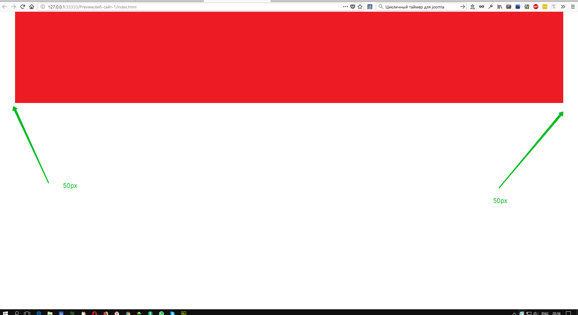
Stretch the object to the width of the browser. Create a graphic style for your object and write for it (for example) the following code.
<style>
.myClass {
margin: 0 50px !important;
}
</style>
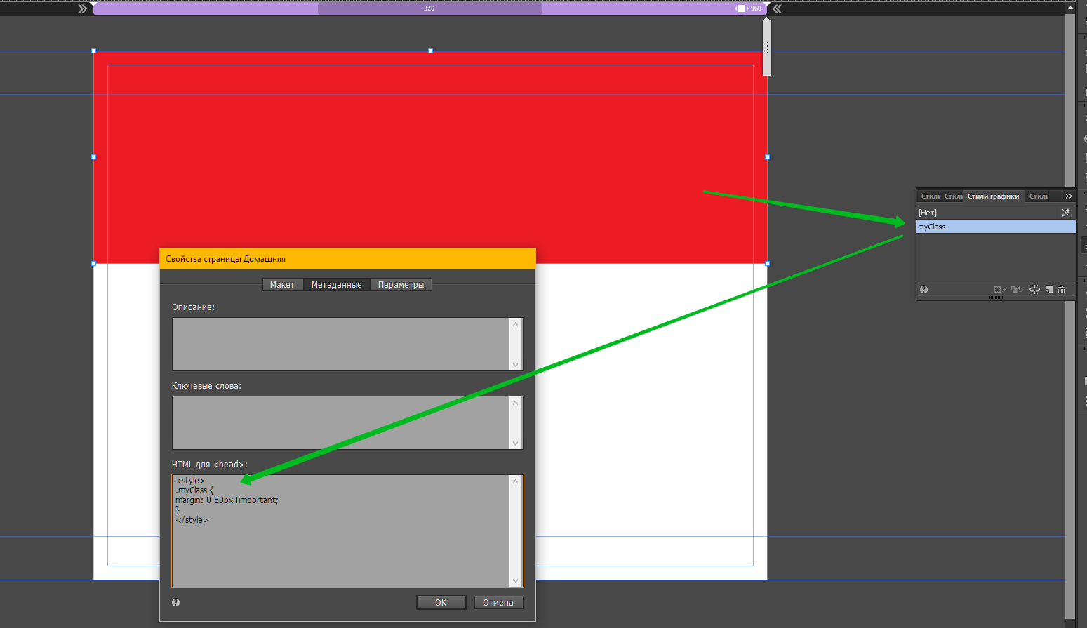
Knowledge of simple css greatly expands the possibilities of Muse 

Copy link to clipboard
Copied
yes and no... imo a little knowledge is dangerous but I like your workaround
css has some pit falls a non-coder needs to be aware of;
- it is code so you need to be careful when you copy and paste it from a browser... if your code doesn't work first time then go back and replace the spaces [%] = [spacebar] i.e, remove and replace them
margin:[%]0[%]50px[%]!important;
- css sees viewable browser [spaces] as different to the actual browser [spaces]... see the vimeo
- and style codes are state precise so if you aren't careful your design will get Tourette because the normal, rollover, active and press can end up with different styles applied
Copy link to clipboard
Copied
- it is code so you need to be careful when you copy and paste it from a browser... if your code doesn't work first time then go back and replace the spaces [%] = [spacebar] i.e, remove and replace them
margin:[%]0[%]50px[%]!important;
Ok. Then so. 
<style>
.myClass{margin-left:50px!important;margin-right:50px!important;}
</style>
Copy link to clipboard
Copied
Thank you guys for your fast answers.
In addition to what I ask I would like to align the Element to the left side of the Side (not the Browserframe) with a fix Space while the right side still has a fix space to the Browserframe.
See here:
http://www.evernote.com/l/AqSTeBZO6ZBBHJ-LntWD2hNvj3IzKHIPaGg/
How can I do that ?
Kind regards
Alain
Copy link to clipboard
Copied
Your screenshot completely does not give an idea of the mechanics of the movement of objects while reducing the screen that you have conceived or imagined. In some cases, it may be wrong on your part. Therefore, to answer your question, based on the data that you provide - is not possible.
The only thing I can suggest now is - do not use fluid breakpoints and then it will work out the way you want.
Copy link to clipboard
Copied
Thanks again.
Your suggestions now bring me to another approach.
 AdChoices