 Adobe Community
- Home
- Muse (read-only)
- Discussions
- Re: how to make a template responsive for mobile, ...
- Re: how to make a template responsive for mobile, ...

Copy link to clipboard
Copied
I have a template that I manipulated to work for my website. I selected the option responsive width and height. By selecting this I thought it meant it would adjust to any size page. I also noticed bove in the main adobe home page you can select phone, tablet and import the desktop settings but they aren't lining up correctly.
Is the proper way to have my website displayed correctly on a mobile, tablet and desktop to select each size point 768, 960, 1200 etc and format the page to my liking? Thanks


 1 Correct answer

They didn´t replace it at all and will probably never do. If you are into coding than go for it (DW).
If not, have a look at one of these like wappler, blocs, pinegrow, without code from muse-themes.com, and similar.
Here in this forum you will find a (and even more) thread only for that topic and will find many of them.
Kind Regards,
Uwe
 30
Replies
30
30
Replies
30
Copy link to clipboard
Copied
This really depends on the template - fifty ways to leave your lover, you know?
If the template is set up to be responsive but with fixed width breakpoints, responsive in width and height will do a bad job.
Also – responsive in width and height is only for certain elements and not for the whole site.
Sites/pages can only be set up with fluid width or fixed width breakpoints and can both fit to one page.
It is still common sense to use fixed width breakpoints for desktop resolutions and change to fluid width breakpoints for mobile resolutions. On the other hand it is also common sense to not think about desktop , tablet, mobile but for design only.
Just add a breakpoint when design doesn`t fit any more.
A lot to think about – also: MUSE is under EOL, so it really depends on what you need in the future farer away than one to two years and maybe think about one of these other apps out there.
Kind Regards,
Uwe
Copy link to clipboard
Copied
I guess they didn't replace it with anything better. I will look into Dreamweaver to create it since muse is eol. Thanks
Copy link to clipboard
Copied
They didn´t replace it at all and will probably never do. If you are into coding than go for it (DW).
If not, have a look at one of these like wappler, blocs, pinegrow, without code from muse-themes.com, and similar.
Here in this forum you will find a (and even more) thread only for that topic and will find many of them.
Kind Regards,
Uwe
Copy link to clipboard
Copied
I loved muse. I am not into coding. I made a website for my friend in muse and I am trying to give it a refresh. The issue is when I have it the way I want it viewing in 1200 and view it in 768 some formatting like a box outline around the menu is thrown off. I think I need to resize it for each dimension to resolve. I just want to make it so when users view it on any size mobile, tablet it looks nice.
I thought EOL Muse meant they were going to venture with a similar product to replace it.
Copy link to clipboard
Copied
Yes, you'll have to resize it in every Breakpoint, of course. That's the idea of responsive websites.
Kind Regards
Uwe
Copy link to clipboard
Copied
I thought there was a way it would resize it for mobile devices for you. I guess even under phone mode I have to do the same.

Copy link to clipboard
Copied
What's the URL to your site? Perhaps I can show you how to re-build your site responsively in Dreamweaver.
I think most people over think the process. Behind the scenes, a web page is just a bunch of imaginary boxes. Once you understand that concept, you can build whatever layout you need to fit on any device.


Alt-Web Design & Publishing ~ Web : Print : Graphics : Media
Copy link to clipboard
Copied
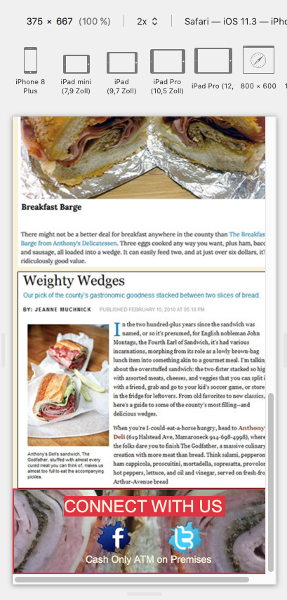
www.anthonysdeli.com I want to clean it up so when you click on menu item its on one page and has a cleaner look. I was trying to attach photos of what I made so far but they won't insert.
Copy link to clipboard
Copied
On my phone the menu appears on one page. To get a cleaner look, give your text some more space left an right, if desired. The newspaper text from "weighty wedges" simply gets too small to read. For design reasons, I would not use it on mobile. It's maybe worth, thinking about transferring this text into real text with just the image on top of it, of course quoted in a way to name the newspaper/the magazine.
Btw, you could of course still use Muse if you have it anyway. But in some future, might be 2 years or even more, maybe much much later, there will be an issue. As for now you won't need a single line of code. You just thought Muse does everything for you, well, no. It's free-form, you decide what happens in different breakpoints. That's it. You are the designer.
Kind Regards
Uwe
Copy link to clipboard
Copied
And think about the desktop version with "contactus"?
If you talk about the menu is is the "technical" website menu or the "delicious" food menu?
For the food menu there´s the same advice, give it some more spacing above and below and on each side … (advice)  .
.
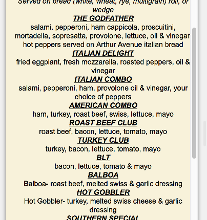
It´s no fun to read it.
Same to your specials topic …

BTW you won´t really need a template for this and you used an quite old template, didn´t you?
These days it is recommended not to use adaptive but responsive design.
Kind Regards,
Uwe
Copy link to clipboard
Copied
I actually have a new responsive template from muse called graze which I am converting everything over to redo. You recommend to add padding to the sides of text. I am working on the text for the articles. The technical menu I redid already. I just need to work on the new format into muse on each breakpoint so I can show you how it isplays and what is wrong. Thanks
Copy link to clipboard
Copied

Copy link to clipboard
Copied
When you're ready to re-build this responsively, use a Bootstrap template. It will save a lot of time and relieve you from tedious coding and fixed width breakpoints. The link below will give you an idea of what's possible in Bootstrap. Just resize your browser viewport.
Alt-Web Design & Publishing ~ Web : Print : Graphics : Media
Copy link to clipboard
Copied
I will look into that template and manipulate it to the way I want the site to look. Thanks now I just need how to purchase that template.
Copy link to clipboard
Copied
$20 gets you 190+ HTML files for any project.
https://wrapbootstrap.com/theme/the-project-multipurpose-template-WB0F82581
Alt-Web Design & Publishing ~ Web : Print : Graphics : Media
Copy link to clipboard
Copied
Thanks I downloaded the restaurant template now I need to work on manipulating it to work for what I need.
Copy link to clipboard
Copied
I couldn't edit last post. I like teh template where you can select menus to see breakfast lunch dinner but I need much more room to add to the menu then they have. Once I figure that out it would be ideal.
Copy link to clipboard
Copied
I can't get this to open in muse. SHould I be using Dreamweaver instead for this template? it looks for a muse file.
Copy link to clipboard
Copied
Which restaurant template did you download? The one from Nancy? Then you´re out of muse. Ask Nancy. Bye Bye.
Kind Regards,
Uwe
Copy link to clipboard
Copied
I am sticking with my muse template. I have updated each size and was wondering where the muse option is to see how it looks on tablet, mobile.
Copy link to clipboard
Copied
Put your work online and test with various devices and browsers.
Alt-Web Design & Publishing ~ Web : Print : Graphics : Media
Copy link to clipboard
Copied
Once you made your site responsive, there´s no "tablet" view anymore - it isn`t even necessary at all. You look only for design and when it starts to fail, add a breakpoint, change layout and so on.
What you may use as a helping tool is a developer tool like the one in Safari as in my 5th post from: 10.12.2018 07:31
You can find the same in Chrome and I guess in Firefox, too.
Kind Regards,
Uwe
Copy link to clipboard
Copied
Muse is not a code editor. To work with HTML & CSS files, you need a code editor like Dreamweaver or Pinegrow. To add more food items, copy & paste the relevant code.
Alt-Web Design & Publishing ~ Web : Print : Graphics : Media
Copy link to clipboard
Copied
As I am trying to test my site which I left unattended for a while I noticed when it's in 1200x1200 it looks nice and in design mode at certain preconfigured break points it looks fine but when I go to design mode it only shows in full screen mode which is fine. When I adjust the size smaller I can't tell what size it is but a few need fixing which I am trying to figure out. What should I look for in Chrome to test the site. Thanks
-
- 1
- 2
 AdChoices