 Adobe Community
- Home
- Muse (read-only)
- Discussions
- Re: how to make a template responsive for mobile, ...
- Re: how to make a template responsive for mobile, ...

Copy link to clipboard
Copied
I have a template that I manipulated to work for my website. I selected the option responsive width and height. By selecting this I thought it meant it would adjust to any size page. I also noticed bove in the main adobe home page you can select phone, tablet and import the desktop settings but they aren't lining up correctly.
Is the proper way to have my website displayed correctly on a mobile, tablet and desktop to select each size point 768, 960, 1200 etc and format the page to my liking? Thanks


 1 Correct answer

They didn´t replace it at all and will probably never do. If you are into coding than go for it (DW).
If not, have a look at one of these like wappler, blocs, pinegrow, without code from muse-themes.com, and similar.
Here in this forum you will find a (and even more) thread only for that topic and will find many of them.
Kind Regards,
Uwe
 30
Replies
30
30
Replies
30
Copy link to clipboard
Copied
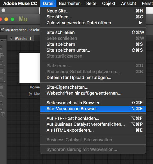
I can't test this in Muse. I think I found it in Chrome. How can I use Chrome to test it w/o making it live yet.
Copy link to clipboard
Copied
I figured it out.
Copy link to clipboard
Copied
You found this?
Copy link to clipboard
Copied
yes thanks but here is the issue I am trying to fix so in Chrome the mobile device is a Galaxy S5 which indicates 360x640 which I would like to tweak or 411x731. How do I create these in Muse so I can tweak it. This should be easier to work with in Muse.
Copy link to clipboard
Copied
You should not think in terms of devices with responsive design. I recommend to start a new thread as this one is solved already. Show us with screenshots your detailed issue.
Kind Regards,
Uwe
Copy link to clipboard
Copied
Thanks I started a ne thread
-
- 1
- 2
 AdChoices