 Adobe Community
- Home
- Muse (read-only)
- Discussions
- Re: How to make my logo responsive?
- Re: How to make my logo responsive?

Copy link to clipboard
Copied
I am redoing the website using Graze template. I placed a background and a logo on top of the background for the header. What do I need to do to make the logo and background adjust properly for mobile, desktop sizes.
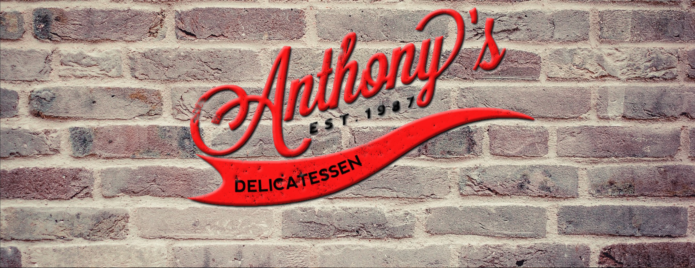


 1 Correct answer

So it should be easy, shouldn´t it? Place your logo in the place to be and resize it for each breakpoint. Test it in browser and resize as desired.
Kind Regards,
Uwe
 7
Replies
7
7
Replies
7

Copy link to clipboard
Copied
I bet, nobody here knows this „Graze“ template …
Could you describe, what happens and what you’d like to happen instead?
Copy link to clipboard
Copied
I would like the logo to resize correctly on different platforms. The brick background already does.
Copy link to clipboard
Copied
We talk about GRAZE from musegrid.com, don`t we? Did you use the responsive version GRAZE?
So we need to know, which changes you made. The logo in the template is set into the menubar like this:

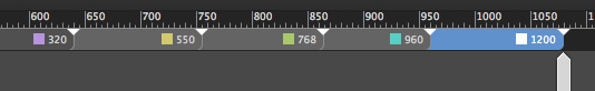
The breakpoints are setup as fixed width breakpoints so it should be easy to do the same for your logo, I hope?
BTW, I would delete the 320 breakpoint so it looks like this:
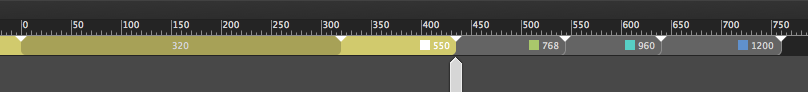
instead of this:
That was a point I mentioned to musegrid as well several times with no satisfying response so far. They also used it for their design kit, I guess. Only they know, why 
Back to your question, I recommend to use the logo inside fixed width breakpoints as well and set the size for each breakpoint as desired/necessary. For my personal taste, I often don´t like the resizing and find it too small towards the smaller breakpoints.
But of course this is your decision, you´re the master 
Kind Regards,
Uwe
Copy link to clipboard
Copied
I understand the logo is in the middle of the menu bar but id like to put it in place of the bread image. I understand the smaller resizing doesnt look great.
Copy link to clipboard
Copied
So it should be easy, shouldn´t it? Place your logo in the place to be and resize it for each breakpoint. Test it in browser and resize as desired.
Kind Regards,
Uwe

Copy link to clipboard
Copied
xxnonamexx wrote
I would like the logo to resize correctly on different platforms. The brick background already does.
Wouldn't it make the most sense to combine bricks with logo in Photoshop? Flatten image layers and then export as JPG. That way you're only dealing with one web image instead of 2.
Alt-Web Design & Publishing ~ Web : Print : Graphics : Media
Copy link to clipboard
Copied
I don´t think so.
It´s better to stretch the brick.bg to browser width and place the logo in an extra layer. I would even in fluid width breakpoints keep the size of a logo. As mentioned above, for me personally the resizing gets too small often.
Kind Regards,
Uwe
 AdChoices