 Adobe Community
- Home
- Muse (read-only)
- Discussions
- how to rotate an image from the center and not fro...
- how to rotate an image from the center and not fro...

Copy link to clipboard
Copied
I have a problem making a widget.
I want to make a card with an image that activates an overlay + a text + and that at the same time the image makes a rotation and a zoom, when the mouse is on the element. Doing it manually with CSS, if it works. But with Muse, the image instead of rotating from the center of its axis, does so from the first corner of the image.
This is what i get:

This is what i want:

How can I solve that?
This is the code:


 1 Correct answer

For the love of Muse
1 line of code will solve your problem
transform-origin: 50% 50%;
If you still have questions in making widgets
drop it like it's hot.
 7
Replies
7
7
Replies
7

Copy link to clipboard
Copied
The parent container (div.poloaroid) rotates 7 degrees on mouseover.
Embed CSS in the <head> tag.
<styel>
<style>
div.polaroid {
width: 300px;
padding: 10px 10px 20px 10px;
border: 1px solid #BFBFBF;
background-color: white;
box-shadow: 10px 10px 5px #aaaaaa;
transition-duration: 0.5s;
}
div.polaroid:hover{
-ms-transform: rotate(7deg); /* IE 9 */
-webkit-transform: rotate(7deg); /* Safari */
transform: rotate(7deg);
}
</style>
Embed HTML code .
<div class="polaroid">
<img src="https://placeimg.com/284/213/nature" alt="Placeholder image">
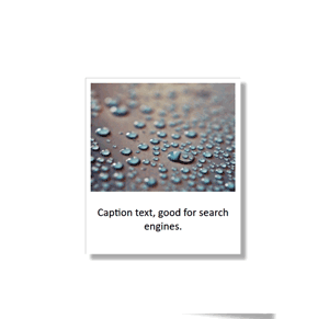
<p class="caption">Caption text, good for search engines. </p>
</div>
Alt-Web Design & Publishing ~ Web : Print : Graphics : Media

Copy link to clipboard
Copied
a simple state button does this in Muse... no code is needed
Copy link to clipboard
Copied
Come to think of it, this revised CSS will work better. It rotates & scales on hover.
<style>
div.polaroid {
width: 284px;
margin: 25vh auto;
padding: 10px 10px 20px 10px;
border: 1px solid #BFBFBF;
background-color: white;
box-shadow: 10px 10px 5px #aaa;
transition-duration: 0.5s;
/**initial scale**/
-ms-transform: scale(0.65);
-webkit-transform: scale(0.65);
transform: scale(0.65);
}
div.polaroid:hover {
-ms-transform: rotate(7deg) scale(1); /* IE 9 */
-webkit-transform: rotate(7deg) scale(1); /* Safari */
transform: rotate(7deg) scale(1);
}
.caption { text-align: center; }
</style>
Alt-Web Design & Publishing ~ Web : Print : Graphics : Media
Copy link to clipboard
Copied
the problem continues, I do not want the whole picture to rotate, only the image that is in the background.
This is my code:
<?xml version="1.0" encoding="UTF-8" ?>
<HTMLWidget name="Zoom-n-rotate_bg" formatNumber="3" localization="none" creator="VC Soluciones" defaultWidth="100" defaultHeight="100" isResizable="true">
<parameters>
<!-- This is where your widget options go -->
<!-- <text name="graphycStyleName" defaultValue="fullHeight" label="Please Add Your Graphic Style Name:"/> -->
<color name="bg-color" label="Color de fondo:" defaultValue="#C74040"/>
<file name="bg-image" label="Imagen de fondo:" filterLabel="Images" fileTypes="*.jpg;*.jpeg;*.png;*.gif" fileRequiredForOutput="true"/>
<text name="titulo" defaultValue="Titulo" label="Texto de Item:"/>
<number name="escala-zoom" min="1" max="5" label="Escala de Zoom:" defaultValue="2"/>
<number name="angulo-rotacion" min="1" max="360" label="Angulo de Rotacion:" defaultValue="25"/>
<builtIn name="width"/>
<builtIn name="height"/>
</parameters>
<headHTML>
<!-- Insert the widgets <head> HTML here -->
</headHTML>
<pageItemHTML>
<!-- Insert the widgets <body> HTML here -->
<![CDATA[
<div class="container img-hover-zoom--quick-zoom actAsDiv">
<img src="{param_bg-image}" alt="{param_bg-image}" class="image">
<div class="overlay">
<div class="text">{param_titulo}</div>
</div>
</div>
]]>
</pageItemHTML>
<bodyEndHTML>
<!-- Insert the widgets <bodyEndHTML> here -->
<![CDATA[
<style>
.container {
position: relative;
overflow: hidden;
}
.image {
display: block;
width: 100%;
height: 100%;
}
.overlay {
position: absolute;
top: 0;
bottom: 0;
left: 0;
right: 0;
height: 100%;
width: 100%;
opacity: 0;
transition: .5s ease;
background-color: #{param_bg-color};
}
.container:hover .overlay {
opacity: 0.5;
}
.text {
color: white;
font-size: 20px;
position: absolute;
top: 50%;
left: 50%;
transform: translate(-50%, -50%);
-ms-transform: translate(-50%, -50%);
}
.container img {
transition: transform .4s ease-in-out;
}
.container:hover img {
transform: scale({param_escala-zoom}) rotate({param_angulo-rotacion}deg);
}
</style>
]]>
</bodyEndHTML>
</HTMLWidget>
Copy link to clipboard
Copied
nice neat code Nancy 
Copy link to clipboard
Copied
.png)
examples;
the code Nancy posted nancy
more or less the same effect in Muse states example2
and a rotate example3
an image is just a fill i.e, something inside a box, css works on the box itself
imo need a widget = pay a few $
want to learn code = start with bootstrap or Pinegrow... Css and Muse are both dead ends now
sorry mate, best of luck to you
Copy link to clipboard
Copied
For the love of Muse
1 line of code will solve your problem
transform-origin: 50% 50%;
If you still have questions in making widgets
drop it like it's hot.
 AdChoices