 Adobe Community
- Home
- Muse (read-only)
- Discussions
- Layout scrambles in responsive Design & Tip for a ...
- Layout scrambles in responsive Design & Tip for a ...
Copy link to clipboard
Copied
Hi everybody,
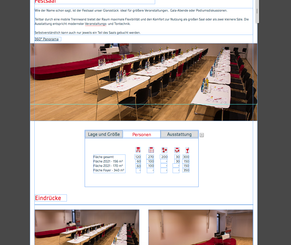
I started to design a responsive website with muse and everything looks good in the first break point (1024):

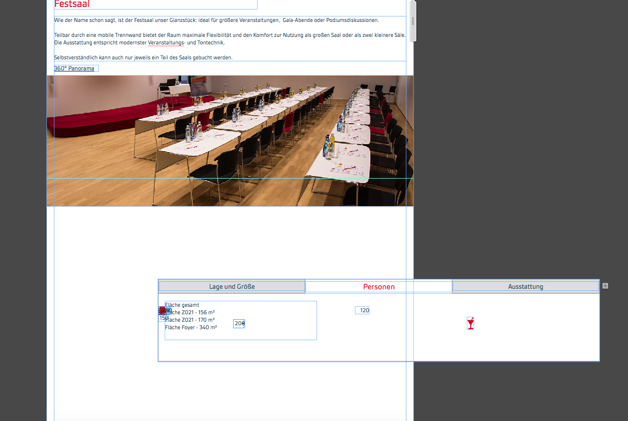
But in the next breakpoint it looks like this:

I know I have to rearrange the elements in every breakpoint. But that's superhard if they all are stacked over another!
Is there a solution for this and maybe someone has a tip how I can do a proper table to show the differnt numbers in the colums.
Now every number is a textfield and I have to arrange it...
Looking forward to your help.
Thanks in advance
Michael
 1 Correct answer
The reason for that is quite unavoidable. I tried to explain it here: https://forums.adobe.com/message/8749608#8749608.
The most easiest way to avoid the problems you are encountering:
Create your layout as recommended: Start with only one – the widest – breakpoint, and if you are mostly done add the other breakpoint.
Talking about tables: A very simple trick to avoid your "table problems" and create nice looking tables within Muse: Create one text frame and paste the small textframes as an object
...Copy link to clipboard
Copied
You have to rearrange the tabbed composition in your second breakpoint and every following breakpoint, of course.
You may also have to resize it (have no idea, why it got bigger).
What you could do to make handling a light easier: Right-Click onto one element and look for "Copy size and position to …" it will show you all breakpoints you already set.

I hope you always use the same tabbed composition? It looks like you use another compo?
For tables you could watch: HTML Table generator - TablesGenerator.com
Uwe
Copy link to clipboard
Copied
The reason for that is quite unavoidable. I tried to explain it here: https://forums.adobe.com/message/8749608#8749608.
The most easiest way to avoid the problems you are encountering:
Create your layout as recommended: Start with only one – the widest – breakpoint, and if you are mostly done add the other breakpoint.
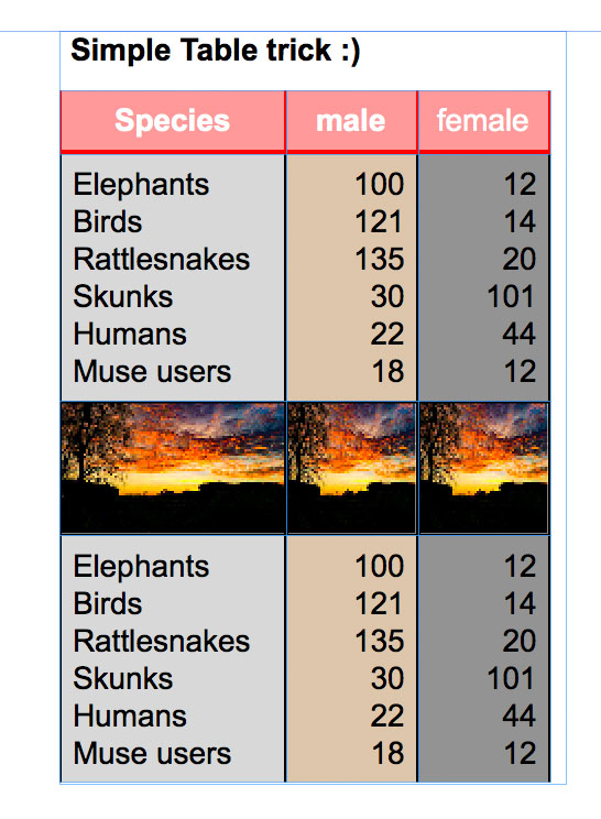
Talking about tables: A very simple trick to avoid your "table problems" and create nice looking tables within Muse: Create one text frame and paste the small textframes as an object into it. In this case you are able to easily edit and format the table (including images!) as you like and it won’t fall apart across different breakpoints.
This table is completely created in Muse, and you can handle it as one single element without puzzling around with small single text boxes:

Here you can download this example as a .muse file: https://www.dropbox.com/s/qlma4a736mfhcw8/Simple_Table_Trick.zip?dl=0