 Adobe Community
- Home
- Muse (read-only)
- Discussions
- Re: Lightbox images are really small on mobile sit...
- Re: Lightbox images are really small on mobile sit...

Copy link to clipboard
Copied
Hi everyone.
I'm still RELATIVELY new to using Muse (this is my first site, and I've been working on it quite a while to make sure it's right before launch). I'm getting close. I have some pages with images, but I ran into a problem:
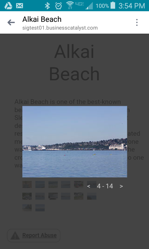
When I select them (or someone else I ask, to make sure it isn't my phone) on my Android phone, they are SUPER tiny. I'm fine with them not being full screen in the lightbox, but they are less than 25% of the size of the screen. Any thoughts on how I can make them closer to 50-75% the size?
Thanks!


 1 Correct answer

You can see on my screenshots, that 320 is not set to be a breakpoint. The + sign would give me the possibility to add on, though.
Even now with all this fluid design options it is not too bad to start with fixed width breakpoints until you hit 768.
Feel free to share just one page with your gallery and we will have a look, if really needed. Sometimes watching example files helps a lot.
Best Regards,
Uwe
 13
Replies
13
13
Replies
13
Copy link to clipboard
Copied
Check your mobile version/part/breakpoints and adjust the size of the lightbox images.
Maybe you have to add a breakpoint and adjust it, so that it fits on every device.
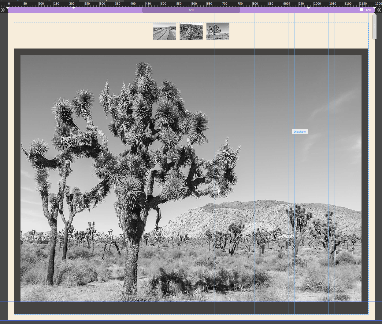
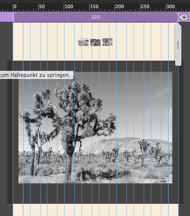
If you start with almost fullscreen for desktop it will fit in mobile as well. I attach two screenshots from 1200 and 320 with the same lightbox gallery.
Best Regards,
Uwe
Copy link to clipboard
Copied
Hi Uwe,
Unless I'm doing it wrong, I tried to think of doing that!
My BPs are set at:
1400
1200
900
720
600
320
Even when you flip the screen sideways (which I would think would be closer to the 600 break point), the picture remains the EXACT same size as in the 320. When I work with them in Muse, however, they certainly don't appear to be the same size! That's why I'm so confused!
Is there another size/sizes I should consider that I don't have set now?
Thanks for the thought!
Copy link to clipboard
Copied
Give us a link to have a closer look.
How does your lightbox look like at 320? Screenshot?
Uwe
Copy link to clipboard
Copied
Again, thanks for looking at this. This is from my test site (because I don't want it obviously coming up on the real one. Everything is showing up like this, even if you turn it sideways, and same goes for verticle pics...
Now, I just had an idea...
I moved my menu out of the way in the next pic... but if I expand this lightbox to be across the entire page, would that do the trick, or not?

Thanks again!
Copy link to clipboard
Copied
As I´m not sure about your breakpoints, yes. Just resize the lightbox so, that the size fits to your needs.
BTW, you could publish a test site to BC, nobody will see it, only the people you give the link to it.
Best way for tests.
Uwe
Copy link to clipboard
Copied
I thought my research was showing something close to that. I might have to try to look into it more, unless you know more about how large the mobile sizes should be. Not super excited about needing to redo about 25 different pages 2-3 more times, but if it's what has to be done...
Thanks for looking into this though.
Copy link to clipboard
Copied
Mobile breakpoint starts from approximately 768 and has a minimum width of 320.
But, as number of devices increase there´s no real mobile breakpoint.
Although it is still common sense to use 1200-960-768-min width 320
AND everything in between when your design starts to fail.
Not too many breakpoints, as this makes your site heavier from each breakpoint added.
BTW, 320 should not be a breakpoint at all but the minimum width.
Uwe
Copy link to clipboard
Copied
I was mostly doing that because 600 wasn't working properly on my phone and when I had 400, it didn't seem to look right either. I'll try the sizes you suggest and see what happens. Seems like the online info I had wasn't incredible (wasn't on here).
Thanks again for the help! Been a long road, but I think I'm finally down the final stretch.
Copy link to clipboard
Copied
You can see on my screenshots, that 320 is not set to be a breakpoint. The + sign would give me the possibility to add on, though.
Even now with all this fluid design options it is not too bad to start with fixed width breakpoints until you hit 768.
Feel free to share just one page with your gallery and we will have a look, if really needed. Sometimes watching example files helps a lot.
Best Regards,
Uwe
Copy link to clipboard
Copied
Let me play around for a little while. Started at 4 AM yesterday and went until like 9 last night and started around 5 or 6 today. Think I need to take a break so I won't start making mistake (I accidentally put a pic in lightbox menu a little while ago when I tried to put it beneath). I'll update you when I get some more work moving forward.
Copy link to clipboard
Copied
Of course.

Uwe
Copy link to clipboard
Copied
Hey Uwe!
Been working my butt off on my site. Looks amazing! Thanks for your advice!
Copy link to clipboard
Copied
Gorgeous  .
.
Best wishes,
Uwe
 AdChoices