 Adobe Community
- Home
- Muse (read-only)
- Discussions
- Re: menu icon falls off page in mobile version
- Re: menu icon falls off page in mobile version

Copy link to clipboard
Copied
Dear All,
I am new to muse and designed my first website, using the latest version of muse on mac. It all worked well, but:
my 'hamburger' icon is positioned too far to the right of my page when I view it on a mobile device (that is larger then 320 pix). Everything else is behaving as I designed it, but the position of this little nasty hamburger is unexplainable so far.
I have pinned it to the corner right, but it is not listening;) I am thinking it might have something to do with the accordeon widget that is placed over it, which is pinned to the top middle.
I have tried to stretch the accordeon widget to browser with, but, weirdly enough, I can not find out how to do this. (checked the tutorials)
The accordeon widget with drop down menu is created in within different breakpoints. The breakpoints are fixed, maybe that has something to do with it?
I hope someone can help!
Ree


 1 Correct answer

I had a look at the file too, but I am not so optimistic about it as Ankushr  .. It would be very useful if ankushr40215001 has a very close look at this post and the linked file. I think, there are fundamental issue concerning design decisions and Muse.
But one after the other:
At first some glitches, which can be fixed easily:
- I have no idea, why your menu consists of six, single manual menus, which are grouped. Why not using one manual menu with six entries?
- In the widest breakpoint, the hamburge
 5
Replies
5
5
Replies
5

Copy link to clipboard
Copied
Hey Ree,
A simple one page Muse file reduced only to the hamburger and accordion shall help us identify the issue.
Please follow the steps mentioned here to share the file - Please Provide a .muse File to Help Us Fixing Your Issue!
Regards,
Ankush
Copy link to clipboard
Copied
Hi Ankush,
Many thanks for your help. below you can find the muse file. I have tried to do it without assets, but could not find out how to. many apologies. If I preview this site in my browser I do not see any problems, because I can not scale my window as small as a mobile phone. The problem only occurs in a bigger then 320 pix mobile device.
Copy link to clipboard
Copied
Hey,
Thanks for sharing your file with me.
I have tried uploading your site to the Business Catalyst and it looks like below in my Android device.
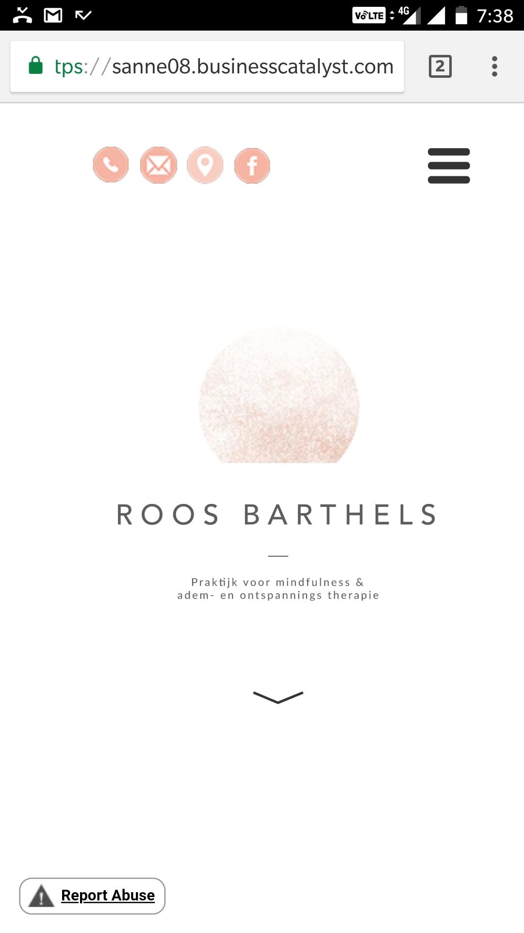
Where exactly are you expecting it to be?
Regards,
Ankush
Copy link to clipboard
Copied
I had a look at the file too, but I am not so optimistic about it as Ankushr  .. It would be very useful if ankushr40215001 has a very close look at this post and the linked file. I think, there are fundamental issue concerning design decisions and Muse.
But one after the other:
At first some glitches, which can be fixed easily:
- I have no idea, why your menu consists of six, single manual menus, which are grouped. Why not using one manual menu with six entries?
- In the widest breakpoint, the hamburger logo is pinned to the right side of the browser window, therefore it doesn’t stay behind the accordion widget. A click onto the hamburger logo causes – nothing, because the accordion itself isn’t stretched to browser width.
- In the widest (fluid!) breakpoint, the accordion is pinned to the centre. If one reduces the browser window, the accordion bleeds out of the page width. If we pin it to the right, it will bleed out at the left side at about 600 px. Both may work fine on desktop, but will cause problems on mobile devices.
- The 320 px breakpoint is unnecessary. There is no mobile device which has a smaller screen size than 320 px. Simply delete it.
- The Menu is placed into the accordion and should stay in the middle of the screen. The accordion „sheet“ is sized to match this requirement. Since an accordion title (the „hamburger“ area) and its „sheet“ (the menu area) can’t be of a different horizontal width, there is no thinkable way to keep (a) the menu centred on page and (b) the accordion within the page boundaries.
Solution: Use a composition instead.
Before we do this, one more crucial information: The page mixes fixed and fluid breakpoints. This is possible, but has serious consequences for the page width. To make this clear without many words:
- Make the guidelines visible, make sure, that no element is selected, and click onto the „Fill“ command in the upper control strip. Choose a colour to assign it to the page background. Now it is plain toi see, that all the menu and header elements (accordion, menu, logos) are positioned far outside the defined page/breakpoint widths. Here a small screencast to visualze this:
I assume, the problem is, that you have confused the position of the scrubber (this vertical, grey handle top right of the breakpoint bar) with an indicator of the page width. This isn’t the case. The position of the scrubber visualises the browser background.
Now, what can be done?
Since the is no way to make an accordion work correctly in this constellation, use a composition instead.
I built a demo .muse file, which compared your solution („old“) with my modified solution („new“). Furthermore, I coloured the page background and the menu elements to make it clear to see, what happens.
One issue remains: If the browser window is wider than the 509 px (fixed) breakpoint, the browser view shifts horizontally. I don’t find a remedy, and suppose, we are dealing with a Muse bug , which often appears on fluid pages containing fixed width breakpoints. This shifting is easily to see, when the „Responsive Design“ mode in Safari’s „Developer menu" is used.
Here the revised .muse file: https://www.dropbox.com/s/pl7nb0ydetboop2/sanneb8014015.muse?dl=0
Copy link to clipboard
Copied
Dear Gunter Heissenbuttel,
Thank you so much for your reply! I am going to try it out tonight and will let you know if I succeed  many thanks!
Ree
 AdChoices