 Adobe Community
- Home
- Muse (read-only)
- Discussions
- Mobile Landscape - Prevent Zoom and centre Content
- Mobile Landscape - Prevent Zoom and centre Content

Copy link to clipboard
Copied
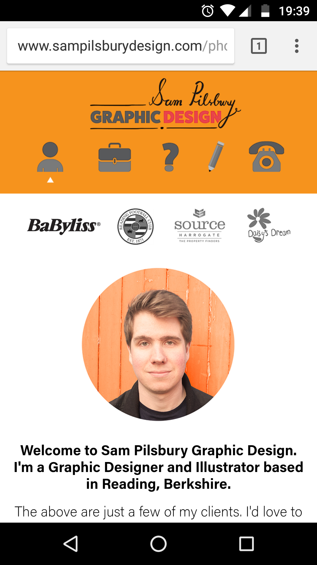
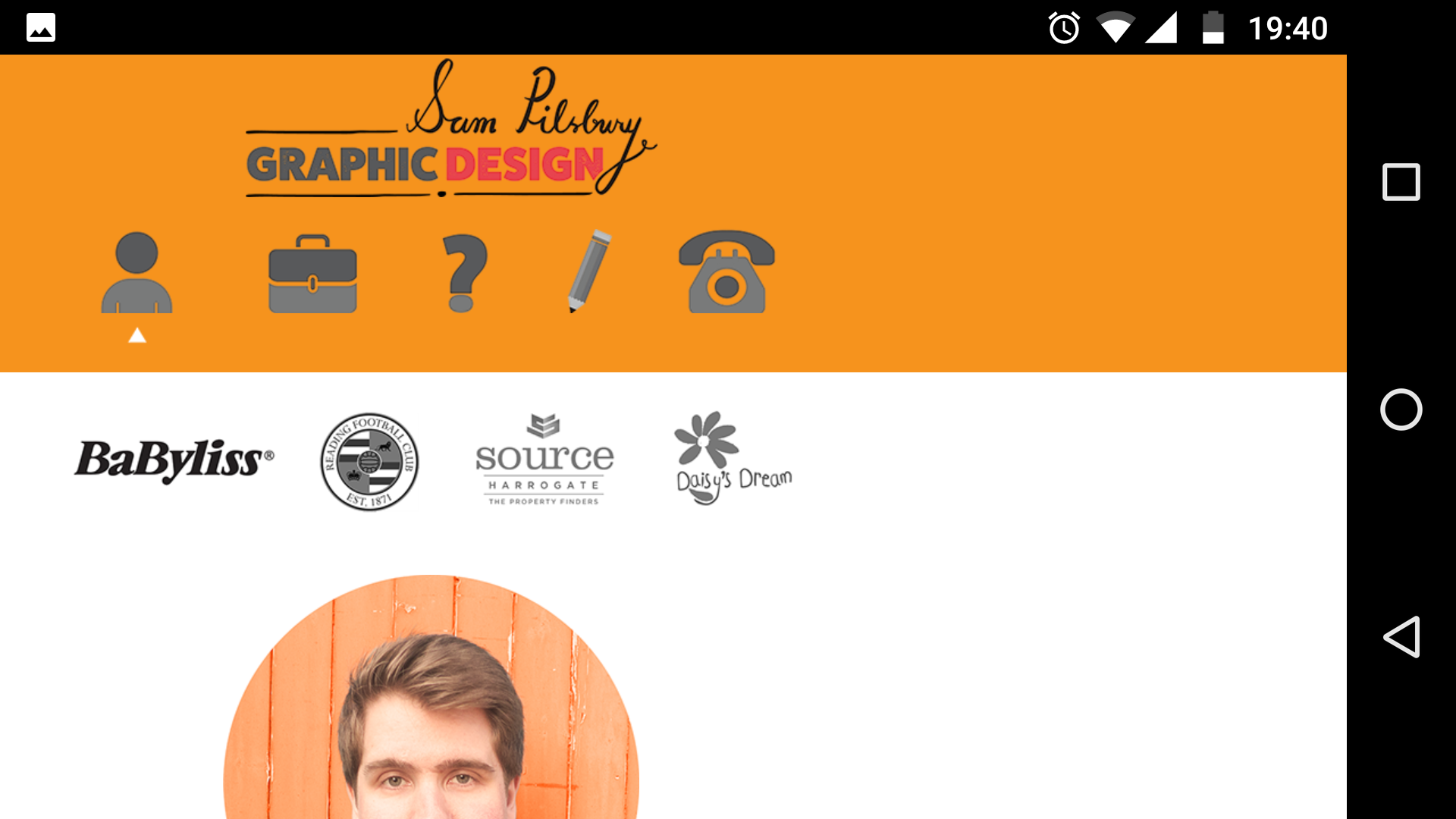
Hi There,
By default my Muse website zooms in when the device is switched from portrait to landscape. Not only does this make everything too cramped but on certain high res screens graphics become fuzzy and soft - even with the 2x HiDPI enabled.
I've tried using <meta name="viewport" content="width=device-width, initial-scale=1">
Which is halfway there, but the problem is all my content is moved to the left of the screen. How do I centre it?
Examples attached -
Thanks,
Sam


 1 Correct answer

Unfortunatly using the meta viewport tag with a fixed layout, means that the mobile device will shrink the web page if it is too big for the display, or as has happened for you zoom the page to fit the display.
If you wish your page to 'fit' the display correctly then the only methods are to use a responsive layout, or to create separate layouts that fit each page to the device size.
 4
Replies
4
4
Replies
4
Copy link to clipboard
Copied
Any ideas?
Any way to control how Muse displays the landscape version of mobile and tablet, and stop it zooming in?
PS I am using fixed layouts not responsive / fluid
Thanks,
Sam
Copy link to clipboard
Copied
Unfortunatly using the meta viewport tag with a fixed layout, means that the mobile device will shrink the web page if it is too big for the display, or as has happened for you zoom the page to fit the display.
If you wish your page to 'fit' the display correctly then the only methods are to use a responsive layout, or to create separate layouts that fit each page to the device size.

Copy link to clipboard
Copied
Hey Sam,
Adding to our ACP's correct answer, let me try elaborating it.
The ACP meant if you are using a fixed width layout then it's wiser to add another Phone or tablet layout from page menu>add alternate layout.
Please try this action and I am pretty sure that your issue will resolve.
Do update us accordingly.
Regards,
Ankush
Copy link to clipboard
Copied
Thanks both of you!
Ankush: Are you saying I can design separate mobile portrait and landscape pages with this method? So I can control exactly how the landscape version looks (with more manual work of course) ?
I'm trying to avoid responsive as I find it very fiddly and frustrating...though only tried it once about a year ago.
Also I have just discovered the wonders of .SVG files which should stop everything pixelating when it zooms in on rotation, which is a compromise until I figure it out properly
Thanks again
Sam
 AdChoices