 Adobe Community
- Home
- Muse (read-only)
- Discussions
- Mobile Menu, submenu fly out not displaying/workin...
- Mobile Menu, submenu fly out not displaying/workin...

Copy link to clipboard
Copied
I have a fixed breakpoint site, with a mobile menu that functions properly on all pages except for three. On these specific pages, the main menu link is clickable, but it won't activate the fly out. Could someone with some insight or fresh eyes help me solve this please?
Thanks
Thomas


 1 Correct answer

Does the menu flight on these three mobile pages does not work on phone? On my side they do work on desktop, shrinked to mobile sizes (Safari and Chrome). I had now some dinner – that makes me more patient, obviously  .
.
We don`t need to look at the master registration, right?
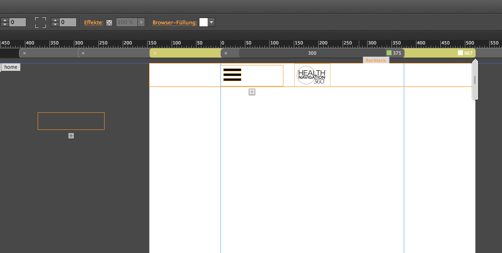
Starting from scratch: The menu – hamburger and menu items – is pinned to center at 667 and 375 ( why did you choose those settings? I think, it is more common to use 768 as fluid width breakpoint with the breakpoint propertie
...
 13
Replies
13
13
Replies
13

Copy link to clipboard
Copied
Link?

Copy link to clipboard
Copied
wow it www(something.net)... how many could there be?
Copy link to clipboard
Copied
I heard that there´s even a printed version of the www out there …
Copy link to clipboard
Copied
Yes, I’ve already bought it! Quite a bargain at Amazon! 
Copy link to clipboard
Copied
Who´s talking ´bout Encyclopediae Britanica, if one can have the web? 
Copy link to clipboard
Copied
Sorry I forgot to include that.
It's only on the 300 and 667 break points.
http://healthnav360.com/professionals---institutions---working-with-reffering-facilities.html
http://healthnav360.com/professionalsandinstitutions-working-with-hospitals.html#hospital_staff
Theres the muse file if that could help
Copy link to clipboard
Copied
Don`t know about the others, but a very reduced file to these three pages with only your issue would have been nicer.
Downloading 162 MB and searching for pages and menus and flights …?
Our live is not that boring, you know ? 
Copy link to clipboard
Copied
Checking the links, you gave us, the menu is working fine here at all breakpoints. fotoroeder, could you please check as well?
If Uwe meets a problem, please cooperate and give us the smallest possible .muse file to demonstrate your issue. If you have luck, you’ll identify the problem by yourself, while preparing your file for upload to Dropbox.
Copy link to clipboard
Copied
Thanks Gunter and fotoroeder for your replies. I hear you that it works and sometimes it works for me too. If I load the page on my iphone, the first time it won't work. If I refresh. It works. To try and solve this, I've (1) rebuilt the menu and (2) I created a separate master that removed the mobile menu and placed it individually on each page. neither of those attempts got it to consistently work.
Thanks,
Thomas
Copy link to clipboard
Copied
For me the flight mobile menus work as well ( on desktop).
In design view I realize an accordion outside the canvas – hide in breakpoint maybe?:
and this widget – not that disturbing and not your issue but you could have done this more easily with a simple button and link to top anchor ( as far as I see, it doesn`t do any fancy stuff ) :
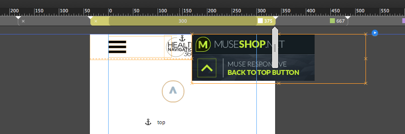
Also with these three buttons on your pages:

there´s a slight misalignment, if I click them on desktop version it is kind of shifting 1 or 2 pixels .
From a design/UX side of view I find it quite difficult, especially on mobile to find these menu items, but this has to do with content, of course and – is not your issue.
Uwe
Copy link to clipboard
Copied
Thank you very much for your insight. I appreciate it.
The desktop break points at 900 and 1200 aren't for the user on a mobile device. Nothing links to them from the mobile breakpoints. So they are essentially hidden. I can't figure out how to delete them without having all the content misalign on the 300 and 667 breakpoints.
This experience is dictated by my client. It's not my choice and not my design. I presented other options. but none were excepted. SO this is what we're goign with.
I hid the astray accordian. But don't think that was the issue as it was happening before that was there and now after it's gone.
Bummer that it can't be resolved. But I do appreaciate you looking at it and helping me try to solve it.
Thank you.
Thomas
Copy link to clipboard
Copied
Does the menu flight on these three mobile pages does not work on phone? On my side they do work on desktop, shrinked to mobile sizes (Safari and Chrome). I had now some dinner – that makes me more patient, obviously  .
.
We don`t need to look at the master registration, right?
Starting from scratch: The menu – hamburger and menu items – is pinned to center at 667 and 375 ( why did you choose those settings? I think, it is more common to use 768 as fluid width breakpoint with the breakpoint properties: minimum width 320.
Does this have a certain reason? Asking Pavel Homeriki and Günter Heißenbüttel, is this also a good practice/is it possible
to use fixed width breakpoint for mobile layout in responsive sites?
Anyway, despite the fact, that for users it is more reasonable and better UX (User Experience) to keep the menu pinned to top or pinned to bottom, Pavel Homeriki and maybe the muse-rules recommends highly, not to pin in mobile layouts.
Maybe this causes the issue on your side.
The pinning is also the reason, why it does not push down your content, right Günter Heißenbüttel? If it should push down ( it is set to not overlap).
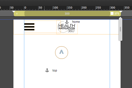
I do nor understand the position of the top anchor.
Does this help?
Uwe
Copy link to clipboard
Copied
Sorry about that. I'm new to this.
I thought that the entire site in context would help solve the problem.
Here are just the pages affected.
Here's a link to a reduced file
https://www.dropbox.com/s/hmb19iim4wcjalz/HealthNav360FinalDraftFor%20Review.muse?dl=0
 AdChoices