 Adobe Community

Copy link to clipboard
Copied
When viewing my website on my mobile (I have only tested on my mobile) the top navigation bar seems to be a little wider than than the main content. So therefore when I scroll up some of the navigation bar gets hidden behind my top mobile icons. To solve this I have to zoom out with my fingers after loading the page and then you can see that there is more space down the right side of the site.
My website is www.webbysmith.com
I hope this makes sense....


 1 Correct answer

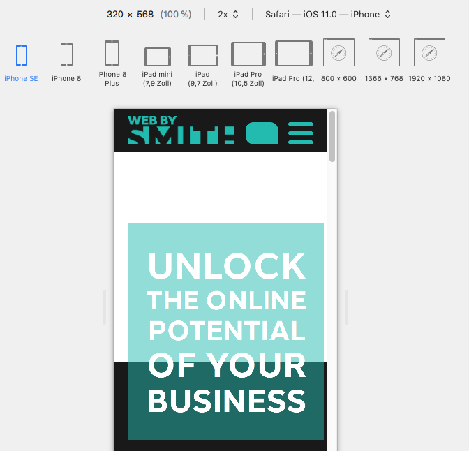
Although it doesn't look too bad on my phone, you may have some elements outside the canvas on mobile. Watching in the developer section of Safari, for very small devices, this issue comes up more obvious, but as written, on my phone it looks almost perfect:
Also on desktop and "faking" mobile, I was not able to reach your following pages, this was no problem on phone.
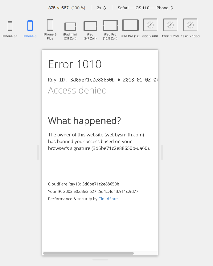
On phone everything AND images was nicely visible, while on desktop I get called something like this (but only using the developer
...
 2
Replies
2
2
Replies
2
Copy link to clipboard
Copied
Sorry I should clarify...
All content is set to be responsive and to adjust to browser width. So there should be no difference in width
Copy link to clipboard
Copied
Although it doesn't look too bad on my phone, you may have some elements outside the canvas on mobile. Watching in the developer section of Safari, for very small devices, this issue comes up more obvious, but as written, on my phone it looks almost perfect:
Also on desktop and "faking" mobile, I was not able to reach your following pages, this was no problem on phone.
On phone everything AND images was nicely visible, while on desktop I get called something like this (but only using the developer tool from Safari, not when shrinking the window):
So I recommend to check properly your mobile breakpoints, hoping you have not set 320 as breakpoint but as mimimum width, for elements outside the canvas and it should be pretty good.
Best Regards and a happy new year  ,
,
Uwe
 AdChoices