 Adobe Community
- Home
- Muse (read-only)
- Discussions
- Re: Muse 320 mobile layout has an overflow on the ...
- Re: Muse 320 mobile layout has an overflow on the ...
Muse 320 mobile layout has an overflow on the right

Copy link to clipboard
Copied
Mobile view works on iOS browsers and desktop browsers, but doesn't work on Android, it generates white space on the right side of the page.
URL of the page:
https://sarita.dk/test/index.html
I have added a 960px breakpoint to this site where it should resize to 320px for phones. The breakpoint triggers the page to resize, but the layout is wider than 320 and the content appears on the left side and the header is centered to that wider look.
I have deleted all the contents one by one to see if there is an object that triggers this.
I have also added a styling script to hide overflow on x, which helped but then disabled the scrolling possibilities on the site.
I have no idea why is this happening. Obi Van Kenobi, you are our last hope! Please help!
Thank you!


 5
Replies
5
5
Replies
5

Copy link to clipboard
Copied
Does this document help: https://forums.adobe.com/docs/DOC-8953?
If not: Delete all pages except one and all elements, which don‘t affect your issue, save the document under a new name, upload it to Dropbox or a similar file sharing service and post the download link here. Then we will certainly be able to help.
Copy link to clipboard
Copied
I haven't managed to fix the issue with your link. I have uploaded a file with single page and a master page where the problem can be seen.
Can't wait for your solution. 
Copy link to clipboard
Copied
Only to make sure:
Your layout has a breakpoint at 320 px. The content of this breakpoint is shown, when the browser window/screen has a width of 320 – 960 px. If the screen/browser window is wider than 960 px, the content of breakpoint at 960 px is displayed. This is, what you intended?
If yes, there is one thing, what astonishes me: Your site/page is „fixed width“ and has a „min. width“ of 320 px. Fixed width pages don’t have a „min. width“ at all – that is the „essence“ of fixed layout. I suppose, your site was created as a fluid with site, which was later on changed to a fixed width version – what did cause some issues. Right?
Additionally, the site has a „max width“ of 520 px (see „Site Properties“) – a value, which doesn’t play any role in the whole layout.
What I tried: I re-built your site using a „fixed width“ layout and your site dimensions from the beginning. Then I copied all your content onto it. (I coloured the page background, to see exactly, which breakpoint actually is used.
I attached this file here. Could you please try, if this works as expected? I can’t, because I don’t have Android systems ans on my devices (macOS/iOS) there is no visible issue.
Perhaps fotoroeder could have a look too.
Here the .muse file:
https://www.dropbox.com/s/cga3gths5vealwn/Website-3-Mod.muse?dl=1
Copy link to clipboard
Copied
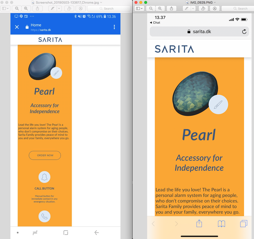
I have tried but the issue still persist. I have made a screenshot about the issue: left the android browser, right: iOS browser.
If you do not have an android device you can still see the issue with google chrome developer tools if you use the toggle devices toolbar to imitate the 320 wide mobile site.
Any ideas? :S
Copy link to clipboard
Copied
I think I found the issue:
Android/Google browsers seem not to like elements, which are (a) placed on fixed width pages and (b) stretched to browser width.
If you reduce the elements to page width, all works as expected. Just look at this sample file: https://www.dropbox.com/s/7xbeou7zb3ujpe3/Website-Mod-2.muse?dl=1
This means, that you may have to redesign your master page – what shouldn’ be THAT difficult on a fixed width page: For example, you can use a pixel precise background image.
Additionally I would suggest, not to use responsive pinning for mobile devices. Mobile browsers are very unreliable in this aspect.
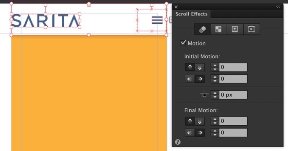
To mimic browser pinning (your header elements) select these object, unpin them and apply the scroll effect „Motion" by setting all its values to „0“:
Finally, I hope, you tested the site on a real(!) device. Browser simulations aren‘t really reliable especially in these kind of issues.
 AdChoices