 Adobe Community
- Home
- Muse (read-only)
- Discussions
- Re: Muse fixed layout looks fine in browser, jitte...
- Re: Muse fixed layout looks fine in browser, jitte...

Copy link to clipboard
Copied
I am having trouble with my fixed-width Muse file.
Note this is not meant as a website, but view-able file mainly meant for phones and tablet, but can also be viewed on a computer screen.
I am VERY new to this.
The file previews fine, but it jumps when i view it on my phone.
Here is the link to the Muse file
Here is the link to the Business Cat link that show the jump.
It only happens when viewing on the mobile devices.
Any help will be appreciated as I am NOW responsible for converting magazine content to this format.
http://marketplace12.businesscatalyst.com/index.html
Please help.
[Moved from non-technical Lounge to Help with using Adobe Muse CC by moderator.]
.


 1 Correct answer

Then you should use adaptive layout, copy everything from your fixed width layout, which is really no disadvantage at all, and paste everything onto your phone layout, place it, resize it as you like and done.
If you use a fixed layout, nothing shrinks or enlarges at all. It is just looking all the same on every device.
Huge screens have a very wide white space around, tablets look almost like your design/canvas, phones "jitter", what ever that
means  .
.
Again: create a phone layout and it shows, how
...
 4
Replies
4
4
Replies
4
Copy link to clipboard
Copied
Hi Ashley, you didn`t create a mobile version.
Your site opened without showing the breakpoint bar, so you should start with this:
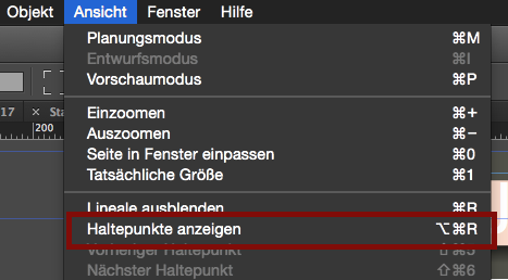
Then you see this:
Copy link to clipboard
Copied
I was too fast with ENTER, sorry.
Then you see this:
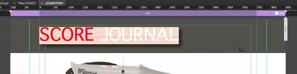
Now, mobile works from 768 towards 320 px width. So you should add at least one breakpoint at 768 with a minimum size of 320:
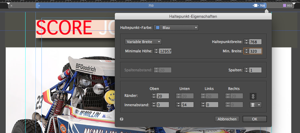
If you now resize your first "hero", that it fits into these guidelines of 768 (in your original size it would be 820, where you put helping lines (green)), from there you should keep on.
You should take care that, using the scrubber, nothing of your elements ever is placed outside the canvas.
Play around with responsiveness of images, resizing them in width only or width and height (AND reduce your font size  ).
).
Welcome to the world of web design  .
.
Uwe
Copy link to clipboard
Copied
THANK YOU!! for your quick response.
I DONT want to make it a responsive website. i want it as a FIXED layout. I want everything to shrink and enlarge proportionally.
Everything is currently viewing properly ( the way that I indend) on all devices, EXCEPT the strange jitter when it first loads.
I thought that by creating a fixed layout that would not happen.
Copy link to clipboard
Copied
Then you should use adaptive layout, copy everything from your fixed width layout, which is really no disadvantage at all, and paste everything onto your phone layout, place it, resize it as you like and done.
If you use a fixed layout, nothing shrinks or enlarges at all. It is just looking all the same on every device.
Huge screens have a very wide white space around, tablets look almost like your design/canvas, phones "jitter", what ever that
means  .
.
Again: create a phone layout and it shows, how you like it.
Uwe
 AdChoices