 Adobe Community

Copy link to clipboard
Copied
I am trying to create a 12 column grid in Muse. The standard bootstrap grid has gutter width split in half on each side of each column. This way you have one gutter for each column with one full measure between each column and half measure outside the left and right most columns. This is done in Bohemian Sketch by selecting a setting called "gutters on the outside". In Muse, it is defaulting to not account for this. So when I choose 12 columns I am only getting 11 gutters. This is resulting in my columns being slightly larger than desired on a fixed width layout to make up for the missing gutter.
How do I achieve gutters on the outside in Muse?


 1 Correct answer
I have hacked it by increasing the page margin by half the value of the gutter. It is important so that our developers can take measurements straight from design files and plug them into bootstrap. We are testing Muse for smaller, simpler pages and I guess it won't matter much since Muse generates code for us. Generally, it's just sloppy and annoying to do the math when switching between systems.
 5
Replies
5
5
Replies
5

Copy link to clipboard
Copied
Isn`t it obvious that you get 11 gutters when you have 12 columns?. Do you want 13? So on each side a gutter as well?
Or did I get you wrong. The two outside are called "padding" in original english. In German these are just called "edges".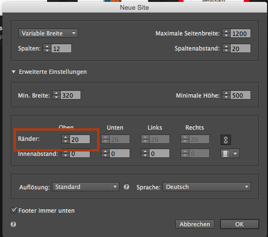
When I get you right you want half and half on each side?
Or do you want just larger paddings outside? Then do so and set them to more than 20.
Did I miss something?
Uwe
Copy link to clipboard
Copied
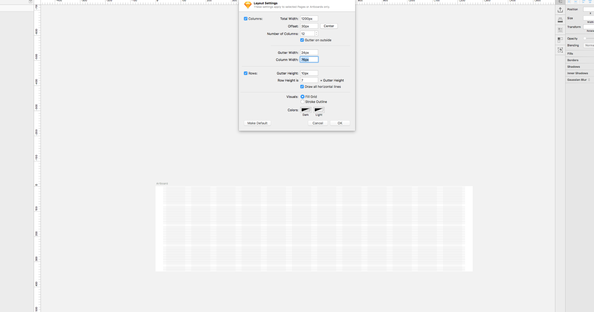
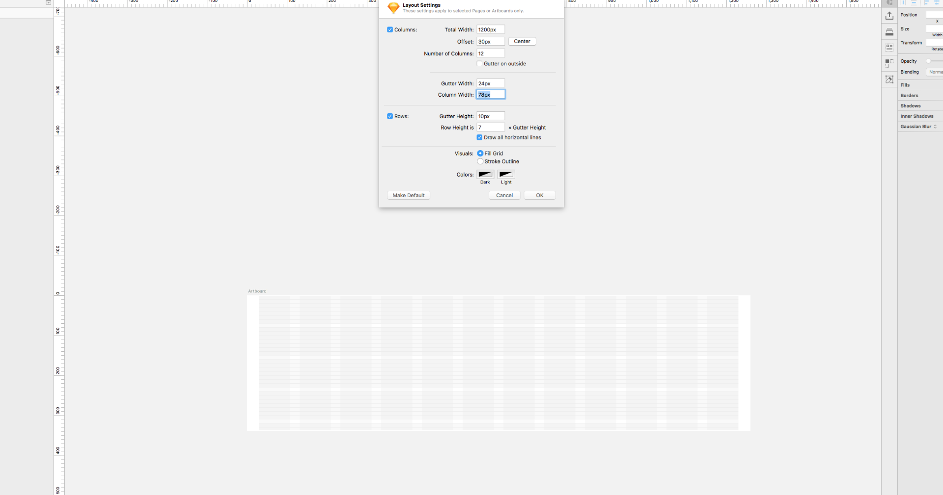
I want the gutters split in half with one-half on either side of each column. This results in a total of 12 times the set gutter width. half on the left, half on the right, and 1 between each column. This is not the same as extra space outside the columns, or "edge", "margin". Notice the screenshots from sketch. There is whitespace on either side of the artboard. On a site, this would be space outside the container. In image 1, the gutter is set to 24 and gutters on the outside is checked. This creates 12 px of padding on the sides of each column. In image 2, gutters on the outside is off. Notice my gutter remains at 24px, but the column width has changed (because now there are only 11 gutters. There is no gutter to the left and right of the layout, only page margin).
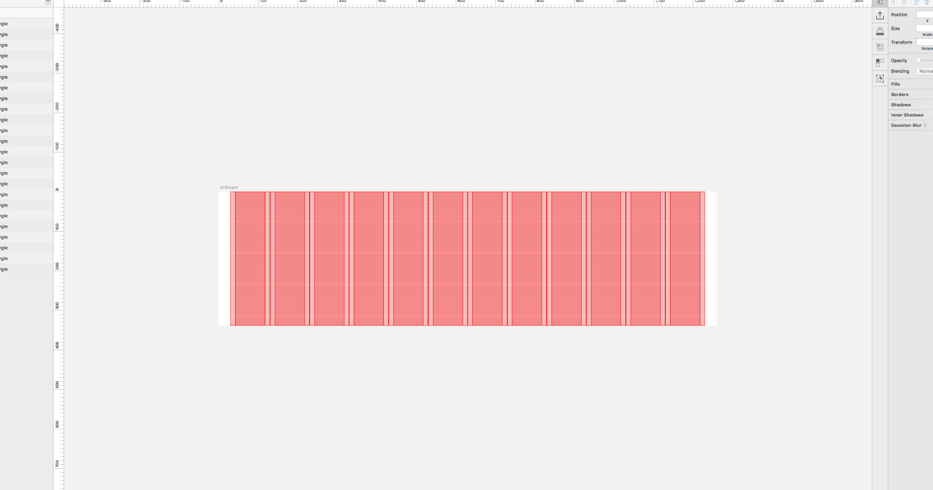
In image 3 have outlined each column in red. The dark pink is column. The light pink is gutter. The white is page margin. Notice that two half gutters touch between each column to make 1 whole gutter. On each side of the layout before page margin, there is one-half gutter.
Copy link to clipboard
Copied
Yes you are right, it´s not the same. As of this reading, I`m afraid, you have to live with the columns as they are provided  .
.
What`s your intention? Why is it important for you to split the gutters?
You could also reduce the width of the gutters as you like.
The paddings on either side could be set wider as you desire.
I understand, it´s not the same but … 
Uwe
Copy link to clipboard
Copied
I have hacked it by increasing the page margin by half the value of the gutter. It is important so that our developers can take measurements straight from design files and plug them into bootstrap. We are testing Muse for smaller, simpler pages and I guess it won't matter much since Muse generates code for us. Generally, it's just sloppy and annoying to do the math when switching between systems.
Copy link to clipboard
Copied
I see, thanks for information – 
 AdChoices