 Adobe Community
- Home
- Muse (read-only)
- Discussions
- Muse Hamburger Menu Breaks Down at Mobile Size
- Muse Hamburger Menu Breaks Down at Mobile Size

Copy link to clipboard
Copied
Hello All,
I hope you can help me, as this seems to be my last major issue with my website. I'm using a template I purchased but in the end it's causing me more headache than I anticipated. My website is meant to be fully responsive, but when I bring the browser down to the minimum phone width (320px), he hamburger menu 'explodes' and you cannot click any of the buttons. The menu seems to work fine in the template (A Master), but won't work on any of my actual pages. Below are some solutions I've tried:
1. Contact the creator of the template through support - no response yet
2. Adding a new breakpoint at mobile size (320px) to fix it - this seems to make it worse, no idea why so I removed the added breakpoint
3. Checking for any wrapping or padding applied to any of the objects nearby or in the menu (none found)
4. Playing with the responsive width option on every part of the menu that would allow me - no luck
5. Adjusting the size in the transform panel - no luck the objects just explode past the set width
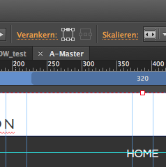
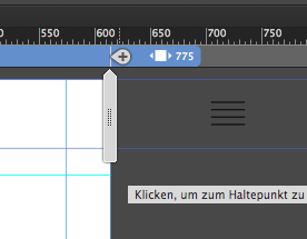
I've noticed the menu acts weird even in the Muse design mode; once you scan in past the 775 breakpoint the menu will not move but just sit past the edge of the artboard. In the browser it doesn't do this, and only seems to break down once you get to right about mobile size.
If you have ANY insight it would be so deeply appreciated
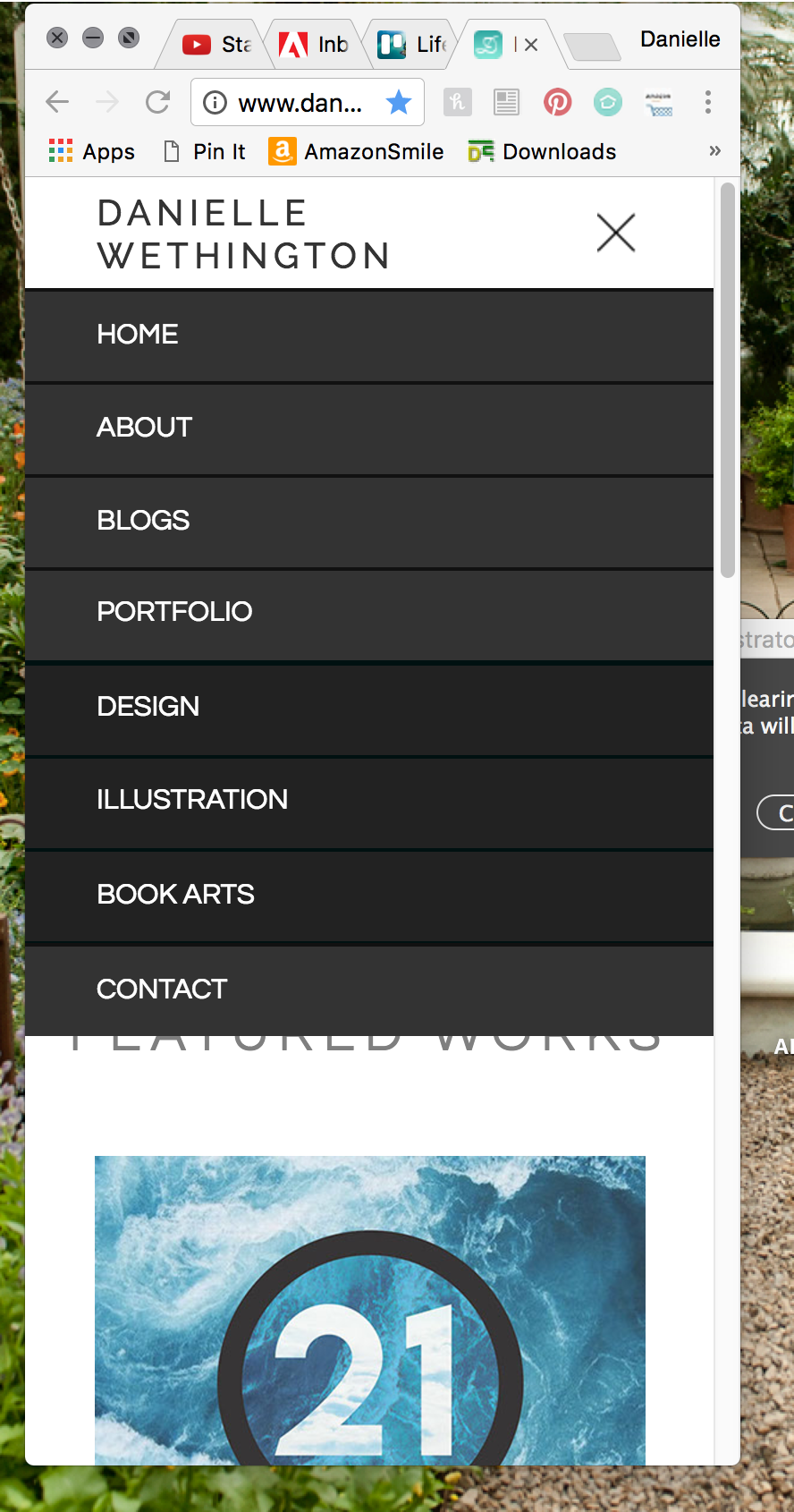
SITE IS LIVE AT: www.DanielleFeliciano.com
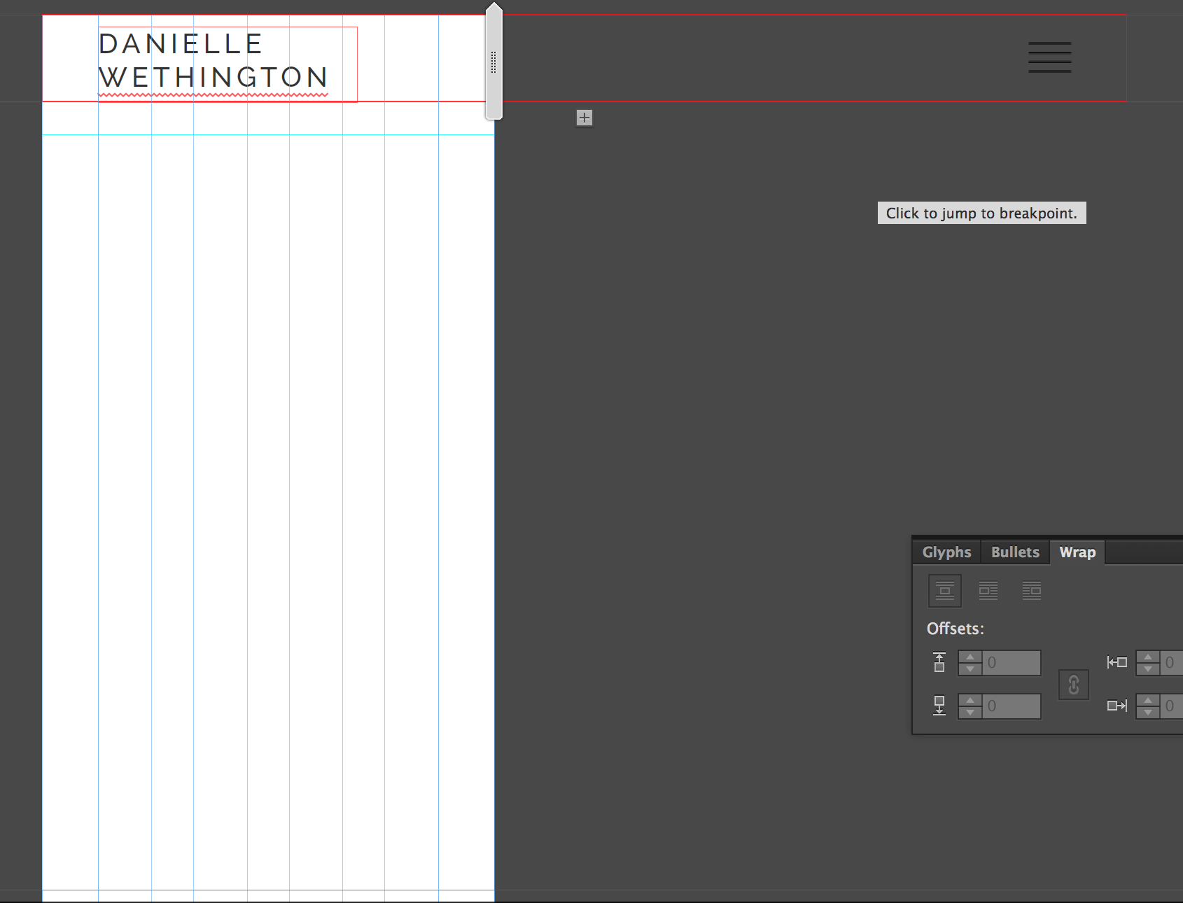
This is what it looks like in Muse ^
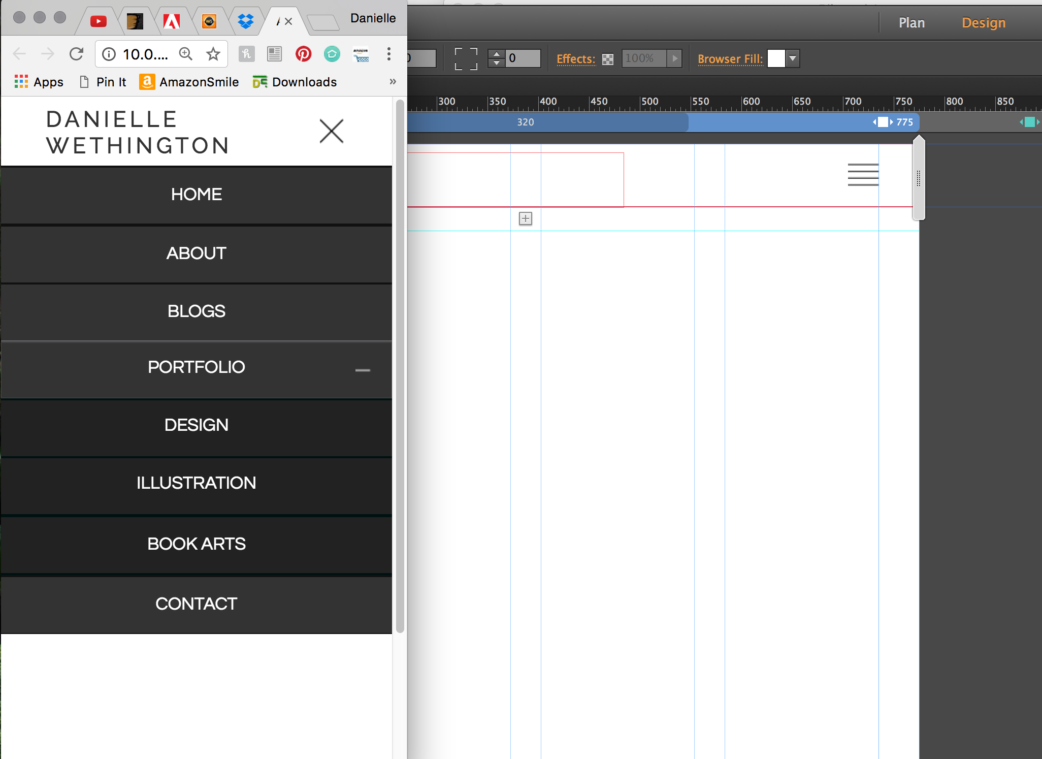
^ When A Master is previewed in browser it looks fine and works correctly at mobile size
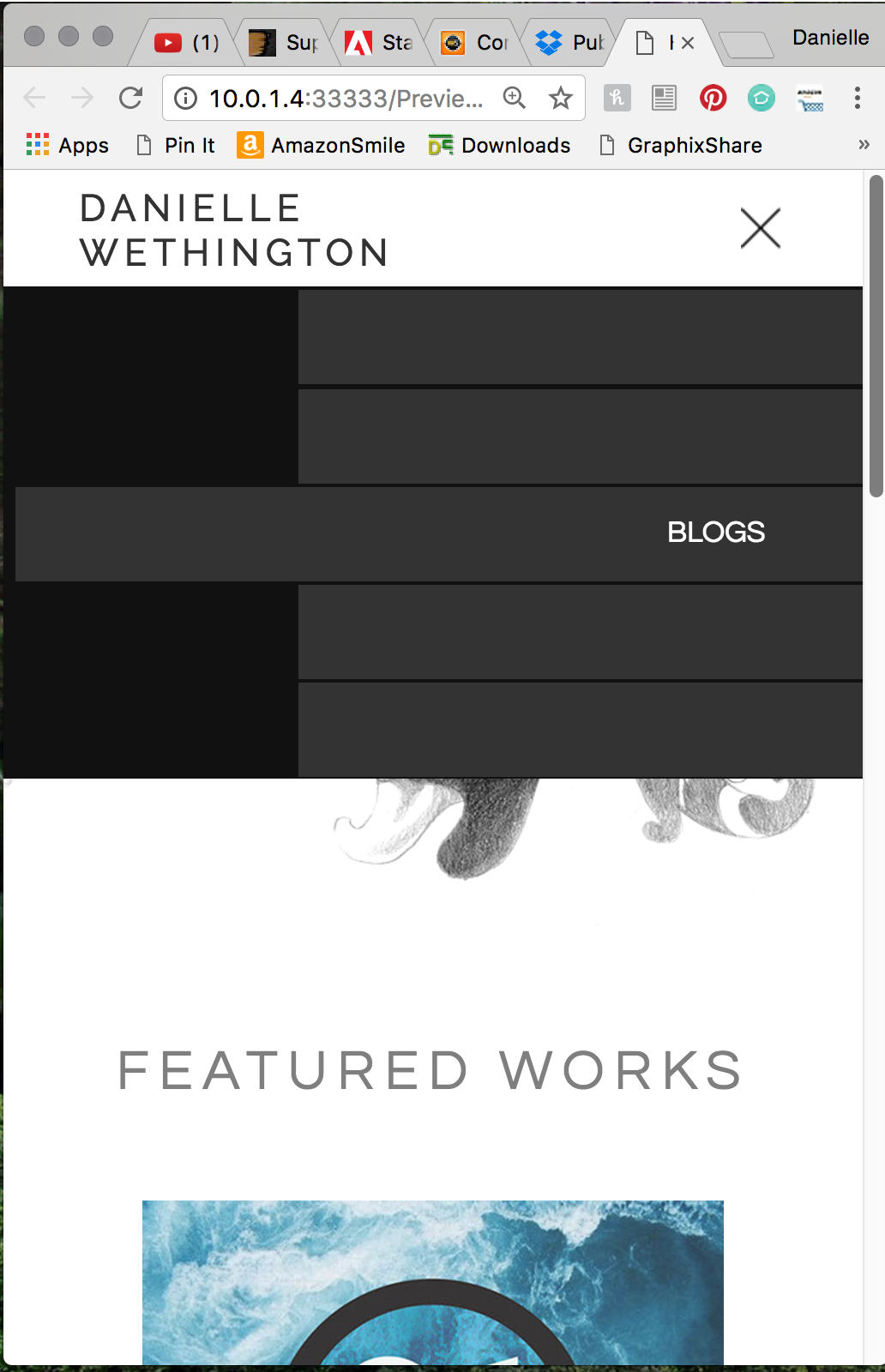
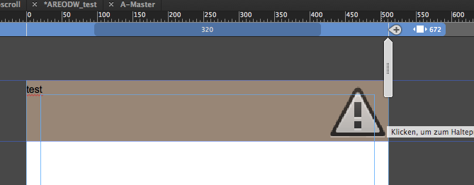
Once you scroll to about 400 something you end up with this.... what the heck?


 1 Correct answer

I had a look at your .muse file. I think, the issue is fixable, but it is quite laborious to achieve:
- Look at your layout page „Home“. You see, there is a breakpoint at 775 px and 475 px.
- Now go to your master page, where your menu is placed.
- Create a new breakpoint on your master at 475 px (just like on your layout page).
- And now the laborious part of the work:
- Best practice in this case: Copy you menu to a new .muse document using the menu command „Paste and Create Breakpoints", to make sure, you h
 7
Replies
7
7
Replies
7

Copy link to clipboard
Copied
daniellef99617211 schrieb
Hello All,
I hope you can help me, as this seems to be my last major issue with my website. I'm using a template I purchased but in the end it's causing me more headache than I anticipated. My website is meant to be fully responsive, but when I bring the browser down to the minimum phone width (320px), he hamburger menu 'explodes' and you cannot click any of the buttons. The menu seems to work fine in the template (A Master), but won't work on any of my actual pages. Below are some solutions I've tried:
1. Contact the creator of the template through support - no response yet
2. Adding a new breakpoint at mobile size (320px) to fix it - this seems to make it worse, no idea why so I removed the added breakpoint
3. Checking for any wrapping or padding applied to any of the objects nearby or in the menu (none found)
4. Playing with the responsive width option on every part of the menu that would allow me - no luck
5. Adjusting the size in the transform panel - no luck the objects just explode past the set width
I've noticed the menu acts weird even in the Muse design mode; once you scan in past the 775 breakpoint the menu will not move but just sit past the edge of the artboard. In the browser it doesn't do this, and only seems to break down once you get to right about mobile size.
If you have ANY insight it would be so deeply appreciated
SITE IS LIVE AT: www.DanielleFeliciano.com
This is what it looks like in Muse ^
^ When A Master is previewed in browser it looks fine and works correctly at mobile size
Once you scroll to about 400 something you end up with this.... what the heck?
1) Who is the inventor btw? If we can get Preran or Ankush with us, it speeds up support normally quite tremendous.
2) You definitely do not need an additional breakpoint at 320. From there on is nothing to break (only for very old Nokias maybe  )
)
3) At this point I think a simple .muse would very helpful. Try to reduce as much as possible just to an empty page with only the menu and if you used the menu automatically the corresponding empty pages so that we can see the complete manu issue.
Also please follow these instructions/strong advices from Mr.GH: Please Provide a .muse File to Help Us Fixing Your Issue!
Watching your site, the menu is from 3rdparty as well? Are you able to detect where the menu is build? How it is build?
Maybe one workaround to use your own mobile menu would be the best for now, depending on your timetable  .
.
Best Regards,
Uwe

Copy link to clipboard
Copied
Thank you for the shout, Uwe.
Ankush is on vacation and I will ask him to have a look at this post when he returns next week.
Thanks,
Preran
Copy link to clipboard
Copied
Here is a .muse for you to look at - I deleted the mass of gallery pages. I have been able to get in touch with the creator through Graphic River after a second contact attempt so hopefully they will have some insight as well. The Theme is called Areo and was purchased from Themeforest. I like using templates because I feel that I learn a lot by seeing what other people did, but I hate that muse doesn't really let me read or interact with the code. I only have basic HTML and CSS but seeing the CSS usually used to allow me to resolve my problems. Not with the way Muse handles it though...
Get my .muse on Dropbox: Dropbox - AREODW_test.muse
Regarding the not needing a breakpoint at 320. The only reason I added one was because on some pages when it hit mobile size everything went haywire so by putting on in I was able to essentially design it for mobile. For example on the Home page my title over the image (Illustration | Design | Printmaking) didn't look right when scaled down to 320 so I had to create a unique item for that size and hide it on other breakpoints. I couldn't find a better way to do this, if there is something I should have done differently I'm open to find out what I could do.
Copy link to clipboard
Copied
Who told you that you have no insight to the code?
Your issue has to do with your accordion – some elements are pinned and some are not, some are pinned to browser, some are pinned to center of a container.
Then you or better the inventor gave you the opportunity to have an accordion inside an accordion.
Wether your inventor mixed it up or you mixed it up.
I was not able so far to create the accordion so it works.
When I create an accordion to fit to browser width and put a graphic picture inside like it is did normally it behaves as expected:
The triangle stays always inside the accordion, even when I use the scrubber.
You´d better get a call to Themeforest, I guess. They got your money, they should help.
On the preview from AERO it works, but they didn`t have an additional menu item below the "sub accordion".
The code issue: Muse is for visual designers – if you want code change to dreamweaver, I would suggest.
Pavel Homeriki recommends to use Muse for design purposes only and hire a coder for (guess what) code.
You also could change your CSS and whatsoever but may loose inbrowserediting features and maybe further muse possibilities.
Best Regards,
Uwe
Copy link to clipboard
Copied
This is what I suspected - What I couldn't figure out is why some objects inside the accordion will let me select them and change their pinning, and others are greyed out so I cannot alter them, even when they don't appear to be child elements of anything else ( like how you have to click into an object to get to the object in it and so forth). Also why the heck would it work on the master page just fine, but not function when applied to a page? I suspect I'll have to re-make my own menu, but when I set out to do it myself putting the accordion in another accordion yielded similarly frustrating results. Likewise, I want to understand WHY it is doing this so I can not deal with it again.
I could make a landing page for the galleries, and eliminate them from the submenu forcing the viewer to go to a separate page and choose the gallery from there but I dislike that.
I definitely get your point and in many ways I'm more comfortable working in Dreamweaver, but I simply cannot keep up with how much is changing with HTML5, responsive design, etc so I get left behind quickly. The truth is, I can do some of this basic web design - but I don't really love it. I do really enjoy solving a puzzle though and will be excited to figure out what is going on with this troublesome menu.
Copy link to clipboard
Copied
I've found one temporary work around - although it isn't what I want and is still somewhat problematic. For some reason if I go through and pin everything in the accordion left instead of center and align the type left it is sort of visually workable. Now the "+" background image gets cut off in mobile and it doesn't look as good as when it's centered, but at least now it can be clicked in mobile.
This leads me to suspect that there is some hidden object, or something I can't edit that is pinned to the right or pinned in a way that prevents everything from staying centered. I honestly could not get to whatever the heck this is - maybe it's an invisible sub menu or something. It's not visible in layers nor findable no matter how many times you click and move things in the menu.
For some reason though there is a new issue (or one I didn't see). It is acting like there is a hidden break point that I did not create. If you have the browser at mobile/minimum size, open the menu, and the stretch the browser the menu will suddenly close (instead of staying open and expanding with the browser). It's as if it's passing into a breakpoint where the menu was closed. So bizarre
Copy link to clipboard
Copied
I had a look at your .muse file. I think, the issue is fixable, but it is quite laborious to achieve:
- Look at your layout page „Home“. You see, there is a breakpoint at 775 px and 475 px.
- Now go to your master page, where your menu is placed.
- Create a new breakpoint on your master at 475 px (just like on your layout page).
- And now the laborious part of the work:
- Best practice in this case: Copy you menu to a new .muse document using the menu command „Paste and Create Breakpoints", to make sure, you have the same breakpoint system.
- Detach all nested elements within the accordion menu.
- Unpin every element. Browser wide elements don’t need any pinning.
- Set all elements to "Stretch to browser width“, except the text containers, which have to be set to „Responsive Width“ (If you choose „Stretch to browser Width“ you can’t nest them into your accordions).
- Now „rebuild" your accordion menu and and make sure, that all text elements are stretched to page width.
You’ll see: Not a very comfortable way to go, but is is quite a heavy design to nest text elements and an additional accordion, which pushes down the elements below, into an accordion, which itself doesn’t push down other elements.
Here you may download a .muse file, containing your menu in a working version: https://www.dropbox.com/s/lf49xvwx63qlpi9/AREODW_test_Mod.zip?dl=0
- Annotation #1: You may detect, that at a certain breakpoint the nested „Portfolio“ accordion will push down „Contact“ button as expected, in others not. If you refresh the browser at this misbehaving breakpoint, you’ll see, that it now works correctly, but fails in another breakpoint. This is a known bug in the actual version of Muse, which should be fixed in the next update.
- Annotation #2: Concerning your uploaded .muse file: If you had isolated only the accordion together with its nested elements, and deleted all other elements, pages and assets, it would be so much easier to find and fix the issues. So every helper has to do this by her/himself …
 AdChoices