 Adobe Community

Copy link to clipboard
Copied
Is it possible to have responsive text fields in Muse CC? They should scale width automatically with the window size...


 1 Correct answer

It is quite simple to achieve this behavior:
1. Draw a text box and select this box.
2. Click into to "100% width" icon in the upper command bar. (This icon spans rectangles, pictures or text containers the whole way from left to right.)
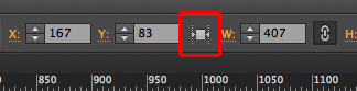
3. Place your text into the container and select it completely
4. To make sure, that the text doesn’t span from the very left to the very right edge of the browser window, give it a left and right margin using the icons in the upper command bar.
 24
Replies
24
24
Replies
24

Copy link to clipboard
Copied
Copy link to clipboard
Copied
Well I have seen this thread... But no really solution for exactly my question
So to keep it simple: It is not possible?
I thought in particular, this is a pretty common and simple thing...
Copy link to clipboard
Copied
>> "Is it possible to have responsive text fields in Muse CC? They should scale width automatically with the window size.."
Look at this example:
https://dl.dropboxusercontent.com/u/7046655/Sample.zip
It makes exactly this "simple thing" you asked for.
But I fear, your question wasn’t precise enough …
Copy link to clipboard
Copied
that looks great  but how to do it? cant find the "trick"

Copy link to clipboard
Copied
Have you tried using STRICTLY web-safe fonts? A web-safe font will scale with the page, where as a different type of font would be saved as an image and pixelation would occur upon zooming in. I probably don't understand what you're asking, though.
Copy link to clipboard
Copied
It is quite simple to achieve this behavior:
1. Draw a text box and select this box.
2. Click into to "100% width" icon in the upper command bar. (This icon spans rectangles, pictures or text containers the whole way from left to right.)

3. Place your text into the container and select it completely
4. To make sure, that the text doesn’t span from the very left to the very right edge of the browser window, give it a left and right margin using the icons in the upper command bar.

Copy link to clipboard
Copied
thats exctly what i meant. thanks, great! theres just one question left: it is something like a "minimal" width. so on my 13" screen it wont get more narrow than approx 700-800px.. possible to change that? (the typography is pretty big with 30px.)
and yes its a webfont, nox pixels
Copy link to clipboard
Copied
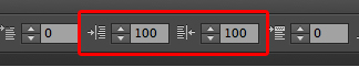
The minimal width is depending on the width of your page. You can change page width by right clicking the thumbnail of the page in plan mode and choosing "page properties".
Copy link to clipboard
Copied
awesome! thanks for your support 

Copy link to clipboard
Copied
Responsive Adobe Muse CC 2015 is live now. Please install the update from CC > Apps.
What's new: New features summary
Release notes: https://helpx.adobe.com/muse/release-note/adobe-muse-release-notes.html
Responsive design:
Adobe Muse Help | Create responsive websites
Adobe Muse Help | Responsive web design in Adobe Muse
Adobe Muse Help | Migrate existing Adobe Muse websites to responsive
Tutorials
Getting started with Adobe Muse (Replaces How to make a website with Adobe Muse (Katie's Cafe):
- https://helpx.adobe.com/muse/how-to/create-responsive-website.html
Create a responsive webpage with Adobe Muse:
- https://helpx.adobe.com/muse/how-to/responsive-web-design.html (more detailed demo of Muse's RWD features)
Thanks,
Sanjit

Copy link to clipboard
Copied
HelloSanjit,
i have the last version of muse.
About responsive text i have only No or width responsive. (i can't write 100% width)

In muse my text reduce but when i publish it
all my page is responsive but the text is not.
Do you know why ?
Copy link to clipboard
Copied
Fluid, responsive textboxes are supported, fluid text size not yet. (My very personal opinion: Thanks god! Imagine you are reading and size your window or turn your tablet from portrait to landscape. Do you want to read or playing a "lost & found game").
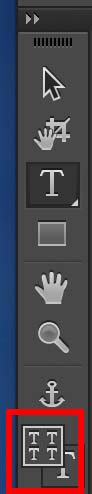
What you can do: Use responsive text size instead of fluid text size. That means: You may change text attributes (size, color, weight …) breakpoint-wise. Just switch on the corresponding command in Muse’s toolbar:
Copy link to clipboard
Copied
Thank You i will try that

Copy link to clipboard
Copied
"Fluid, responsive textboxes are supported, fluid text size not yet. (My very personal opinion: Thanks god!"
fluid text size was supported in phone layouts and now it is not possible using breakpoints, making Muse useless for mobile design now. I'm not going to make a breakpoint at every 100 pixels to make text that properly fills every phone screen. It means I have to add a separate phone layout just like before and rebuild every page, meaning the so-called "responsive design" is not a very useful feature.

Copy link to clipboard
Copied
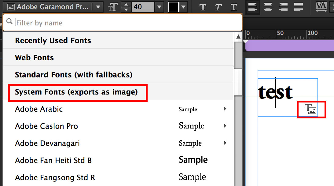
Here's a trick that makes text size fluid: Insert a blank space in your text field (like at the end of a paragraph), select the space and change the font to a System font — not a Web or Standard font. Basically anything that shows up in your font submenu under "System Fonts (exports as image)." This changes the whole text box to an image that will scale like any graphic element. Downsides: loads slower and, as mac_heibu noted, loses some legibility as you scale the window down. In many cases, you don't really want the text to shrink as you resize the window. But in the cases where you do, this trick will work.
Copy link to clipboard
Copied
• "… fluid text size was supported in phone layouts" -> Fluid text size never was supported in Muse.
• "… now it is not possible using breakpoints" -> Of course it is possible using breakpoints! And: Did you ever take notice of the "4 T" command in your tool bar?
• Just have a look at this widget: https://dl.dropboxusercontent.com/u/7046655/ResponsiveTextSize.mucow
This widget brings responsive text size to Muse. Just place it on your page like an image and configure it as usual. I hope, Lance Bushore from the Muse team doesn’t mind, when I post his widget here!
Copy link to clipboard
Copied
Then how did the text size previously scale with screen size in mobile layouts? Seemed to work fine there, I've used it many times.
The 4T icon merely allows editing text across breakpoints or singularly, I would have to make many breakpoints and manually change the text size every time, that is not the same as scaling. In the old mobile option, the text scales perfectly to fit every screen so that the layout looks the same regardless of screen size. This seems like a basic and essential feature of responsive design, so it is strange that Muse does not address it, and it leaves the responsive implementation as feeling rushed and unfinished, like most Adobe products these days.
I've learned the hard way that widgets are dumped from support at times in new versions of Muse, and they tend to work in rickety ways, making them a pain in the ass. I have entire websites I cannot properly work with in the new version now because I used widgets (some also interfere with each other or basic standard components in Muse now). There seems to be a lack of communication or adherence between Adobe and widget makers (also, Muse likes to have difficult communicating with CC and refuses to show my own private widgets in the menu until I log in, which it does not always allow me to do). There are many problems.

Copy link to clipboard
Copied
Hi, I could not find it in dropbox. Could you please share it again? Thank you.
Copy link to clipboard
Copied
Are you takling about this: https://www.dropbox.com/s/vrry1tk9o2ihsiv/ResponsiveTextSize.zip?dl=0
Copy link to clipboard
Copied
Yes, Thank you.
Copy link to clipboard
Copied
1. The widget I linked is from the Muse team.
2. Again: There never existed scaling text in Muse, believe it or not!
Perhaps you managed it in a "dirty" way, by using system font text kr at least a system font blank in a text box. In this case, text has to be converted to sn image, which – of course – may be scaled.
And: The "4T" command doesn't allow text editing, as you say. It only allows different text styling.
Perhaps you are talking about "viewport scaling". This is a feature of mobile browsers, which scales page content of fixed width pages to the width of every mobile browser.
You can have this behavior by using a relatively wide fixed breakpoint. The smallest fixed breakpoint is "viewport scaled" as it ever has been – what means, your text is scaled too.
Alternatively you can mix responsive and fixed layout: Instead of responsive phone layout breskpoints you can use a fixed width phone layout to cover phones, thus forcing viewport scaling.
Copy link to clipboard
Copied
I was using custom fonts, and no dirty way, just drop them into the mobile version. It must be the viewport scaling, which also works if I bring up the mobile version in a desktop browser. That is interesting to know that viewport scaling occurs at the smallest fixed breakpoint, that would solve my issues, thank you.
Copy link to clipboard
Copied
I don't know if this has changed, but on my current project with a fluid layout for large breakpoints and the smallest breakpoint set to fixed (master breakpoints matching to page), the viewport scaling does not occur, even on mobile. Perhaps I'm missing a setting of some kind?
Copy link to clipboard
Copied
If a text fiel changes its size proportionally (width & height), this has normally one specific reason:
You are using system fonts instead of standard fonts or web fonts (look into the font menu, they are sorted in those sections.
System fonts have to be converted to an image, because Muse can’t assure, that every visitor of your site has these fonts installed. And as these fonts are converted to an image, they of course behave like an image and scale proportionally. You can identify those converted text frames by the little icon to the bottom right of the text frame (if you have switched on this view option.
Attention: Only one system font character – even a blank – is enough, to force your text frame being converted!
 AdChoices