 Adobe Community
- Home
- Muse (read-only)
- Discussions
- Muse Slideshow Mobile Resizes Header and Footer
- Muse Slideshow Mobile Resizes Header and Footer

Copy link to clipboard
Copied
Trying very hard to include a slideshow widget on my client's site.
The problem is that the slideshow pushes the header and footer out to the right. I also am having problems with centering the slideshow.
You can see what I am talking about at local2501.businesscatalyst.com/phone/gallery.html.
Ideally, I would like the mobile site to resize depending on the mobile device but, if that is not possible, I would like it to have a max width with the background showing on the left and right hand sides.
Any advice?


 1 Correct answer

This page definitely can’t react responsive. Too many layout problems.
Look at your site, drag the scrubber (this grey handle top right to the breakpoint bar) slowly inwards and observe, what happens:
Most elements are bleeding outside your page boundaries:
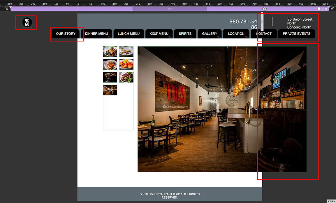
Your created a responsive site, but
- the slideshow isn’t responsive (I guess, you are using an older Muse version, which has no responsive slide shows like in the newest version),
- the menu is built of single text frames set to „Resize: None“,
- the te
 4
Replies
4
4
Replies
4
Copy link to clipboard
Copied
There seems to be a layout issue. Please check on layout and(!) master page, if there are elements placed outside/overlapping the page/breakpoint boundaries, which you have defined.
You find such elements quite easy, if you zoom out considerably and select all elements (cmd+A) on layout and master page.
If this doesn’t help, please let us have a look at your.muse file. Please follow these instructions: https://forums.adobe.com/docs/DOC-8652
Your second question: Of course you can create truly responsive sites with Muse. Just have a look at these tutorials: https://helpx.adobe.com/muse/how-to/responsive-web-design.html
Copy link to clipboard
Copied
Günter-
I am still having the problem.
You may view my Muse file at Dropbox - Muse
The gallery seems to be pushing past the allowed area on the right side and I can not seem to center the gallery (mobile site only).
Can you assist?
Eric
Copy link to clipboard
Copied
I‘ll do my best tomorrow morning. Now it is bed time for me (in Germany)! 
Copy link to clipboard
Copied
This page definitely can’t react responsive. Too many layout problems.
Look at your site, drag the scrubber (this grey handle top right to the breakpoint bar) slowly inwards and observe, what happens:
Most elements are bleeding outside your page boundaries:

Your created a responsive site, but
- the slideshow isn’t responsive (I guess, you are using an older Muse version, which has no responsive slide shows like in the newest version),
- the menu is built of single text frames set to „Resize: None“,
- the text in your menus uses system fonts. This means, it has to be converted to an image during output, what causes unintended scaling. Why? Read my post 4 here: https://forums.adobe.com/thread/2357163
- You pinned each and every element. Why? It isn’t necessary and causes wrong positioning in many cases.
Since mobile browsers try to display everything on your page, they have to shift or zoom in the view of your page. And that is then issue, you are observing.
Additionally, I don’t think, one breakpoint will be enough for your site, because your horizontal menu is much to wide to display correctly on moblie devices.
Looking at your site, I’d like to suggest, to start with building a fixed width site. This will be much more easy, if you aren’t experienced in using Muse. And I strongly recommend, to have a deep(!) look at these videos and tutorials: https://helpx.adobe.com/muse/how-to/responsive-web-design.html
 AdChoices