 Adobe Community
- Home
- Muse (read-only)
- Discussions
- Re: Greetings Uwe, Thanks for your reply. I me...
- Re: Greetings Uwe, Thanks for your reply. I me...
Muse webpage/website, designed on 1440 wide motior, breaks up on 1080p monitor. So 4k monitors etc ?
Copy link to clipboard
Copied
Say we set a max site width of 1000px (and 800px + 400px widths for mobile devices).
Now im working on a 1440px width monitor (1440x900) and start designing on it and all looks good.
Then when i randomly saw the website on a 1080p monitor i was taken aback to see the design broken. I mean theres a widget doing fullscreen video which i stretched manually and fit exactly when working on the 1440px width monitor. But on the 1080p monitor its has become a window in the middle of the site background. Also my menus etc look a little smaller.
So i should set the outermost breakpoint to be 4000px wide and arrange things accordingly if someone decides to see it on a 4K monitor ? I thought my max was 1000 and anything beyond my set 1000px it would scale in proportion, like how a projected image scales from a projector to fit any screen size.
Copy link to clipboard
Copied
I must admit not be able to follow. Did you setup a site as an adaptive Website instead of responsive? How did you crate your menu? With the build in menu from muse or buttons by yourself?
Maybe a link or some screenshots could clarify your issue.
Kind Regards,
Uwe
Copy link to clipboard
Copied
Greetings Uwe,
Thanks for your reply.
I mean i designed a website which had max breakpoint as 1000px. (i also set 800 and 400px breakpoints for smaller devices, theres no problem here).
I was working on this design using a 1440px wide monitor and happily set everything to look good on that monitor. Without realizing im setting everything in proportion to that resolution. When i had a chance to preview the webpage on a larger monitor (1080p). All the elements moved away and shrank in size etc. The lower sizes arent giving problems.
I thought the final max set breakpoint (1000px will freeze the site at that size and blow it up to fill any higher size monitor). I mean i thought what it looks like on my 1440p monitor is how it will look on a larger monitor. But the layout just dispersed to the sides and the paragraph & background video etc shrank to unreadable sizes.
I now assume to design a site apt for 1080p monitors one has to work on a 1080p monitor ? Because how else can i judge what is going to come where when im limited to my previews on a 1440x900 monitor ?
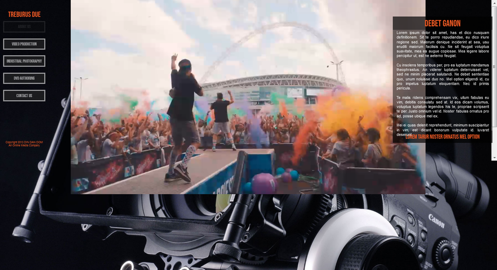
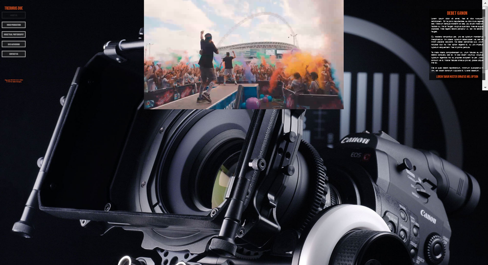
Like your rightly said, ive made screen shots of how the preview in browser looked on my 1440px wide monitor and how it looked when previewed on a 1080p monitor. Hope you can take a look. I just want to know is there a way i can retain the proportions and look of the 1440px preview to just scale to the 1080p preview. Apparently just setting the chevron arrows on the last break point to expand outwards doesnt achieve this.
Full screen grab from preview on 1440x900 monitor... (video plays full screen correctly, it also scales correctly when shrinking the browser to smaller sizes etc, the problem starts only with larger sizes)
Full screen grab from preview on 1920x1080p full HD monitor...
Note : The camera img given as browser fill is the only thing that scales properly. The video widget has shrunk as have the paragraph and menu too.
I understand the paragraph hasnt shrunk that much but imagine what it would be like on a 4k monitor :). It would look something like this...(again the background jpg alone scales correctly).
Is there a way out from this dilemma or should i redesign everything from scratch with a max 4000px breakpoint and then a 2500px breakpoint and a 1000px breakpoint for tablets ending with an 800px breakpoint for mobile phones.
Many thanks
Vik
Copy link to clipboard
Copied
Well, I´m not a video guy and if I used a video, I only made them fixed width in a fixed width layout. I was always and still am to no fullcsreen (except my websites landing page), so how can I help here? - I would never design for 4000 px screens as it is common sense that most users now go on mobile or tablet, but I kind of understand, that this is no help in your case.
How did you setup your video? Inside what? A Frame? Social Media widget (youtube or whatever) out of Muses widgets? Is it setup as responsive in width and height? It doesn´t look like so.
I can only tell, that of course text does not shrink or grow the same way as images/videos. Text gets smaller as images get bigger and vice versa as your browser window grows or shrinks.
Instead I would try to get a different approach and have the text below the video, so it can "follow" the image/video.
Your background with that huge camera gets also kind of lost behind the video, doesn`t it? Wouldn`t it be better to be below the video as well?
Does this help? Have no clue so far, I must admit.
Anyway - Kind Regards,
Uwe
Copy link to clipboard
Copied
Hi Uwe,
Im sorry about the puzzling problem. Let me simplify this. Forget about the video (it was done using a downloadable video widget). So lets ignore the video. Its just an object on the stage.
(Also its my fault for not telling you that the background image of the camera is just a dummy image. I put it in using the muse basic menu to have an image as browser background and set to scale to fill. I put in that image only to show you the actual webpage size and how its scaling. Because that was the only element that was scaling to larger monitors. So actually i would be removing that image. The entire background is only the video frame.)
My first image is the correct look of my website. Thats how it would fill the frame at any size. Can i know how to ensure the text box which is nothing but text in a rectangle, to scale and become bigger on larger monitors ? And also the menu set. If thats possible i can try applying the same solution to the video box.
I should also remark that all my breakpoints are set at fixed width (not fluid).
To put my problem in just 1 line i would say...... I want my site look which is on the first image posted (from 1440px monitor) above, to look the same on larger 4k monitors. If possible.
Thanks & Regards
Vik
Copy link to clipboard
Copied
If you build your site with percentages instead of pixels, you won't have these problems. That's why I prefer responsive web design frameworks like Bootstrap over Muse. Bootstrap uses ranges of breakpoints to cover a wide variety of device sizes from xs to xlg and everything in between.
https://www.w3schools.com/bootstrap4/
Also a CSS max-width means exactly what it says. It can go no higher than that width. So on high pixel density devices, your max-width layout looks like a postage stamp.
Alt-Web Design & Publishing ~ Web : Print : Graphics : Media
Copy link to clipboard
Copied
Hi Nancy,
I gave it a look. But i cant code even if my life depended on it. Im too old for learning coding at this age. I did learn actionscript with flash and was very good at it. And till this day remember how to code in flash professional. Im made amazing looking full websites in purely flash but that was about 10 years ago. Those sites ran flawlessly till today and im forced to redo them in muse now. Before muse i even tried learning HTML coding, but my head isnt coping with remembering the syntax.
Thanks
Vik
Copy link to clipboard
Copied
Muse will be ending life in no time at all. Without code and with how Muse works and the sizes your wanting that viewed at I do not think Muse will be the right fit to get this sorted and longer term. You probably will need to look at other software or online based solutions if your not able to code this out.
Copy link to clipboard
Copied
What is the best alternate (non online) solution to no code based website design ?
Copy link to clipboard
Copied
For non-coders, the options are slim to none. And Slim just left town. Web design is not as simple as some people think.
Best advice for non-coders, hire an experienced developer to create your site in WordPress or a bespoke content management system that you can update your site with.
Or use an online DIY site builder like Wix, Weebly, Squaerspace, Webflow, etc...
Alt-Web Design & Publishing ~ Web : Print : Graphics : Media
Copy link to clipboard
Copied
For non coders there might also be Blocs for Mac, but unfortunately for Apple users only.
Kind Regards,
Uwe
Copy link to clipboard
Copied
Hi,
What about PineGrow ? Easier than dreamweaver or just as complex ?
Thanks
Copy link to clipboard
Copied
As PG provides some more advanced tutorials for me, it was easier but there´s a learning curve indeed. The main reason to move to PG is that one owns PG. Except some newly added plugins which are not necessary at all (for animations stuff) there´s no subscription.
Overall I guess/know/experience that Webdesign gets more and more complex. One reason for, that there are quite e few prototyping tools out there. So even design gets more and more complex although I still think that Muse does and did a great job to try to put this together it might had to be renewed from the ground up and some thought - let´s better drop it!
So if you are in the mood to try XD, there´s a plugin for "export as html" and although this is by far not the best way to do, you still can use that html in PG and learn/teach yourself with it. Of course that code could be used in Dw as well but … (see above).
Kind Regards,
Uwe


