 Adobe Community

Copy link to clipboard
Copied
Hi all – I’m very new to Muse and this is my first post, so I apologise in advance for anything noobish that I write.
I’m currently working on my 2nd Muse site having completed a very simple one for some local self-promotion, which you can find here http://www.stevemcc.co.uk. I’ve been learning as I go along…it’s been a slog, but I’ve managed to find solutions or work arounds by watching/reading online resources. That said, I’m certain I’m not putting things together in the most effective & efficient way or making the best choices for the kind of content I wish to display – fixed, fluid, pinned, grouped…as someone who’s worked with print for 20 years, the interface is very familiar, but getting my head around the myriad of end device sizes, orientations and responsive behaviours sends my head into a bit of a spin!
When doing stevemcc.co.uk, I ended up with an awful lot of fixed breakpoints before I was satisfied that the site displayed ok from a mobile in portrait orientation, right up to 27 inch retina screen. It seems to work on all devices I have tested and whilst I’m sure it could have been built in a fraction of the time it took me, I’m reasonably happy with it as a first stab.
However, the new site I’m working on is driving me up the wall. There’s much more content that the first site, although I’ve tried to keep the design very simple and template across the galleries. This is a link to my WIP - http://stevemccallumcoukldn01.businesscatalyst.com. I’ve got everything looking good on my big screen and MacBook Pro. Unlike my previous site, I opted to create an alternative layout (+phone) to cover these devices – partly driven by the wish not to have to create endless breakpoints across dozens of pages and because I assumed this to be best practice…though I have since read varying opinions on this.
I’ve yet to deal with tablet formats and ensure things work on smaller laptop screens (the nav menu on the top of the brand work pages currently overruns once it comes down to about 1000px wide.
The case studies/blog sections have driven me up the wall…trying to keep text vertically centred within the colour blocks and also wanting the block to ‘grow/shrink to accommodate the text’…and then all the blocks to remain together and not push apart…I’ve been going crazy with it.
I’ve wasted endless hours over the last week trying to work out the best way to complete this site without causing myself untold unnecessary work (and disappointment) and would really appreciate the views of some seasoned Musers, based on what I’ve done so far – even if that view is ‘oh, you shouldn’t have done it like that!’. As I said, I’m still very much in the early stages with this software and am really keen to progress, so and advice would be massively appreciated.
Thanks in advance
Steve


 1 Correct answer

Concerning your issue: „Likewise, as the browser gets smaller (and the text deeper), it overflows out of the coloured box and onto the next.“:
This is due to a different HTML behaviour of 2 different settings, which appear to be the same for us „non-coders":
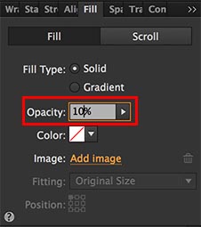
Talking for example about the coloured background of the "3-image-block“ and the text, starting with „O2 Home Broadband …“ you have set opacity to 10 % in Muse’s upper control strip. Set it to 100 % again and set the value of 10% opacity not i
...
 9
Replies
9
9
Replies
9
Copy link to clipboard
Copied
Hello Steve!
Congrats! Very nice looking, clear and organised site!
… what I would strongly suggest:
You can’t expect us to go through a complete, ready made site, guessing (now knowing), how this and that is done, what is a 3rd party and what a „built in“ widget, what you want to achieve and what not, and then tell you, what may be right or wrong.
What can be done in a forum:
Please isolate a single issue, give us a sample .muse file with only one page and only the misbehaving element(s). So, we don’t have to poke into a complete layout, deleting element by element to isolate a potential issue. This should be done by you, so we can concentrate to fix a problem, not to find it.
Besides that, isolating issues is the best way to detect and fix problem by oneself.
So, please show us an issue, describe exactly(!), what is wrong in your eyes, and give us a small .muse file demonstrating the issue by uploading it to Dropbox, CC Files or a similar file sharing service and posting the download link here.
Then, in most cases, we will be able to help without disassembling and rebuilding a complete site from scratch.
You may follow these steps: https://forums.adobe.com/docs/DOC-8652
Copy link to clipboard
Copied
Hi Günter – many thanks for getting back to me and apologies for being so vague. As you suggest, I’ve isolated one (of numerous queries), but one that’s been driving me particularly mad. I’ve extracted part of my case studies page – We Transfer link to Muse file here: https://we.tl/EmZtMiDUMb - it’s just the beginning content of a longer page, but you’ll get the jist. I’m using full browser width colour blocks to help divide up the content, which is made up of text, placed images and some single frame composition widgets that open up lighbox Vimeo links.
At 1400px everything’s perfect…all the text sits evenly (top to bottom and left to right) on top of the colour blocks. When I increase or decrease the browser width, the text behaves as I would like (responsively) and reshuffles onto more or less lines as required, but it flows – so happy with that. The problem of course is that the colour blocks don’t follow suit…so as the screen gets wider and the text depth shrinks, large spaces appear between the bottom of the text and the colour block. Likewise, as the browser gets smaller (and the text deeper), it overflows out of the coloured box and onto the next.
I understand the principal of why this is happening, but I can’t for the life of me work out the best way to solve it.
As I said, this is but one of a dozen little issue I’m coming up against – some I’ve manahed to solve myself, but this one has got me stumped.
Hope I’ve explained myself clearly?
Many thanks
Steve
Copy link to clipboard
Copied
Concerning your issue: „Likewise, as the browser gets smaller (and the text deeper), it overflows out of the coloured box and onto the next.“:
This is due to a different HTML behaviour of 2 different settings, which appear to be the same for us „non-coders":
Talking for example about the coloured background of the "3-image-block“ and the text, starting with „O2 Home Broadband …“ you have set opacity to 10 % in Muse’s upper control strip. Set it to 100 % again and set the value of 10% opacity not in the control strip, but using the „Fill“ panel:
Do this for every rectangle, which should grow/shrink vertically, when the elements within are growing/shrinking. This should solve the issues, which you are describing in your post #3
Copy link to clipboard
Copied
Morning Günter – I really wish I’d asked you this question about a week ago! I knew it would be something frustratingly simple, but I can’t believe it was that simple – works a treat, thank you!
Whilst you’re on a roll, perhaps I can ask you a further question, which isn’t dissimilar from the first. Sample page here – https://we.tl/MaCaKo4LdE
I have a responsive composition widget comprising of different-sized/shaped triggers, each containing image screengrabs. The effect I wish to achieve is that when you rollover one of the triggers, the opacity drops to 20% (which I’ve set in states), revealing the text caption hidden beneath. I have this working on the first couple of boxes, but again, when the browser width & composition widget changes size, the text moves from being central in the box and pushes out, either up or down.
I tried dragging the text caption into/inside the trigger frame, but this meant that the 20% opacity state of the trigger is also applied to the text on rollover, rendering it difficult to read – I want the text to be 100% opacity and the trigger20% - so have kept them as separate boxes.
Again, forgive my cack-handed explanation, hopefully this makes sense?
Many thanks in advance
Steve

Copy link to clipboard
Copied
To add to Günter Heißenbüttel: If you get driven up the wall with your blog, to mention one, you should ask the vendors of the 3rd party widget (qooqee?).
Your case studies may need some text settings like letting the text resize with responsive width. Did you try this?
The secret (thanks Günter Heißenbüttel  😞 text needs no pinning, once it resizes with responsive width.
Your issue may come up because of the left hand sided main menu. This should be thought of for mobile – more than 50% of the screen will be filled with a menu, won`t it (170 px width from 320 for mobile)?
Same to your blog – but as I didn´t create a blog since now, I don`t know if this is done in muse.
Some widgets out there are filled with content through extra panels which makes control quite unpredictable.
Your submenu (clients) from case studies, of course, needs some design decisions, this will not work on mobile.
You may think of a mobile menu in a lightbox to keep the main menu and the submenu on the same screen.
But the amount of clients won´t make this easy, though.
Best Regards,
Uwe
Copy link to clipboard
Copied
Hi Uwe –thanks for your response.
The Blog issue is more of a formatting problem than a functionality issue…it’s not a true ‘Blog’, more just a ‘Latest/News’ section, so don’t think I require 3rd party widget etc.
I chuckled when I read your comment about the case studies and responsive text – that what I’ve spent the last few hours working on. Am much happier with the way the text is behaving now, but I have an ongoing issue with aligning the text, with colour blocks as the browser width changes (see my reply to Günter). I am midway through shifting the main menu to the top of the screen – it was causing me so many additional issues on the left, it made sense to shift it…still work in progress.
The submenu issue is a tricky one due to the quantity of clients, but I think I’ve got a workable solution. Incidently, there is an alternative layout mobile version of the site on the same link (works on my iPhone anyway) – I think I’ve used the kind of mobile menu you were describing.
Appreciate all your input. Ad I said, I’m on a steep learning curve. And whilst there’s been a fair amount of shouting t the screen, there’s been a few very satisfying moments when I finally work out why something’s not working the way it should!
I don’t doubt I’ll be back with more questions at some point soon.
Cheers
Steve
Copy link to clipboard
Copied
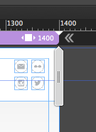
Your increasing browser from 1400 to wider could get easily fixed, if you set those double arrows to show inside instead of outside.
So the screen stay like it is set at 1400:
The "more space" issue should be pretty much solved now.
I made some quick changes to your settings: 1400 changed to fixed width breakpoint – added a breakpoint at 960 (fluid width).
Changed placing and pinning in header elements (logo and social) at 1400.
With this now you should, as mentioned in my first post, your main menu in header to a so called mobile menu (hamburger-cheeseburger-menu  ).
).
Check the file I shared if this may fit your needs: Adobe Creative Cloud
Best Regards,
Uwe
Copy link to clipboard
Copied
This is quite simple:
- Place the text box „into“ the trigger.
- Set the trigger to „Opacity: 100%" in all states.
- Set the image frame within the trigger to „Opacity: 100%“ in normal state and to „Opacity: 0%“ in rollover and mouse down state.
- Set the text box to „Opacity: 0%“ in normal state and to „Opacity: 100%“ in rollover and mouse down state.
But I fear, a problem will follow up: If you resize the browser window, the text may need two lines, when the horizontal space gets smaller, thus enlarging the trigger vertically, and in consequence mixing up your image grid. If you can’t fix this by using breakpoints, you should think about placing not „real“ text, but a SVG graphic of the text, created in Illustrator
Copy link to clipboard
Copied
Günter - I owe you a pint! 2 problems solved in 2 clear, easy to follow replies. Thank you! S
 AdChoices