 Adobe Community
- Home
- Muse (read-only)
- Discussions
- Objects in Adobe Muse CC are Moving in Preview
- Objects in Adobe Muse CC are Moving in Preview

Copy link to clipboard
Copied
Hello everyone, I have been searching for an answer for this problem for two days and have read questions from other people who have had this problem all the way back to 2012 and nothing has worked for me.
I am working on a site and I have recreated the problem twice.
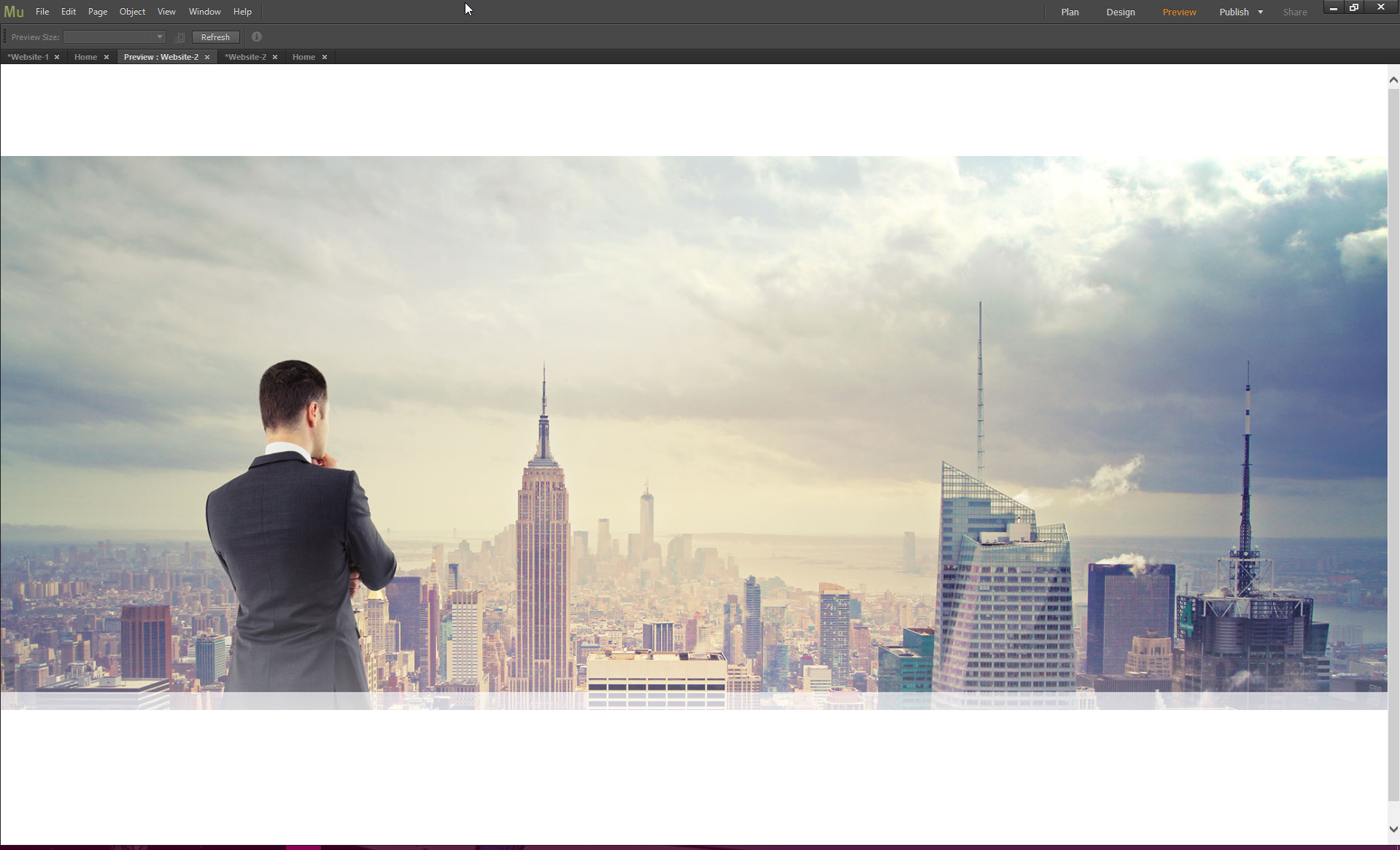
I put a rectangle into the page and fill it with an image. Tell it scale to fill and preview it - when I preview it the rectangle is half of it's size and doesn't show it's bottom half. Then when I add other objects to the page the objects move up about 20-30 pixels for no reason.
Inside my original muse site:

Previewing Original Site in Muse:
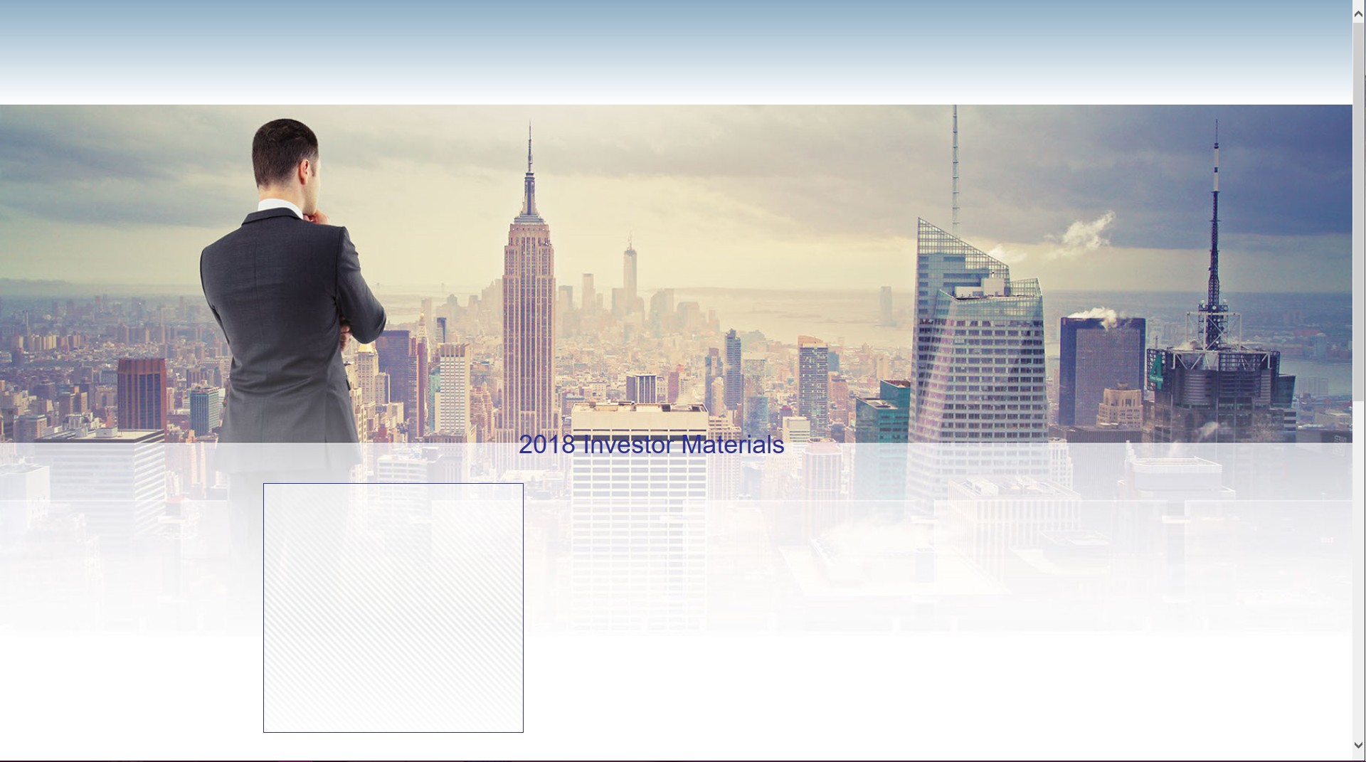
Recreated Site in Muse:

Recreated Site in Preview:
I read in one answer that it said to restart the page in a new website so I did and the rectangle is still doing the same crap it was before. I'm very frustrated and don't understand why this is happening. It would be almost easier to code it out the long way with HTML and CSS than mess with Adobe Muse. But my work requires me to use this program.
This problem happens when I export the site as well.
So I would love an answer, Adobe. What is going on?


 1 Correct answer

The most was already said in my post 3.
First some general annotations: Most Muse beginners think, working in web design is just the same as working in print design: Here an image, there some text, and when I scale the browser window, all works as expected. This can’t be more wrong!
Different as in print design, all elements in responsive web design influence each other and that often causes the (wrong) impression, that the elements „move“ unpredictably. If you want the same behaviour as you are u
...
 5
Replies
5
5
Replies
5

Copy link to clipboard
Copied
Hey Robin,
Many apologies to find you in this trouble.
However, would you mind sharing your .muse file with us so that we can investigate and try fixing it?
For sharing the file you can follow the steps explained here - https://forums.adobe.com/docs/DOC-8652.
Regards,
Ankush
Copy link to clipboard
Copied
I have a muse file created as requested but I am on a company firewall and I am unable to access dropbox. I also tried to open Adobe Cloud program but it seems I don't have permission for that either. Is there anyway I can email this file to you guys? I'd really like to find out what is going on. 
Copy link to clipboard
Copied
- Your first issue:
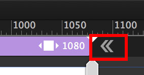
You fill a rectangle and tell it to stretch browser-wide. Rectangles only scale in width, when stretched to browser width, so there is no way out: If the rectangle doesn’t have the exact same aspect ration, parts have to be clipped. You only can set the edge, where the image is clipped (using this 9-dot-icon).
Placed images scale in width and height, but can’t be set to browser width (In many cases they would get far, far to big).
So: If you badly need proportionally scaling images in browser width, you have to go the other way round:
Place an image, drag it bigger, until both vertical edges touch the vertical page guidelines.
Now stretch the whole page (not the image) to browser width by using the double arrow icon left/right to the breakpoint bar:
- Your second issue:
No element does „crap“, even you think, it does. Muse behaves, as it should behave. How and what told the other elements, to stay under the image filled frame? Nobody, I assume.
There are many ways to achieve what you want, but many reasons as well, why this doesn’t happen. So follow Ankush’s recommendation and delete all pages but one and all element except the misbehaving ones, save this .muse file under a new name, upload it to Dropbox, CC Files or a similar file sharing service and post the download link here. Then we will have a look and find the problem.
If the file is small enough – and if you follow the instructions, it definitely should be – you can drop me an email. I will provide the address by personal message.
Copy link to clipboard
Copied
I have and I sent the muse file to the email address provided. I am very curious as to what I'm doing wrong so I can not do it wrong next time.
Thank You for your help,
Megan
Copy link to clipboard
Copied
The most was already said in my post 3.
First some general annotations: Most Muse beginners think, working in web design is just the same as working in print design: Here an image, there some text, and when I scale the browser window, all works as expected. This can’t be more wrong!
Different as in print design, all elements in responsive web design influence each other and that often causes the (wrong) impression, that the elements „move“ unpredictably. If you want the same behaviour as you are used to in print design, you have to use fixed width pages – and that is, what I recommend strongly to all beginners!
What happens in your design:
You filled the image into a rectangle. That makes the image scale within its rectangle, when the browser window is resized, and that inevitably causes parts of the image being cropped. Not a Muse issue, but a fact, when using this kind construction in the web.
You may place an image instead of a filled rectangle, but now you can’t stretch it to browser width.
The solution: Stretch the whole page (not the image) to browser width, by clicking onto the double arrow icon (see my last post).
When elements (text/image) are overlapping (or in many other ambiguous cases) it is a good idea to tell Muse, what you want to achieve:
- In case of your layout place an equally scaling transparent rectangle over the background image. It should only touch – not overlap – the text frame below. Now group this rectangle and the text frame and Muse has an idea, what you want to achieve. The „problem“ however of the scaling image remains.
This only can be avoided be placing an image (not filling a rectangle). And set the complete page to stretch browser-wide.
Now again: Place a transparent, equally scaling image frame onto the background image and make sure that it doesn’t overlap the text frame. Group this „guiding frame" and the text frame, and all should work better. „Better“ – not completely correct, because of one more problem:
Text doesn’t scale proportionally, but keeps its size. This is desirable, because font size shouldn’t become smaller at narrower screen sizes. This gives the impression, that the text „flows“ out of the image, when the browser window is resized. But it doesn’t: The image scales down proportionally and leaves the text area.
This is only avoidable by
- placing the text as an (SVG) image or
- by adding breakpoints to compensate this behaviour.
Here you find a modified version of your file with two different pages, demonstrating the two different approaches (image as a rectangle fill/image as a placed image): https://www.dropbox.com/s/omdr5tgfvedtjwy/Robin-Gurl.muse?dl=0
If you go to the second page and use a system font for „Investor Materials" instead of the actual standard font, the text will be converted to an image during and you will see, that the synchronous movement of text and image works quite correctly.
(About image conversion of system font text, please read my post 4 here: https://forums.adobe.com/thread/2357163)
Finally, you may see: Responsive layout is really(!) complex, if you choose a print design approach with overlapping elements.
 AdChoices