 Adobe Community
- Home
- Muse (read-only)
- Discussions
- Objects Jumping Around in Browser
- Objects Jumping Around in Browser
Objects Jumping Around in Browser

Copy link to clipboard
Copied
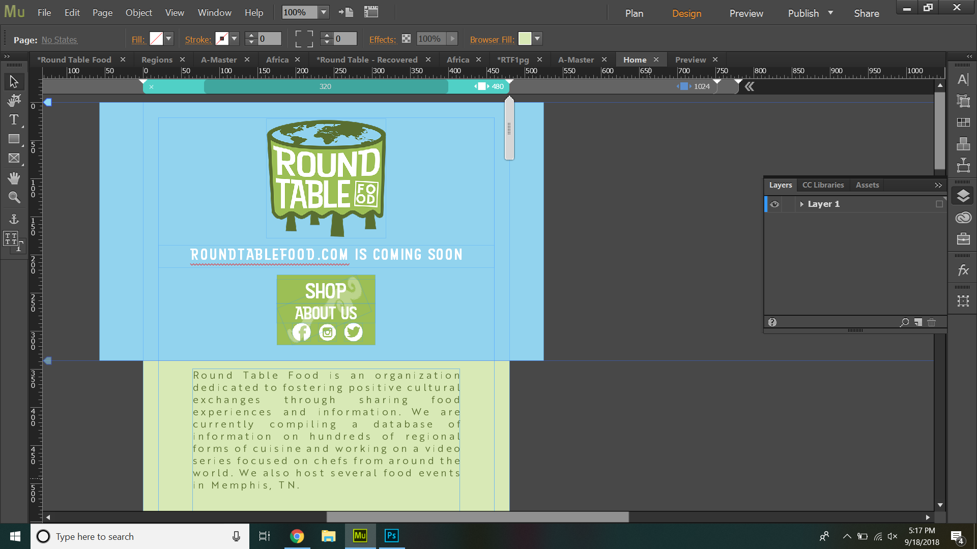
So I've been trying to make my website responsive and it looks great in the editor, it took a little fenagling but it looks good when I preview it too, but when I export it to the browser everything is wonky and all over the place. I've tried pinning everything, I've tried locking and grouping and everything, I can't seem to get anything to stay put.
How it looks in the editor:
How it looks in the preview:

How it looks in my phone browser:


 3
Replies
3
3
Replies
3

Copy link to clipboard
Copied
A gentle suggestion about your typography: Don't use justfied text on the web. It looks hideous. Stick with left aligned or centered text for all devices.
Alt-Web Design & Publishing ~ Web : Print : Graphics : Media

Copy link to clipboard
Copied
on your 480 breakpoint the 'blue round table' div is outside the canvis bounds... a phone will then ignore your layout in order to show all the content and I'd start by re-adjusting that div to be fully with in the canvas at 480 pixels
p.s, I also agree with Nancy on typography i.e, indesign is for print and this is the web... they use different rules

Copy link to clipboard
Copied
The issue of „misplaced elements“ is very easy to resolve, if one knows, how Muse is working.
Do the following:
- Delete all pages and elements, except the ones, you show us in your screenshots.
- Save this document under a new name.
- Upload the .muse file to Dropbox, CC Files or a similar file sharing service.
- Post the download link here.
We will certainly be able to fix the issues. But since there may be many causes for your „wonky“ site, it is necessary, to have a look at the file.
 AdChoices