 Adobe Community

Copy link to clipboard
Copied
Hello,
this is probably a real simple fix, I am wanting to know how to set up three images to be always centre on bottom line of slideshow?
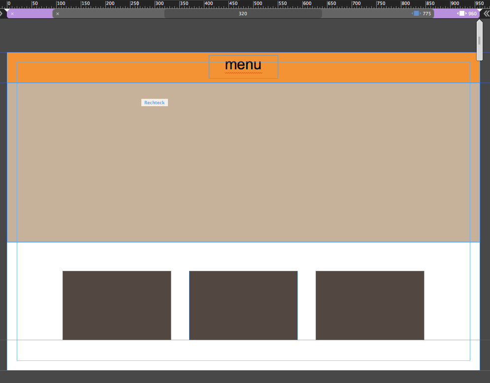
Please see site:
I want these three boxes (Core Standards, Privacy & Teaching Practices to be always centred on bottom line of slideshow, meaning these three boxes would be half in slideshow and half out. Responsive makes this a challenge!
Cheers
Glenn


 1 Correct answer

I think, we have not really enough informations to fix the issue completely, for example:
- These 3 boxes, are they simply „boxes“ or composition triggers as it seems?
- Is it intentional, that most elements don’t scale responsively (for example these boxes), but only breakpoint-wise, because they are scaled manually there?
Generally, it is easy and difficult at the same time to achieve, what you want  :
:
1. If you have a simple responsive slideshow with proportionally scaling hero images
When elements are
...
 3
Replies
3
3
Replies
3

Copy link to clipboard
Copied
you have to think about what happens when the screen is too small to show them side by side

Copy link to clipboard
Copied
How should it appear? Like this (1900)

or like this?

It could be like this:
Watch the .muse here:
If you need further assistance, let us know, share your muse (like I did via CC, for example) or via dropbox.
Best Regards,
Uwe
Copy link to clipboard
Copied
I think, we have not really enough informations to fix the issue completely, for example:
- These 3 boxes, are they simply „boxes“ or composition triggers as it seems?
- Is it intentional, that most elements don’t scale responsively (for example these boxes), but only breakpoint-wise, because they are scaled manually there?
Generally, it is easy and difficult at the same time to achieve, what you want  :
:
1. If you have a simple responsive slideshow with proportionally scaling hero images
When elements are overlapping, it is hard for Muse to decide, which element influences which others. You can solve this issue by placing a transparent, equally scaling (this is proportionally in this case) container exactly over the slideshow heroes. The height of this transparent „guiding“ container ends at the top of the 3 rectangles. If you now group this auxiliary container with the 3 rectangles, all behaves correctly.
2. If you have a browser wide slideshow, you can’t achieve this behaviour.
You can place such an auxiliary frame onto the slideshow, but browser wide elements can’t be grouped with others. Consequence: The construction, used in 1.), won’t work.
(Addition: I modified the download file a little bit, and added a third page ("Non Scaling Boxes“), because I found a possibility to use a browser wide slide show together 3 non scaling boxes by simply placing them into a states button.)
3. What is working in every case:
Don’t use browser wide spreading elements, but make your complete page stretching browser wide by using the double arrow icons to the left/right of the breakpoint bar..In this case all will work fine.
Here you find examples for these construction, based on your intentions:
https://www.dropbox.com/s/waqrqc1z5rke08x/overlapping-boxes.muse?dl=0
The first page shows a working and a failing slideshow situation.
The second page shows working examples (including a composition) by using the „Stretch complete page browser wide“ (>>) function.
The third page shows working examples by using a browser wide slide show and 3 non scaling boxes with a browser wide scaling states button.
Heavy stuff, isn’t it. If you have questions, just ask!
 AdChoices