 Adobe Community
- Home
- Muse (read-only)
- Discussions
- Re: Placement bug using rectangles as background
- Re: Placement bug using rectangles as background

Copy link to clipboard
Copied
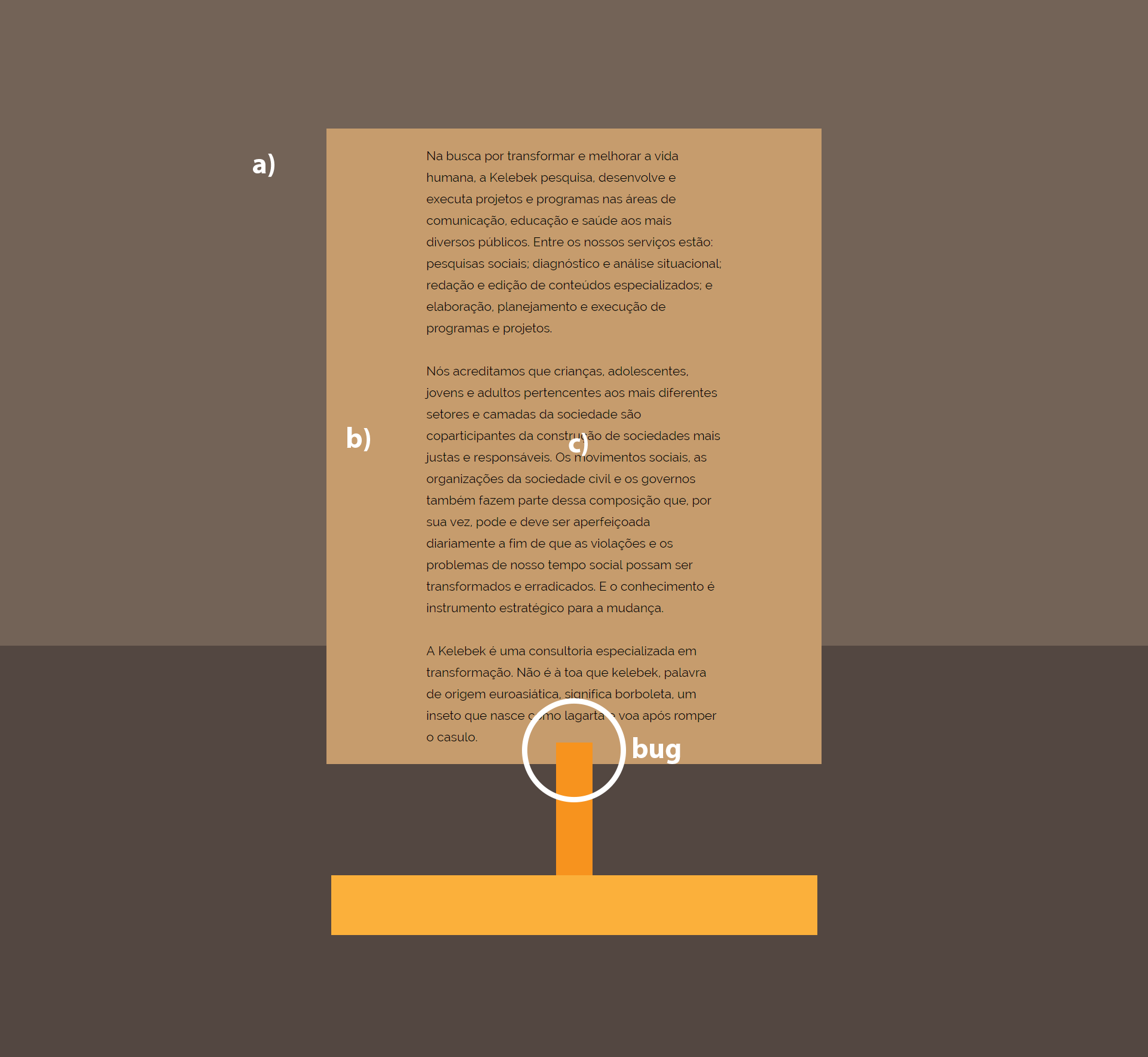
I was working on a web site for a client, and out of the blue, I found a placement bug.
When using the sequence of objects
a) rectangle as background higher than 990 px
b) rectangle
c) text area
Some elements are wrongly shifted on the page. Curiously if I remove the background, everything works perfectly. I never had this kind of problem because I always used much much smaller rectangles as a background.
Below the web site without the rectangles as background, working without a problem:
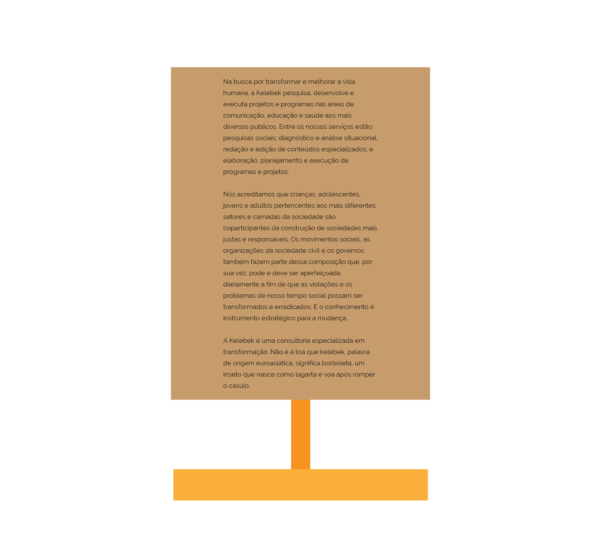
Besides that, when the browser is resized, the text area doesn't push other elements down. If I remove the background, everything works perfectly again.
What I already tried, without success:
- Moving back to previous versions, like the 2015 version.
- Trying several pin and fluid resize options to all objects
- Trying to make it a fixed layout.
- Trying to apply the .mulib vertical shift fix (that one used for the 2017 version)
- Using different fonts in the text area. The problem persists even with Arial. It doesn't matter.
- The bug happens online, local, preview...
It's pretty easy to reproduce the bug, but here a link to the muse file (it's not the actual web site I'm working on): Dropbox - website_kelebek_test_v01.muse
Any ideas? It is really a bug? Thanks in advance.


 1 Correct answer

Such a small file, and so many issues!  But nevertheless, I don’t think, there is a bug.
First of all:
There are two reasons, why the text overlaps the orange vertical rectangle:
- The text frame slightly overlaps the vertical orange rectangle from the beginning, so it won’t be pushed down.
- Please count the lines of the middle text paragraph in Muse’s layout (= 12 lines) and in browser (= 13 lines). Consequence of this difference: The text frame in layout is shorter than in browser. This is no Muse i
 7
Replies
7
7
Replies
7
Copy link to clipboard
Copied
Such a small file, and so many issues!  But nevertheless, I don’t think, there is a bug.
First of all:
There are two reasons, why the text overlaps the orange vertical rectangle:
- The text frame slightly overlaps the vertical orange rectangle from the beginning, so it won’t be pushed down.
- Please count the lines of the middle text paragraph in Muse’s layout (= 12 lines) and in browser (= 13 lines). Consequence of this difference: The text frame in layout is shorter than in browser. This is no Muse issue. This is, because every browser has its own text engine and you can’t rely on having the identical text flow in Muse, in Preview, in browser A or browser B. This unfortunately can’t be influenced by Muse in any way. You only can take this into account, by creating a flexible layout. If the layout isn’t correct in this case – for example, when text overlaps other elements, which should be pushed down –, you will run into these kinds of problems.
- (One additional hint: The browser differences in text flow are heavier, when you use justified text, as you are doing. I’d really avoid this anyway, because actual browsers don’t support hyphenation and this causes a very inconsistent „patchy“ view, if using justified text flow.)
To fix your issues, this will be necessary:
- The text container has to be completely(!) within the brown rectangle, to cause the rectangle extending vertically according to the text frame.
- The text frame isn’t allowed to overlap the vertical orange rectangle, if you want it to be pushed down.
- If you want the text frame and its background to push down the rectangles, these element need to be responsive. But they aren’t in your layout. They are set to Resize: None.
- Muse tries to figure out, which elements should push down which other elements. If there are many different sized, overlapping elements (in your we have case 6 overlapping rectangles and one text frame), Muse can’t know, which element is the „initial“ element, which you expect to affect the other ones.
So help Muse to do a better job: Group the elements which should influence each other. In this case the text box, the underlying rectangle, and the rectangles below. If you set all elements to responsive width and group all elements, except the background rectangles, all works as expected.
Please have a look at this .muse file, based on your sample document: https://www.dropbox.com/s/y2xubgpt16fhp1u/kelebek.muse?dl=0
Copy link to clipboard
Copied
Dear Günter, THANK YOU.
First of all, that's a GREAT explanation of how Muse works!
I have opened your file and the thing about grouping the elements is a plot twist to me! Although the text area was inside the rectangle, if you just ungroup the elements, the "bug" will appear again! I mean, grouping has a major role of how muse should "understand" the page layout, and this changes everything.
So, THANK YOU! Really!
But if you don't mind, I was messing around with your file and I still have one doubt: why can't I group the text area, the rectangles AND the background? I mean, I still don't understand how to make the background be stretched down with the text. Am I missing something here? The background has its resize set to "stretch to browser width". Is there a way to make the background stretch its height to the text area?
Thanks again!
Copy link to clipboard
Copied
Could you please tell us: Which „background" are you talking about?
- The lighjt brown background (rectangle) „including" the text? This is stretching together with the text. There seems to be only a display glitch in Muse’s layout mode. In browser preview it works fine!
- The two dark brown rectangles at the very back of all elements? These rectangles scale browser wide, and you can’t group elements, scaling browser-wide.
- But, like in most cases, there are solutions:
- Delete the bottom rectangle completely and fill the page background with the same brown. Or
- Make the top rectangle considerably longer (so it stretches invisible behind the bottom rectangle). and pin the bottom rectangle to „bottom - middle“ using the left pinning icon.
Or did I understand completely wrong?
Copy link to clipboard
Copied
Hey Günter, thanks again for your answer.
I'm talking about this background:
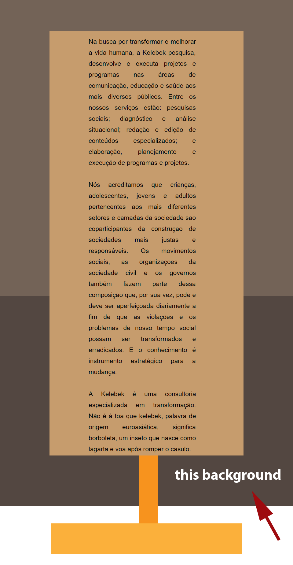
I didn't intend to have the first background to stretch in height, but just the second. And the way you talk, I think there's no solution for my layout.
- But, like in most cases, there are solutions:
- Delete the bottom rectangle completely and fill the page background with the same brown. Or
- Make the top rectangle considerably longer (so it stretches invisible behind the bottom rectangle). and pin the bottom rectangle to „bottom - middle“ using the left pinning icon.
Or did I understand completely wrong?
No, you didn't, the thing is I didn't tell you the whole story. This web site is slightly more complex than I showed here. If you want to see the final project, please access my client website: Kelebek - Consultoria Especializada em Transformação
I had to deliver this project last Friday, so I had to find a way to make it work. So you'll notice that I found a different solution for this problem. But that's ok, this project is finished and I'm over it (haha). I just posted my concerns here on the forums thinking about future projects.
As you can see, some backgrounds rectangles has pictures. I would love to have these stretched vertically with the content. Now that I know about grouping objects, I will design accordingly thinking about how content should behave with other objects. But still, I don't know how to make the background stretch vertically. Filling the page background would work, but not for this case. Your second solution maybe would work if I think about it next time.
Would you think in any other way to have these backgrounds stretched vertically?
Thanks again for your time
Copy link to clipboard
Copied
If I understand correctly, you want:
- images in the background, which are moving up and down, when the screen is scrolled up and down, and
- these images should always fill the screen, no matter how wide or high this screen is.
Of course 1. is possible, 2. is not.
Supposed, you have 3 images, this would require that each image is
- set to browser width, no matter, how wide the actual screen is and
- fills 1/3 of the screen height, no matter how high the actual screen is.
If this is a correct interpretation of your intentions: This isn’t unfortunately possible in actual Muse.
Responsive Muse doesn’t support 100 % height rectangles or images for now, and therefore doesn’t support something like 1/3 of 100 %.
The only way to do this, is baking these images into one (Photoshop!) and use this image as a browser fill with „Scrolling“ activated.
Copy link to clipboard
Copied
https://forums.adobe.com/people/G%C3%BCnter+Hei%C3%9Fenb%C3%BCttel escreveu
If I understand correctly, you want:
- images in the background, which are moving up and down, when the screen is scrolled up and down, and
- these images should always fill the screen, no matter how wide or high this screen is.
Of course 1. is possible, 2. is not.
Supposed, you have 3 images, this would require that each image is
- set to browser width, no matter, how wide the actual screen is and
- fills 1/3 of the screen height, no matter how high the actual screen is.
If this is a correct interpretation of your intentions: This isn’t unfortunately possible in actual Muse.
Responsive Muse doesn’t support 100 % height rectangles or images for now, and therefore doesn’t support something like 1/3 of 100 %.
The only way to do this, is baking these images into one (Photoshop!) and use this image as a browser fill with „Scrolling“ activated.
Yes, you are right about my intentions. And everything you said make sense.
In my next project I'll take all of these facts in consideration. Thanks again for your help and time.
My best regards 
Copy link to clipboard
Copied
You’re welcome!
 AdChoices