 Adobe Community

Copy link to clipboard
Copied
Bonjour,
Comment atteindre des points d'ancrages précis sur une page alors que les éléments sont en hauteur responsive ?
merci pour votre aide


 1 Correct answer

I want to add, that the elegant way has to do with this:
It may be called "Distance before" but I was not able to figure this out anymore, that anchor stays in the top left corner and text starts after 70 or whatever value you would need.
Best Regards,
Uwe
 11
Replies
11
11
Replies
11

Copy link to clipboard
Copied
Hello,
They should word accurately.
Are you facing any problem while doing so?
Can you please share your site URL if it is broken.
Thanks,
Ankush

Copy link to clipboard
Copied
Hello,
I have the same problem with :
Look as full screen (13"), in "photos" for example, when you reduce the screen, of course the "ancrage" do not move, but all elements move so that's not going well.
Thanks a lot for your response.
Octave
Copy link to clipboard
Copied
Hey Octave,
From your issue description, I understand that after dragging the browser window anchor position is slightly disturbed and it appears as if the objects are moving, is that correct?
After curating your site I have found that the anchor position changes when as soon as it reaches the two large breakpoints at 1400px and 1200px.
However, as per the design of your site, these two breakpoints are not at all needed.
My first suggestion would be the two large breakpoints and see it it works fine.
Let know so we can it further.
Regards,
Ankush
Copy link to clipboard
Copied
Hi Ankush,
Thanks, indeed, when I erase section 1200px and 1400px the 1800px I create work fine with the anchor.
But, look in "qui suis-je?". When you drag (before the 967px breakpoint, the text and the girl photo is going so badly !
What am I suppose to do ?
Other question very important, how many breakpoints and what pixels numbers do you advise for a good responsive website ?
I did pixel as follow : 360, 760, 967, (1200,1400px erase) and 1800
Thanks for your advises,
Octave
Copy link to clipboard
Copied
Well, the main problem is, anchors are not responsive in their settings. They do not move out of the box.
As long as you persist on fluid width design this needs a strong workaround.
As far as I experienced with help from Günter Heißenbüttel, there´s only one way to deal with this.
You might have to place anchor points inside text layers.
In your case this could work, if you place the anchor points in your headline-text-layers.
Much easier (maybe) if you use fixed width breakpoints. This way you could place anchor points very exact for each breakpoint.
For mobile version this would not work any more.
This is the main idea, let`s see, if we can help you further more. Let´s talk how you decide to keep on.
Best Regards,
Uwe
Copy link to clipboard
Copied
Hi Uwe,
Very interesting.
How do you integrate an anchor in text ? I looked into but didn't find out.
For mobile version, are you saying it's not working ? Do you create only fix width on Muse ?
Actually, I can't imagine a website without an anchor for User experience, so if fluid width doesn't work with anchor, what's the purpose of fluid width o_O ?
I tried to make a fix width, I've seen my work truncated. Is there a way to have a fluid text in fix width ?
Hope my questions are clear and easy for you to respond.
Thanks a lot for your time.
Octave
Copy link to clipboard
Copied
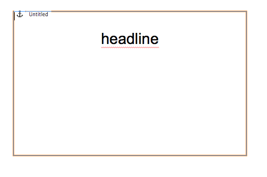
- You start with placing an anchor on your page what you already did.
- You drag a text layer with no text, yet empty
- You "cut out" your anchor (copy works, too. But you have to delete the anchor after the process)
- Paste this anchor into the text by "activating the text cursor inside your text layer, like you want to start to write" and click cmd+v or STRG+V
- It should look like this:

- Now write your headline and hit enter to put your headline where you want it in correlation to distance from top.
From Günter Heißenbüttel I "know" that there´s a much more elegant and technical correct way, coming from Id instead of PS.
At the moment I am not able anymore to reproduce "his" way, sorry
But you can watch this: anchor-in-text and download directly from browser.
Best Regards,
Uwe
Copy link to clipboard
Copied
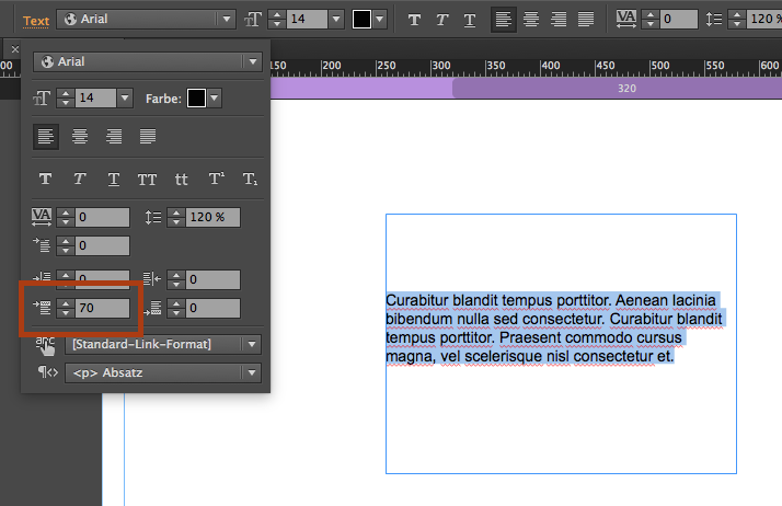
I want to add, that the elegant way has to do with this:
It may be called "Distance before" but I was not able to figure this out anymore, that anchor stays in the top left corner and text starts after 70 or whatever value you would need.
Best Regards,
Uwe
Copy link to clipboard
Copied
Incredible response ! It's working !
That's amazing, thank you so much fotoroeder !
It's working on mobile too 

Copy link to clipboard
Copied
Hi !
See this 5 Useful Tips to improve your Adobe Muse Experience - Responsive Muse - Templates & Widgets
I hope you will find answers to your question.
Copy link to clipboard
Copied
Thanks a lot, very useful !
 AdChoices