 Adobe Community
- Home
- Muse (read-only)
- Discussions
- Re: Preview in browser is different than design mo...
- Re: Preview in browser is different than design mo...

Copy link to clipboard
Copied
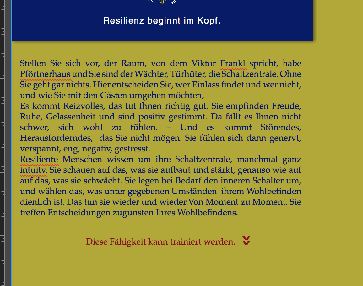
Hi,
there is one icon, that shows constantly different in the preview browser than in the design modus.
I am enclosing screen shots.
Does anyone has an idea why?
Thanks for response


 1 Correct answer

Some informations:
Your site is responsive width, but since you defined the minimal page width identical as the breakpoint width, your elements can’t react responsively: You tell them to be responsive, but you forbid this behaviour at the same time.
The moving icon (I think you are talking about the 90 degree rotated text frame containing the „>>“) isn’t an issue here. It keeps its place perfectly.
But if you want to be sure, that this won’t happen do this:
- Define this „>>“ text frame as „Resize: No
 9
Replies
9
9
Replies
9
Copy link to clipboard
Copied
This may have different reasons. Instead of guessing:
Could you please delete all pages and all element except the ones, your screenshot is showing? Then save this small .muse file under a new name, upload it to Dropbox or a similar file sharing service and post the download link here. Then we can have a closer look.
Copy link to clipboard
Copied
https://www.dropbox.com/s/eml0eexha36xtrj/resilienz-TEST.muse?dl=0http://
Danke Günter, Gruss Angelika
Copy link to clipboard
Copied
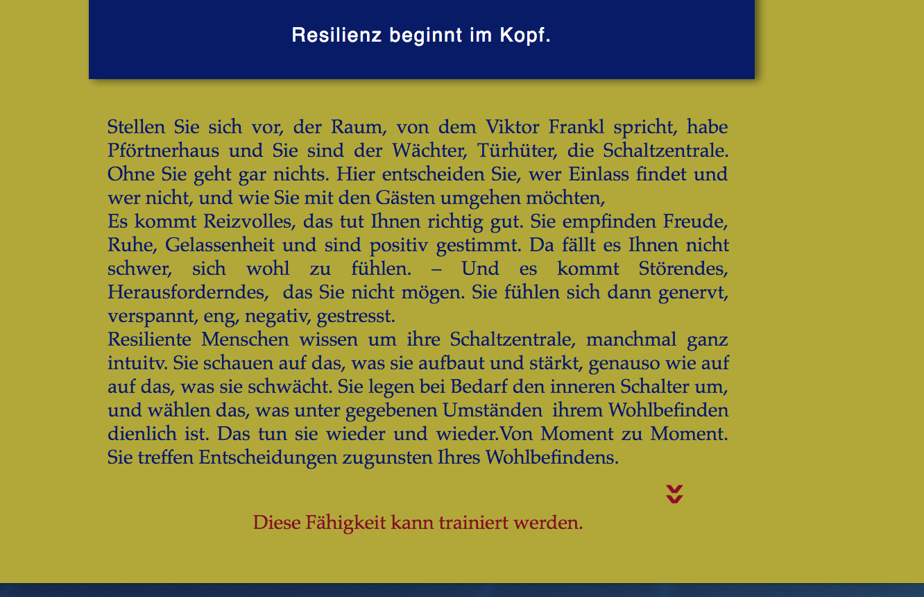
Some informations:
Your site is responsive width, but since you defined the minimal page width identical as the breakpoint width, your elements can’t react responsively: You tell them to be responsive, but you forbid this behaviour at the same time.
The moving icon (I think you are talking about the 90 degree rotated text frame containing the „>>“) isn’t an issue here. It keeps its place perfectly.
But if you want to be sure, that this won’t happen do this:
- Define this „>>“ text frame as „Resize: None“ (because it tries to resize vertically, since the frame is rotated 90 degrees)
- Make the text box containing „Diese Fähigkeit kann trainiert werden" a little bit higher.
- Cut (or copy) the „>>“ box (cmd+X)
- Place a text cursorat the very end of/into the „Diese Fähigkeit …“ text box .
- Paste the copied „>>“ text box into the „“Diese Fähigkeit …“ text box.
- Choose the Selection“ tool (= arrow) and drag the icon vertically to its place.
Now, both elements are kept together.
Here a small screencast:
And here the modified .muse file:
https://www.dropbox.com/s/2c28yxszsmm1btv/resilienz-TEST-MOD.muse?dl=0
One more info: Since browsers try to position anchors always top left of the browser window, the viewport will shift horizontally, if you don’t place the anchors at the left edge of your page. (Your anchors are placed somewhere to the right of your pages.)
Copy link to clipboard
Copied
Hello Günter,
thank you so much. It works perfect.
I wonder, would you explain to me, how I can change what you wrote: Your site is responsive width, but since you defined the minimal page width identical as the breakpoint width, your elements can’t react responsively: You tell them to be responsive, but you forbid this behaviour at the same time.
Copy link to clipboard
Copied
Simply open the „Page Properties and define the „minimal width“. For the smallest breakpoint this is normally 320 px. Do this for your master page, and, if you want different values for the layout page, check page properties for the layout page too.
Copy link to clipboard
Copied
Thank you Günter!
Copy link to clipboard
Copied
Günter, I have another question: the top of my site I would like to make on a master page. But once I do this, I cannot scroll the page down as I designed it, so that the below content 'moves' behind the top. This works only, if I keep the top on each page.
Can I change this?
Copy link to clipboard
Copied
There is a simple fix for it:
You have to know, that Muse works with layers.
Open the „Layers“ panel and have a close look at it. Muse’s layer necessarily work site wide, not only page wide.
So, do this:
- Copy the elements, which you want to appear on every page and paste them (menu „Edit/Paste in Place“) onto your master page.
- Now open the „Layers“ panel and create a new layer above all others by clicking onto the „Sheet“ icon (= „New Layer“) in the footer of this panel.
- Drag your menu item’s entries onto this layer.
Now all should work as expected. Here a short screencast:
Copy link to clipboard
Copied
Thank you Günter, this was extremly helpful for me, I learned a lot!!
 AdChoices