 Adobe Community
- Home
- Muse (read-only)
- Discussions
- Re: Problem with the export (display) Muse CC
- Re: Problem with the export (display) Muse CC

Copy link to clipboard
Copied
Hello,
I have 2 problems with the display of my web site. When I preview my site in my web browser and I reduce the size of my page, 2 problems appear :
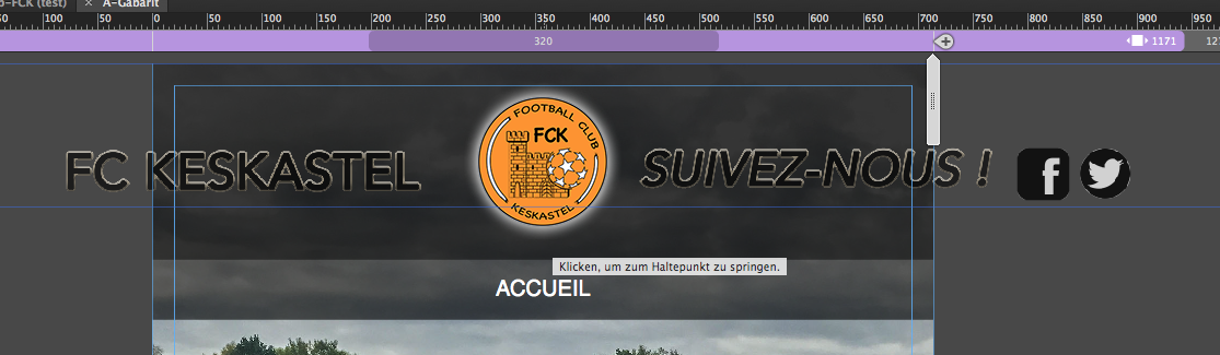
1) When I go to the right, my "top page" don't continue (the black rectangle up right) :
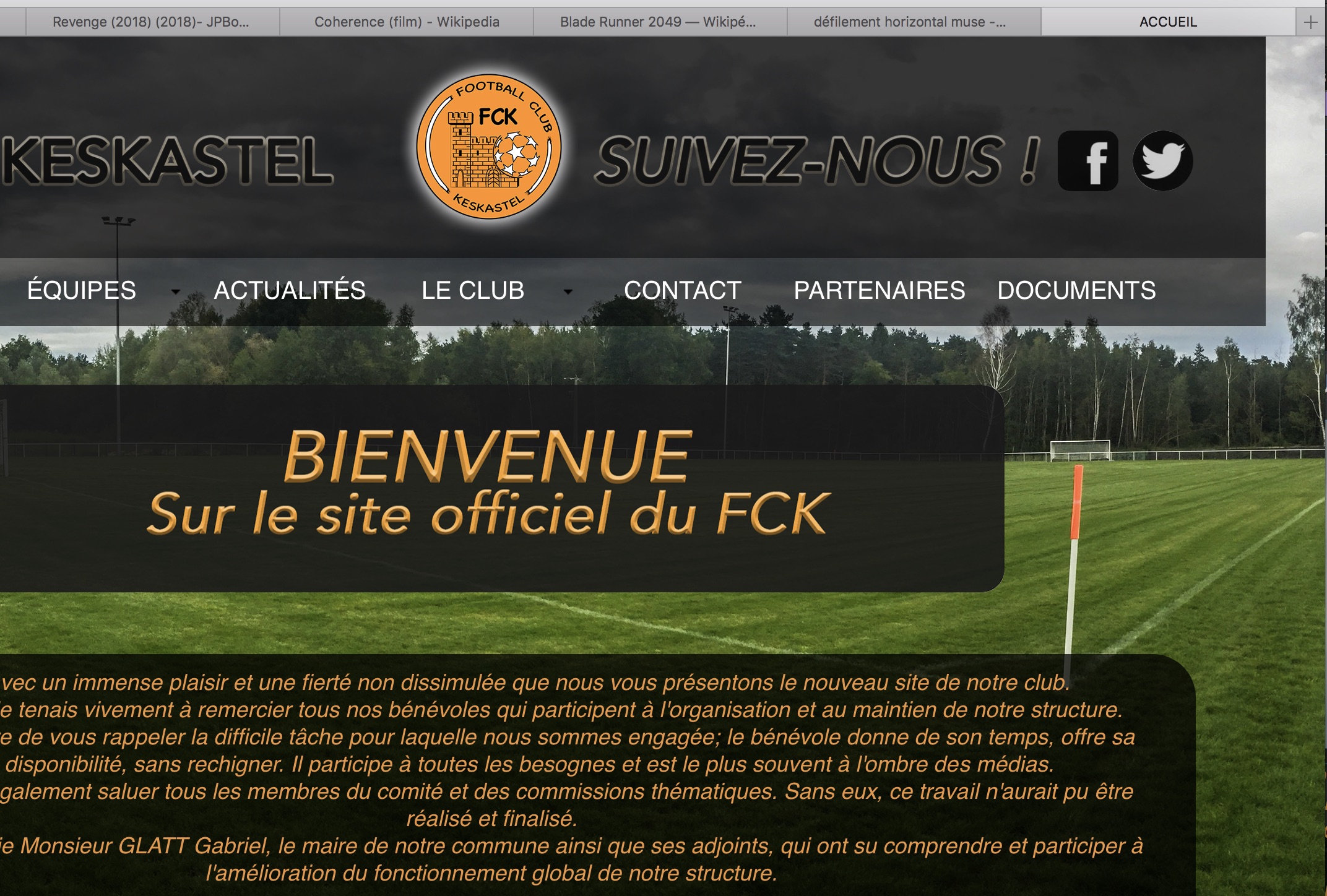
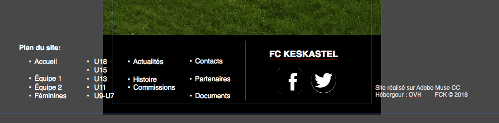
2) And I can't go to the left, and the contents of the page is just "cut" :
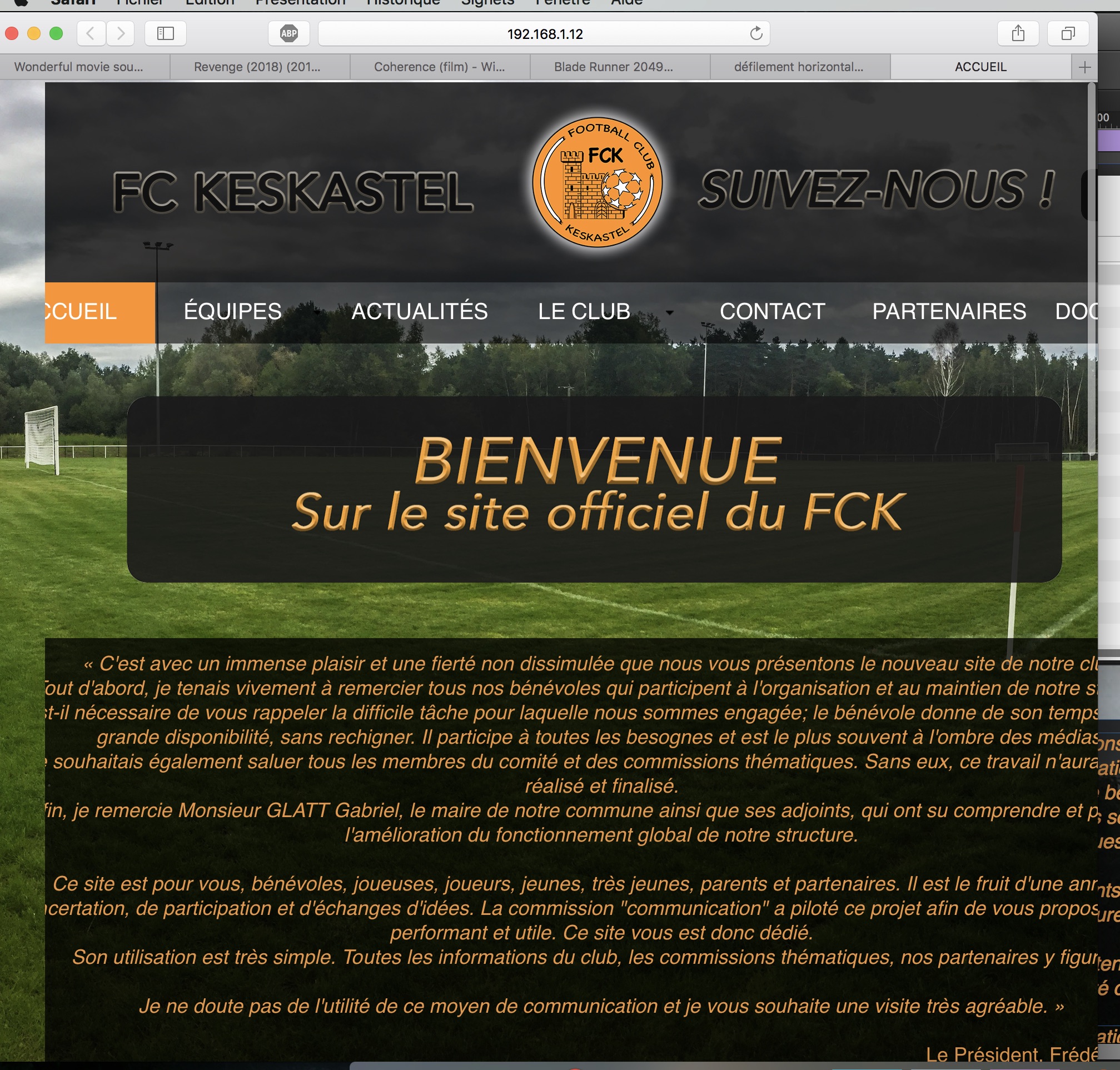
On this example, I force the left to show you.
How can I change that ?
PS: My width is not responsive, it's fix.
Thank you.


 1 Correct answer

This is your new file, if you want to follow my recommendations.
I changed some elements on master ( have a kind look at it) to have it responsive, using the scrubber.
You may have to change layout of course to your needs, but I guess you get the idea about using breakpoints and stuff.I left it for the moment as fluid responsive but you may change this as well to fixed width – it helps, organizing everything.
On your master I changed these issues but you have to change this to
...
 7
Replies
7
7
Replies
7
Copy link to clipboard
Copied
Without a muse no chance to help.
You could provide some screenshots as you showed from the browser, how that looks in muse design mode.
I guess, some elements are outside the canvas as soon as you use the scrubber?
Best Regards,
Uwe
Copy link to clipboard
Copied
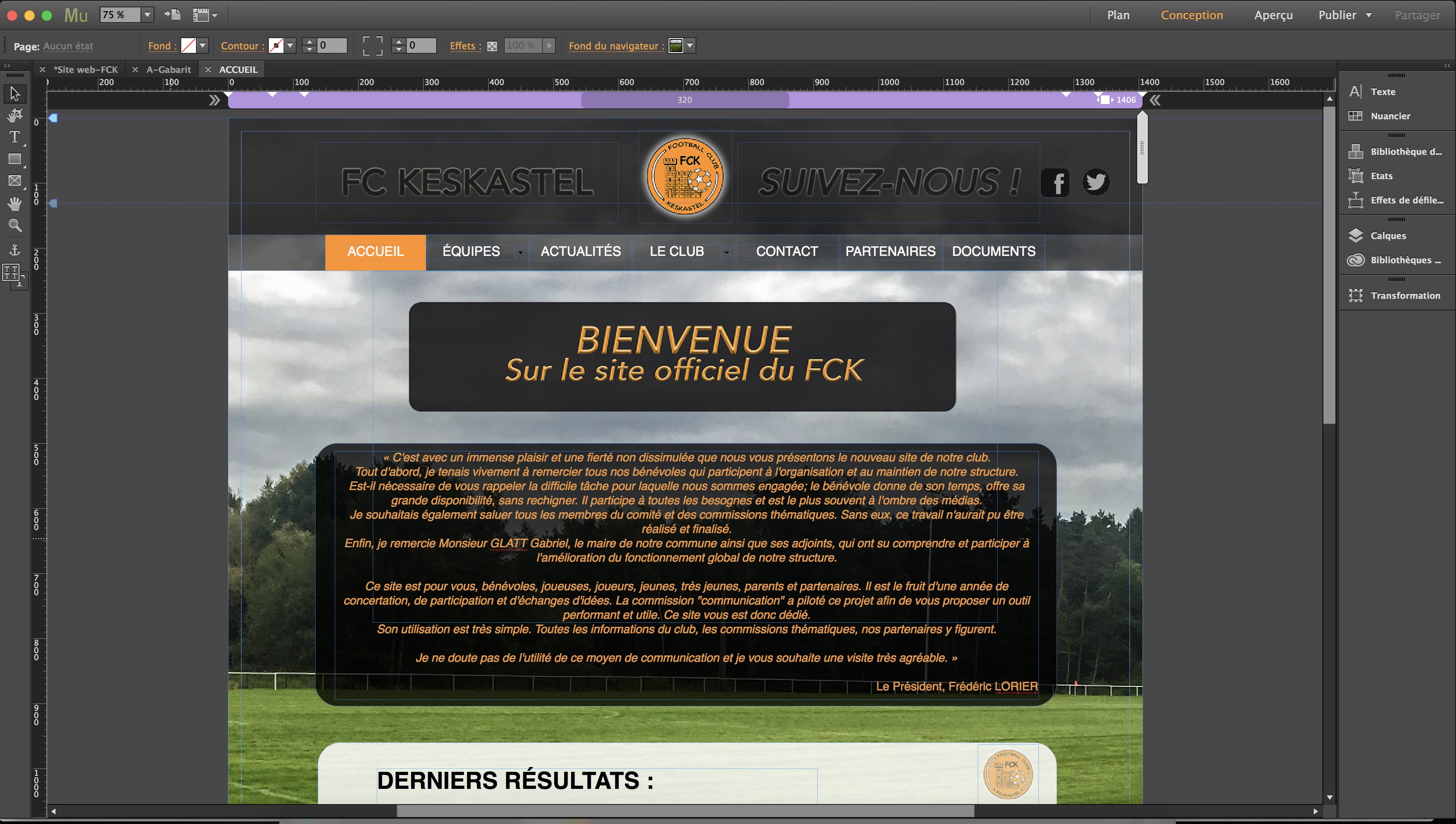
Hello, in muse design mode, the display is "normal" for me :
What is the scrubber ?
Copy link to clipboard
Copied
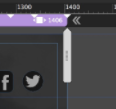
Moving this shows you, how your page looks aproximately in browser.
You say: PS: My width is not responsive, it's fix.
You don`t use fixed width BTW but fluid width breakpoints.

Now as soon as you move this scrubber, you may see the issues. From guessing: your elements are set to not resize or/and are pinned in wrong way.
If you can change this by yourself, go for it, if you have problems pass us your .muse.
To do this, delete all other pages except the one, shown on screenshot, safe it with a new name into your "Creative Cloud Files" and by right click on this, share that link with us.
Best Regards,
Uwe
Copy link to clipboard
Copied
Thank you, I don't think that I can do it, so I share my .muse.
You can find the project there : https://adobe.ly/2FFTvPZ
Copy link to clipboard
Copied
This is your new file, if you want to follow my recommendations.
I changed some elements on master ( have a kind look at it) to have it responsive, using the scrubber.
You may have to change layout of course to your needs, but I guess you get the idea about using breakpoints and stuff.I left it for the moment as fluid responsive but you may change this as well to fixed width – it helps, organizing everything.
On your master I changed these issues but you have to change this to your needs:
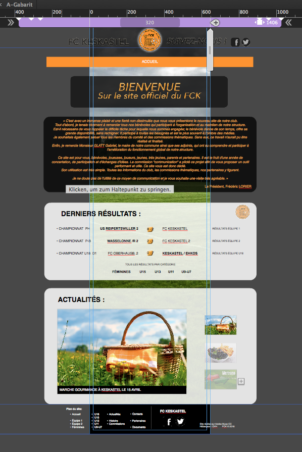
On your page, this was the problem.
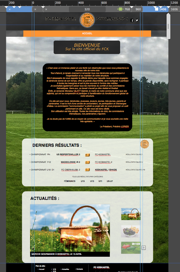
Changing it to fixed width it can look like this:

Take care of this blue guides, you´ll see in the next breakpoint with the text box (Ichanged this as well to just a text box with no background layer – have a look at it  ), that this stays in between the guides but the white ones expand too much. You have to change this as you need it for all breakpoints.
Hope this helps for the beginning. Come back as soon as you need some more guidance.
Best Regards,
Uwe
Copy link to clipboard
Copied
Thank you for yours helps !! I will try to take your advice to change my all website.
Thank you again !! 
Raphaël K.
Copy link to clipboard
Copied
You´re welcome .
Best Regards,
Uwe
 AdChoices