 Adobe Community
- Home
- Muse (read-only)
- Discussions
- Problems aligning different header elements
- Problems aligning different header elements

Copy link to clipboard
Copied
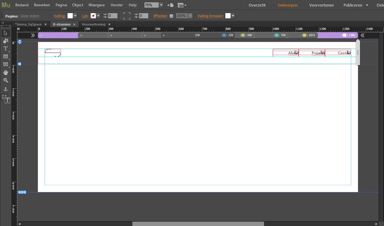
When in design mode, the header menu on the right and my logo on the left, are perfectly aligned.
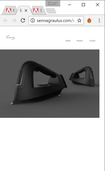
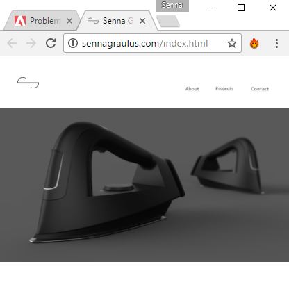
Although when I go to preview mode or I publish my website, they are not aligned anymore.
I tried different things, like pinning the elements or aligning them to each others, but no luck yet.
Also it gets worse when I make my browser window smaller.


 1 Correct answer

Coming to the easiest way without changing too much.
Set your click state to the same font as the normal and active state and resize to none in every breakpoint.
Change width of the menu as desired.
Set your logo to resize "none" in all breakpoints as well.
Watch 480 to 320, if you are staisfied, if you do not resize.
Be aware that pinning to browser for mobile is not recommended. It is unpredictable for any i–devices.
At these breakpoints pinning to container is more recommended.
Hope it was not too c
...
 10
Replies
10
10
Replies
10
Copy link to clipboard
Copied
Because you used a system font, indicated by this tiny little "T" in the downhand right corner, this font is exported as a "picture".
This could lead to your error.
Try a web safe font from the typekit menu. At first you could try any webfont to see, if this gets solved with a webfont.
Best Regards,
Uwe
Copy link to clipboard
Copied
Thanks for responding!
Tried using one of the webfonts, but didn't help. Any other ideas?
Copy link to clipboard
Copied
A lot of. Send us a reduced to your issue created one page .muse via dropbox or share it via CC.
Only the logo and the menu – if necessary three empty pages for the menu, if it is a three page website.
Uwe
Copy link to clipboard
Copied
Copy link to clipboard
Copied
It looks like something distracting, a glitch or whatever.
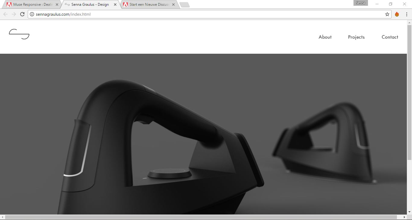
Watch this and download directly from browser: Senna Graulus - Design
I have no idea what exactly you did. Because even after changing to a webfont (Bebas Neue - please feel free to change this to your needs), I still realize this tiny little "T".
And of course you should change in different states, what you want to achieve.
I added a simple text menu as well, with your underlining settings from the site properties.
Maybe you mixed the automatic menu with something else?
I also changed it from resize responsive to "none". As well the logo and the menu. Of course you have to think about a mobile menu  .
.
Does this help?
Uwe
Copy link to clipboard
Copied
I got it – in your click stat you used (Futura LT). This font in brackets show you that this is no webfont.
Copy link to clipboard
Copied
Coming to the easiest way without changing too much.
Set your click state to the same font as the normal and active state and resize to none in every breakpoint.
Change width of the menu as desired.
Set your logo to resize "none" in all breakpoints as well.
Watch 480 to 320, if you are staisfied, if you do not resize.
Be aware that pinning to browser for mobile is not recommended. It is unpredictable for any i–devices.
At these breakpoints pinning to container is more recommended.
Hope it was not too complicated
Uwe
Copy link to clipboard
Copied
This: Senna Graulus - Design is the corrected file, if you still need.
Also – you don`t need a breakpoint at 320. It is enough to have this set as a minimum width.
Best Regards,
Uwe

Copy link to clipboard
Copied
This is perfect!
Thank you so much for your time, appreciate it a lot 
Copy link to clipboard
Copied
You are welcome in this forum all time.
 AdChoices