 Adobe Community
- Home
- Muse (read-only)
- Discussions
- Re: Problems with lightbox/slideshow widget Muse 2...
- Re: Problems with lightbox/slideshow widget Muse 2...

Copy link to clipboard
Copied
Hello,
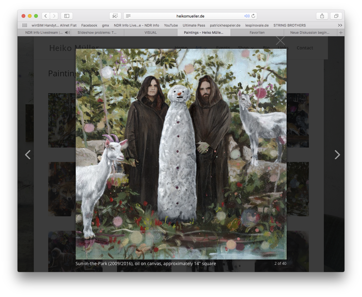
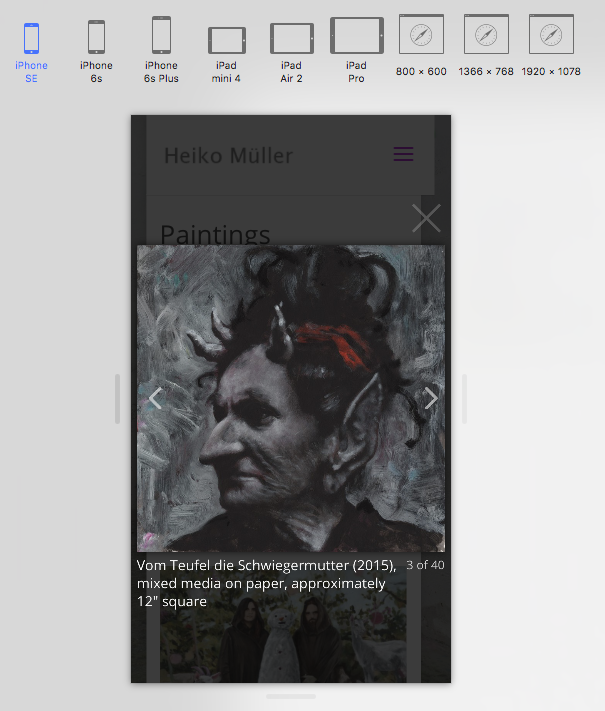
I am working on a responsive web site for a client VISUAL whose paintings are to be displayed in galleries like in this example of a friend:
Paintings - Heiko Müller - Paintings and Drawings. (Pic 1)
Unfortunately, the lightbox widget always causes me problems:
The captions, the cursors, and the close buttons are hard to handle.
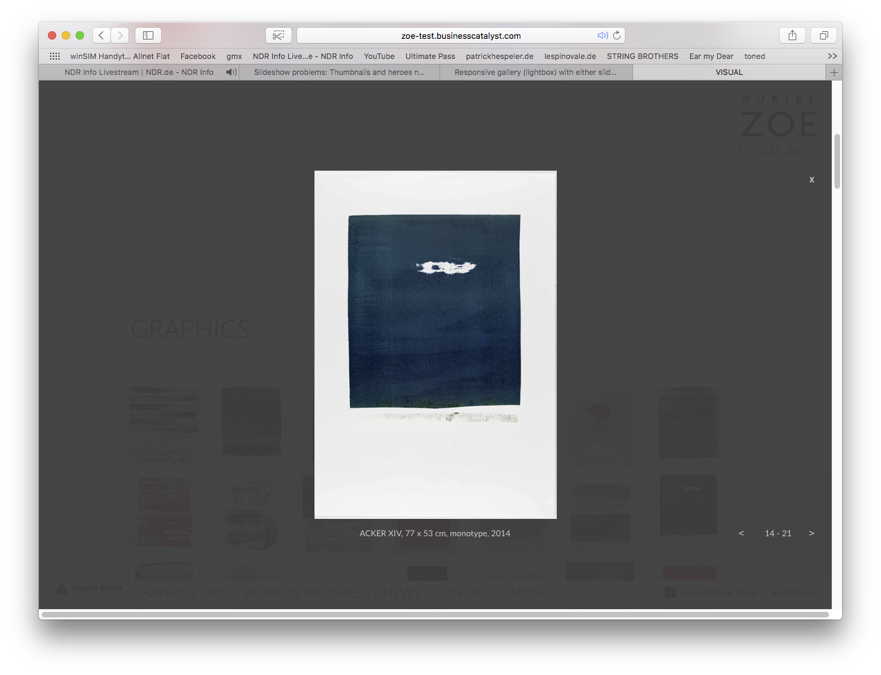
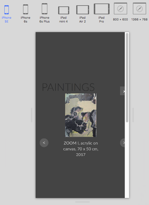
After trying for a long time, I found a solution that closely approximates the intended example. (Pic 2) VISUAL (>“GRAPHICS")
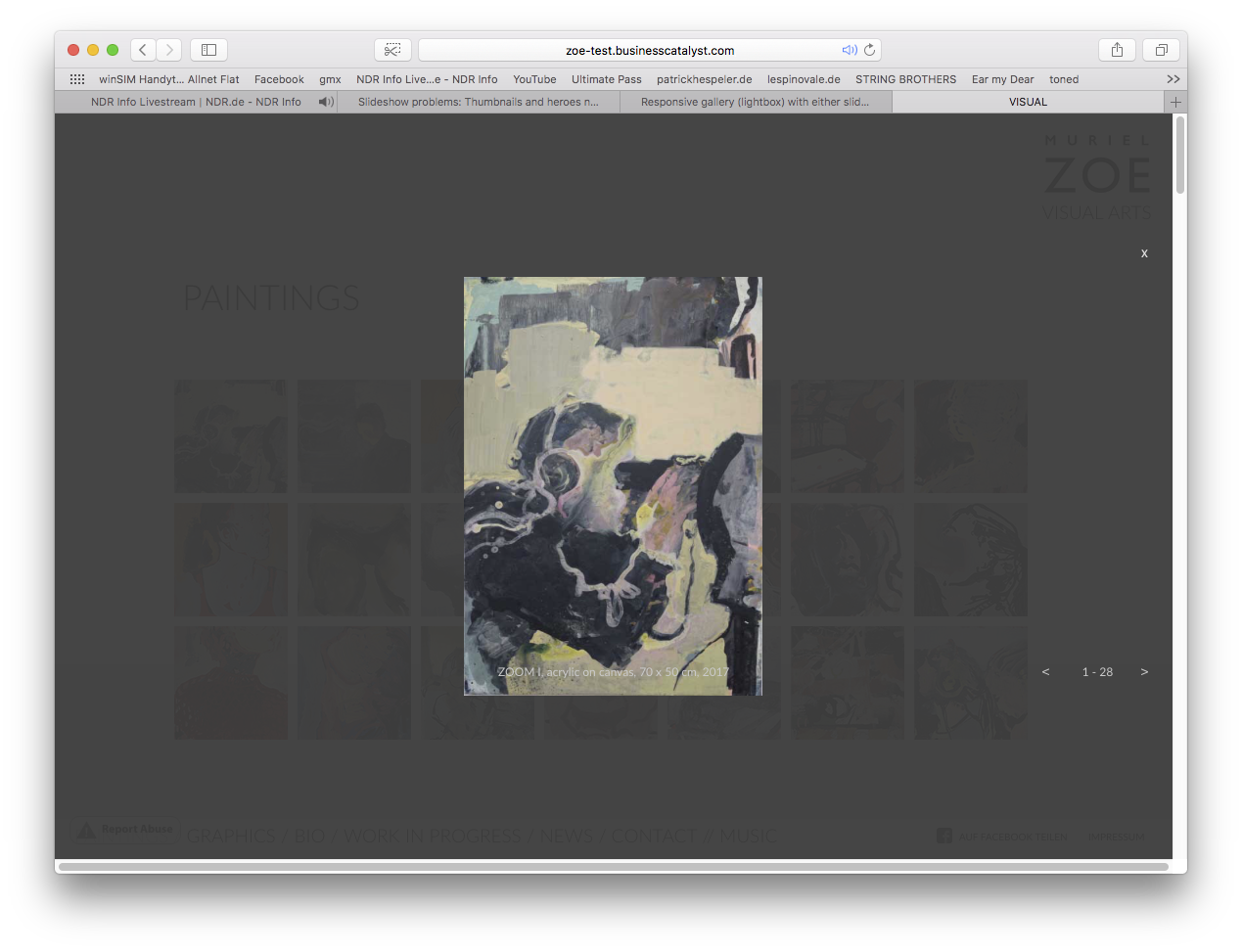
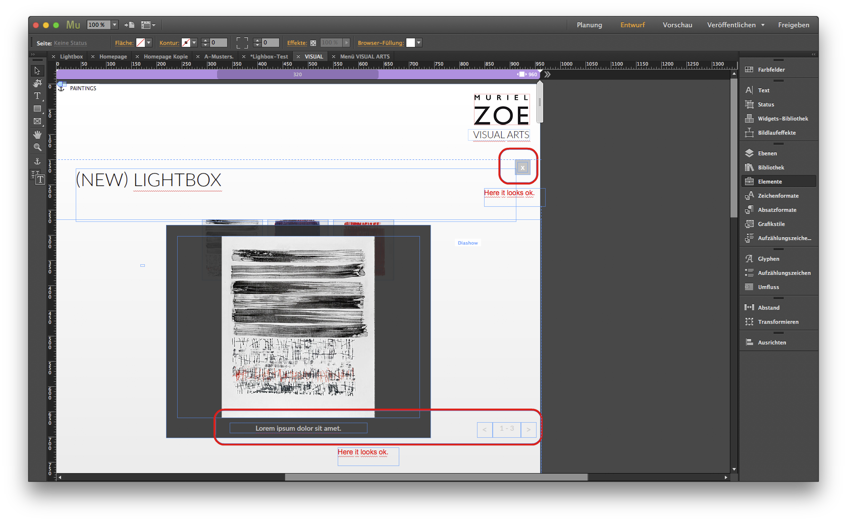
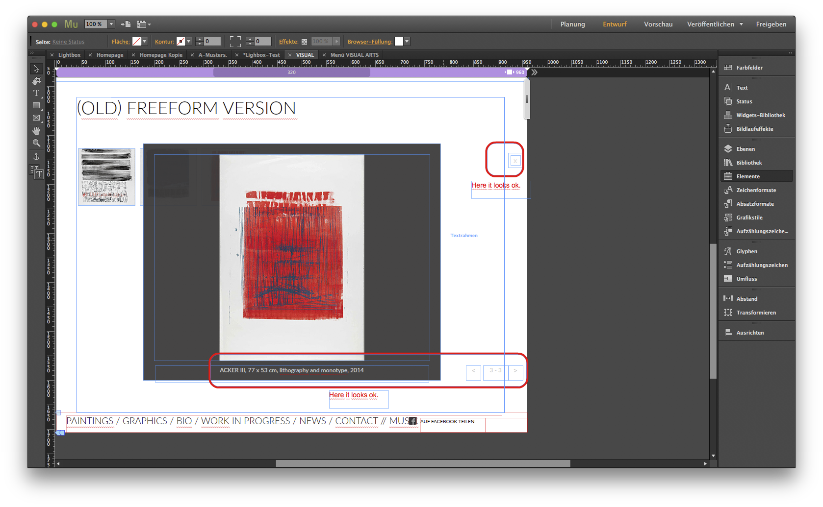
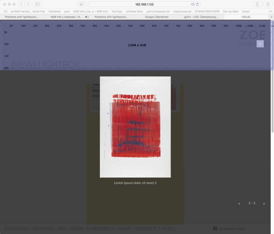
But after adding more photos to the Lightbox Gallery, the position of captions, and controls in the lightbox has shifted and are no longer docked to the image as desired. (Pic 3) VISUAL (>“PAINTINGS")
In addition, I use "Freeform Thumbnails" so that I can freely determine the distance and shape of the thumbnail. However, then it is not possible any more, for e.g. rearrange the order of the thumbnail so that the numbering adapts correctly. If I deselect "Freeform Thumbnails" to better organize one of the thumbnails, the above named problems will occur.
What is the best way to create a Lightbox gallery like this one Paintings - Heiko Müller - Paintings and Drawings. (Pic 1), and edit it without a bad fix for a responsive website?
............................................................
German:
Hallo,
ich arbeite an einer responsiven Webisteite für einen Kunden dessen Paintings in Galerien dargestellt werden sollen wie in diesem Beispiel:
Paintings - Heiko Müller - Paintings and Drawings. (Pic 1).
Leider macht mir das Lightbox Widget immer wiede Probleme:
Die Bildunterschriften, die Cursor und der Close-Buttons sind schwer zu händeln.
Nachdem ich lange herumprobiert habe, habe ich eine lösung gefunden, die dem angestrebten Bespiel nahe kommt. (Pic 2) VISUAL (>“GRAPHICS")
Aber nachdem ich die Lightbox-Galerie um weitere Fotos erweitert habe, hat sich die Position von Bildunterschriften, und Steuerelemente in der Lightbox verschoben und sind nicht mehr dem Bild wie gewünscht angekoppelt. (Pic 3) VISUAL (>“PAINTINGS")
Ausserdem verwende ich „Freiform-Miniauturen”, damit ich Abstand und Form der Thumbnail frei bestimmen kann. Allerdings ist es dann nicht nehr möglich, z.B. die Reihenfolge der Thumbnail so neu zu ordnen, dass die Nummerierung sich korrekt anpasst. Wähle ich dann nicht „Freiform-Miniauturen”, um eine die Thumbnails besser ordnen zu können, kommt es zu oben benannten Problemen.
Was ist der beste Weg, eine Lightbox-Galerie zu erstellen wie diese (Paintings - Heiko Müller - Paintings and Drawings. (Pic 1)), und diese ohne Probleme für eine responsive Website editieren zu können?
Pic 1:
Pic 2:
Pic 3:


 1 Correct answer

Many questions in one post! 
I try to answer them one by one:
- ––> "after adding more photos to the Lightbox Gallery, the position of captions, and controls in the lightbox has shifted and are no longer docked to the image as desired."
This normally doesn’t happen. The caption and controls have one position for the complete slideshow, no matter how big the images are. If you reposition the caption in one slide, it will be repositioned in all other slides too. You can see this quite clearly, when yo
 12
Replies
12
12
Replies
12
Copy link to clipboard
Copied
Many questions in one post! 
I try to answer them one by one:
- ––> "after adding more photos to the Lightbox Gallery, the position of captions, and controls in the lightbox has shifted and are no longer docked to the image as desired."
This normally doesn’t happen. The caption and controls have one position for the complete slideshow, no matter how big the images are. If you reposition the caption in one slide, it will be repositioned in all other slides too. You can see this quite clearly, when you colour the grey hero image background (Not the semi transparent hero image container) Shifting of the caption may be a visual illusion, when the images have different aspect ration or different orientation.
Attention: It is actually not possible, to place a caption „onto" an image (overlapping) and make it move synchronously with the image! - ––> "I use "Freeform Thumbnails" so that I can freely determine the distance and shape of the thumbnail."
In your actual slideshow there are no different thumbnail sizes, therefore there is no need to use freeform thumbs. Additionally: You can set the „distance“ between the thumbnails by selecting the thumbnail container, open the „Spacing“ panel and adjust the horizontal and/or vertical gutter. - ––> "… then (= when using freeform thumbnails) it is not possible any more, for e.g. rearrange the order of the thumbnail so that the numbering adapts correctly."
Of course rearranging can’t happen automatically in this situation: It’s „freeform“! But the sequence of the slide’s appearance can be adjusted. The first (in z-order) slide is shown first, the second in z-order as the second one and so on. You can change the z-order by selecting a thumbnail, right click onto it and choose one of the „Arrange“ commands. Alternatively, you can drag the thumbnails in the „Layers“ panel to the desired place to rearrange their order of appearance. - ––> What is the best way to create a Lightbox gallery like this one: http://www.heikomueller.de/paintings/?
Simply by doing it the same way as he did: All his images have the very same size and orientation. That is the most easy way for creating a slideshow. - If you still find issues with your slideshow, please do the following:
- Reduce your slideshow to 3, 4 images, which show your issue clearly. (Please, not more. You’re a German and you may imagine, that I don’t want to spend more time on downloading a file than to fix an issue.
- Copy this small slideshow into a newly created .muse document.
- Share this .muse document with us using Dropbox, CC Files or a similar file sharing service. You may follow these instructions: https://forums.adobe.com/docs/DOC-8652
- It is possible (though I hardly believe it), that you run into a bug, which seems to be fixed in the actual prerelease version of Muse.
Copy link to clipboard
Copied
Thanks for your help,
but there are still problems:
1. I built a new test lightbox. this woks, but it seems not possible to center the preview-thumbnails when the setting of these is not responsive („Responsive Hohe und Breite”):

So I guess I have to choose a responsive size? That doesn't make it easy to combine an additional Headline lift-aligned with the wirst Thumbnail.
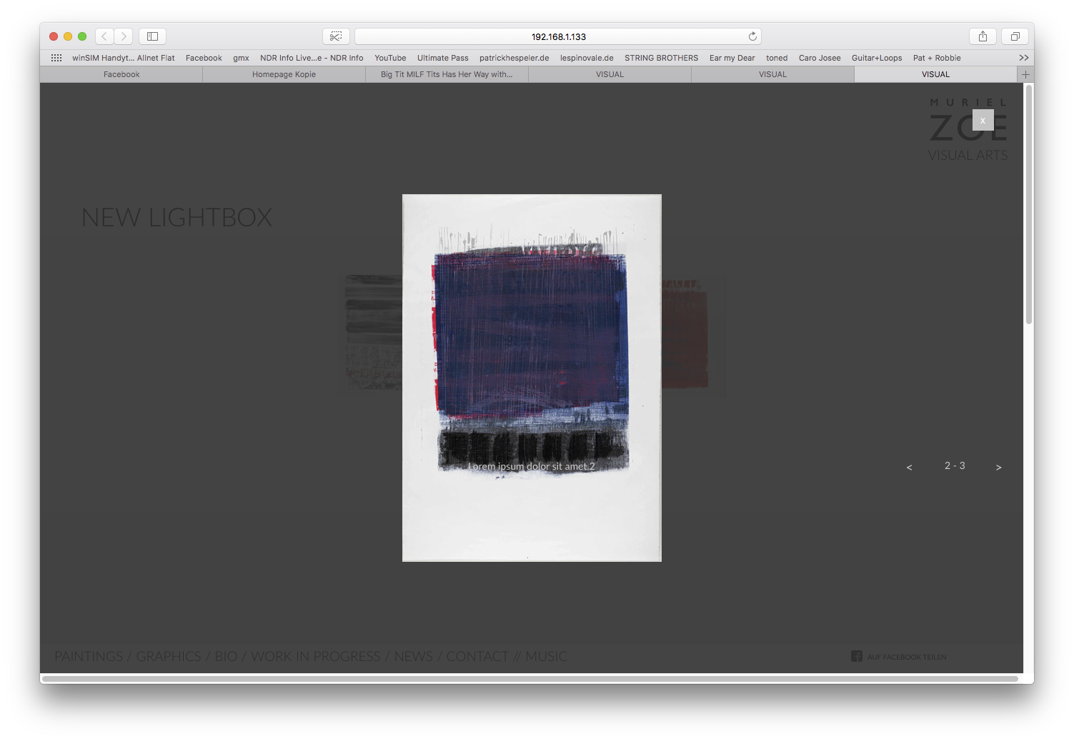
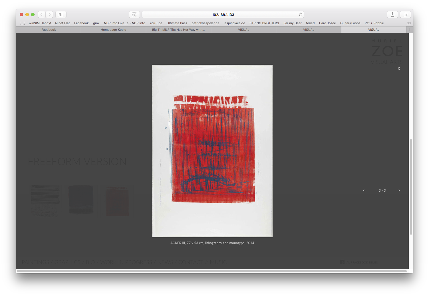
2. As recommended I built a new test-project with three of the pictures (different formats) of may client. Including my older freeform version and the new lightbox. In both lightbox galleries the behavior of the captions and controls are not synchrone withe the shown picture. Only in the freeform version the captions are ok:
New lightbox – in the muse project it looks fine:
New lightbox – in browser... problem with captions und controls:
(old) freeform lightbox – in the muse project it looks fine:
(old) freeform lightbox – in browser... problem with controls:
Please have a look onto this Muse project:
Best regards
Patrick
Copy link to clipboard
Copied
There are different „issues“ with that:
1. Your „New“ light box“:
If you want the thumbnails not to resize, set the thumbnail container to „Resize: None“. This will set the thumbnail to „Resize: None“ too.
But now you have to be aware that these elements really(!) don’t resize.That means, they will bleed out of your breakpoint/page width, when resizing the browser window, if you don’t take precautions. At the moment, the browser window gets smaller than the breakpoint width, the thumbnail container is still centred in the breakpoint, but not in the browser window any more. Just look at this screencast:
You can see this very clearly, if you colorise the thumbnail container (as I did in the screencast above and the following screenshot) and drag the scrubber (this grey vertical handle top right to the breakpoint bar) slowly inwards: The thumbnails „bleed" outside. That is the reason, why it appears, as if centring the thumbnails isn’t possible. But it is. You simply have to handle this situation correctly.
The way out: Resize the thumbnail container so, that it won’t touch the breakpoint boundaries at any time. When it tends to reach the boundary, create a new breakpoint and resize the thumbnail container.
This is the „essence“ of fixed width elements/breakpoint, and can’t be changed.
2. The asynchrone shifting of control elements and caption:
This is a small glitch in actual Muse, which can simply be avoided: Place all the light box elements to the left outside of your page area. Otherwise they may conflict with other page elements in some situations:

Copy link to clipboard
Copied
https://forums.adobe.com/people/G%C3%BCnter+Hei%C3%9Fenb%C3%BCttel schrieb
There are different „issues“ with that:
1. Your „New“ light box“:
If you want the thumbnails not to resize, set the thumbnail container to „Resize: None“. This will set the thumbnail to „Resize: None“ too.
But now you have to be aware that these elements really(!) don’t resize.That means, they will bleed out of your breakpoint/page width, when resizing the browser window, if you don’t take precautions. At the moment, the browser window gets smaller than the breakpoint width, the thumbnail container is still centred in the breakpoint, but not in the browser window any more. Just look at this screencast:
You can see this very clearly, if you colorise the thumbnail container (as I did in the screencast above and the following screenshot) and drag the scrubber (this grey vertical handle top right to the breakpoint bar) slowly inwards: The thumbnails „bleed" outside. That is the reason, why it appears, as if centring the thumbnails isn’t possible. But it is. You simply have to handle this situation correctly.
The way out: Resize the thumbnail container so, that it won’t touch the breakpoint boundaries at any time. When it tends to reach the boundary, create a new breakpoint and resize the thumbnail container.
This is the „essence“ of fixed width elements/breakpoint, and can’t be changed.
>>> Thank you, Günther, that helps me.
2. The asynchrone shifting of control elements and caption:
This is a small glitch in actual Muse, which can simply be avoided: Place all the light box elements to the left outside of your page area. Otherwise they may conflict with other page elements in some situations.
>>> I tried this (screenshot 1). At the two test breakpoints 960 px and 1366 px the position of the controler and captions is as desired. a browser postion between the brakpoints causes the controler to be asynchronous again (out of control ;-)) see screenshot 2.
screenshot 1

screenshot 2
Here is the actual Muse file:
Copy link to clipboard
Copied
Open Muse, zoom out, so you have an overview of the thumbnail container and the complete light box. Try to understand, what happens:
- The caption is placed directly under the image and moves synchronously with the image – just as all elements on the page do (for example an image and a tex tbox below).
- The controls are not placed vertically under this image container and therefore aren’t affected, when the image is scaling. (The same happens, if you place an image on your page and a text box below, but not vertically „under“, but to the left/right of the image)
Solution:
- Make the hero image container wider, so that it is placed vertically over the control elements too.
- Reposition the caption, so that it centres again under the image
Look at this screencast (for better visualisation, I colorised the hero image container, the caption and the slide controls:
There may be still small(!) divergences, but these are caused by the different scaling behaviours of the individual elements.(images, text boxes, rectangle container), and can b– if necessary – simply managed by slight repositioning per breakpoint-wise
Copy link to clipboard
Copied
Sorry Günter, I have to work on different issues of Muse projects.
(I also had problems displaying the thumbnails centered on the page - even when used with a grouped rectangle guides. Now it seems working.)
What I do not realize yet is how I design the lightbox so that it works well in portrait as well as in landscape mode (for example on a mobile phone) - if possible so that I do not have to generate so many breakpoints.
In the Heikos gallery example, I like the fact that the images in the small, mobile versions are going to the edge in the width. Is that possible with the Muse Lightbox?
Unfortunately, the pictures in the small high formats of the mobile devices, the pictures are not so big, as in Heiko's example.
http://www.heikomueller.de/paintings/
Paintings - Heiko Müller - Paintings and Drawings
Heiko's Lightbox:
Meine Test-Lightbox:
Regardless of that, I'm afraid if I've already populated the gallery with pictures, I'll have to adjust the size of each one by hand, in every breakpoint, right? I suppose you should set the size for a picture before filling, right?
Best regards, Patrick
::::::::::
Sorry Günter, ich muss gerade an verschiedenen issues von Muse Projekten arbeiten.
Ich hatte auch Probleme, die Vorschaubilder zentriert auf der Seite darzustellen – auch unter der Verwendung mit einem gruppierten Rectangle-Guide. Jetzt geht es scheinbar.
Was mir noch nicht klar ist, ist wie ich die Lightbox so gestalte, dass es im Hoch- wie im Querformat gut funktioniert (z.B. beim Handy) – nach Möglichkeit so dass ich eben nicht so viele Breakpoints erzeugen muss.
Bei dem Heikos Galerie Beispiel gefällt mir, dass die Bilder in den kleinen, mobilen Versionen in der Breite bis an den Rand gehen. Geht das mit der Muse Lightbox?
Leider sind die Bilder in den kleinen Hochformaten der mobilen Geräte die Bilder nicht so schön gross, wie in Heikos Beispiel.
Paintings - Heiko Müller - Paintings and Drawings http://www.heikomueller.de/paintings/
Unabhängig davon: Ich befürchte, wenn ich die Galerie bereits mit Bildern bestückt habe, muss ich die Grösse bei jedem einzelnen von Hand nach justieren, in jedem Breakpoint, richtig? Ich vermute, man sollte vor dem Befüllen, die Grösse für ein Bild anlegen, richtig?
Schönen Gruss, Patrick
Copy link to clipboard
Copied
Geh doch weg von diesem Phone/Tablet/Computer-Denken! Wenn du an Geräte denkst, müsstest du Hunderte, Tausende Breakpoints erstellen.
Platziere Breakpoint dort, wo das Layout nicht mehr funktioniert. So lässt sich auch das Problem Hoch- und Querformat lösen (auch auf dem Handy können unterschiedliche Breakpoints genutzt werden.)
Wenn dir das alles zu viel ist (es scheint fast so, denn allein diese Slideshow-Frage füllt inzwischen schon Stunden von Arbeit auf Seiten der Helfer), dann schau dir mal die entsprechenden Widgets von MuseThemes an. Um sie zu nutzen, brauchst du allerdings eine recht günstige Ein-Jahres-Mitgliedschaft. Dafür kriegst du aber auch den kompletten Bestand der sehr hochwertigen MT-Widgets.
Copy link to clipboard
Copied
Hallo Günter >>>
https://forums.adobe.com/people/G%C3%BCnter+Hei%C3%9Fenb%C3%BCttel schrieb
Geh doch weg von diesem Phone/Tablet/Computer-Denken! Wenn du an Geräte denkst, müsstest du Hunderte, Tausende Breakpoints erstellen.
>>> ... ich werde es bei den zukünftigen Projekten versuchen, danke.
https://forums.adobe.com/people/G%C3%BCnter+Hei%C3%9Fenb%C3%BCttel schrieb
Platziere Breakpoint dort, wo das Layout nicht mehr funktioniert. So lässt sich auch das Problem Hoch- und Querformat lösen (auch auf dem Handy können unterschiedliche Breakpoints genutzt werden.)
>>> ... Hast Du ein Bespiel für mich, wie ich dies lösen kann? Ich verstehe noch nicht, wie ich eine Slideshow anlege, die sowohl im Hochformat als auch im Querformatfunktioniert also wie in dem Beispiel von Heiko Müller's Galerie. Bei Youtube und Co finde ich nur sehr knapp beschriebene Tutorials, die auf das Thema „hoch /quer ” nicht eingehen. Eine im Querformat angelegte Slideshow wirkt auf dem Handy im Hochformat schnell sehr klein (u.U. sind die Bilder dann nich viel grösser als die Thumbnails).
https://forums.adobe.com/people/G%C3%BCnter+Hei%C3%9Fenb%C3%BCttel schrieb
Wenn dir das alles zu viel ist (es scheint fast so, denn allein diese Slideshow-Frage füllt inzwischen schon Stunden von Arbeit auf Seiten der Helfer), dann schau dir mal die entsprechenden Widgets von MuseThemes an. Um sie zu nutzen, brauchst du allerdings eine recht günstige Ein-Jahres-Mitgliedschaft. Dafür kriegst du aber auch den kompletten Bestand der sehr hochwertigen MT-Widgets.
>>> ... Ich verstehe, was Du meinst, und Danke Dir für Deine Zeit. Zu meiner Entschuldigung möchte ich sagen, dass auch ich viele Stunden verbrauche um mit komplizierten Situationen umgehen zu können, denn sowas muss man erstmal rausfinden:
· Das Bearbeiten durch Platzieren der Lightbox neben dem Canvas...
· Verwendung von Guide-Frames
· Das Beginnen mit dem Gestlten der Seite in dem grössten Breakpoint
· u.v.a.
Hinzu kommen einoge Buggs/Kinderkrankheiten/Kompliziertheiten von Muse, die gerade Gestalter, die eben keine Programmierfachmänner (und wohl keine Minderheit der User und Käufer und damit wohl auch Zielgruppe von Adobe Muse) sind, zu schaffen machen. Trainingworkshops in meine Nähe kosten horrende Summen an Euro, und sind meist nur für Beginner.
Das Thema Slideshow ist für mich so wichtig, weil ich es fast immer verwenden muss, und weil ich in Zukunft ohne die Hilfe von Kennern wie Dich auskommen möchte.
Ganz blöde bin ich ja nicht. Simple Webseiten mit Muse kann ich gestalten – ich versuche nur, diese für mich und meine Kunden nicht 0815 ausschauen zu lassen. Ich nehme aus dieser Diskussion mit, dass ich dies schaffen muss, ohne den strukturellen Aufbau der Seite zu verkomplizieren.

Copy link to clipboard
Copied
Die Bilder von Heiko Müller sind quadratisch. Die von Dir sind hochformatig also immer etwas schwerer zum Einbauen.
Der Browser richtet sich danach, wie groß Dein Bild angelegt wurde und verkleinert es, sobald das Browserfenster schmaler wird.
Die Höhe des Bildes ist dem Browser ziemlich egal, denke ich.
Wenn es ins Hochformat eines Handys reinpassen soll machst Du am besten keine Lightbox mehr sondern nur noch einfache Bilder.
Oder Du verwendest eine normale Diashow mit Hochformatbildern, die kann auch "gewischt" werden. Diese sollte dann natürlich in anderen Breakpoints nicht gezeigt werden.
Uwe
Copy link to clipboard
Copied
Hi,
fotoroeder schrieb
Die Bilder von Heiko Müller sind quadratisch. Die von Dir sind hochformatig also immer etwas schwerer zum Einbauen.
jein, leider noh schlimmer – die Bilder von meiner Kundin sind beides – hoch- und querformatig.
Der Browser richtet sich danach, wie groß Dein Bild angelegt wurde und verkleinert es, sobald das Browserfenster schmaler wird.
Die Höhe des Bildes ist dem Browser ziemlich egal, denke ich.
Wenn es ins Hochformat eines Handys reinpassen soll machst Du am besten keine Lightbox mehr sondern nur noch einfache Bilder.
Oder Du verwendest eine normale Diashow mit Hochformatbildern, die kann auch "gewischt" werden. Diese sollte dann natürlich in anderen Breakpoints nicht gezeigt werden.
Uwe
>>> Ich habe noch etwas herum probiert ziehe das Fazit daraus: Will ich, dass das bild in der Lightbox wie in Heikos Beispiel im Hochformatbrowserfensetr bis an den Rand geht, muss ich die Light box in einem eigenen Hochkant-Breakpointlayout anlegen, da sich die Lightbox

Copy link to clipboard
Copied
Hi I'm also having problems with the lightbox feature,
I'm working for a client who wants to display previous projects with text accompanying
It's working fine on my laptop and phone, but on a narrower browser the text is falling off the page
I've used the browser "drag to simulate browser width" scroll bar and it doesn't appear to overlap at any point. I also had trouble on the mobile site initially, it's now working on my phone but I don't know how I fixed it, and is slightly aligned right on the clients
I can't figure out how to share on the new adobe cc desktop app, can you share a link to a folder I can share it in?
here are some screenshots of the problem


thanks
Copy link to clipboard
Copied
Best way to start a new thread as this one is already solved and will probably not be viewd at.
Yes you can drag a folder with its .muse into the CC on your machine - wait for it to be synchronized and share a link with "right click".
Please reduce your .muse to only one page with the elements with issues save it with a new name into CC (or as I wrote earlier - drag the new folder with the new .muse into CC). It doesn`t has to be a folder, the .muse is just enough - btw.
Kind Regards,
Uwe
 AdChoices