 Adobe Community
- Home
- Muse (read-only)
- Discussions
- Re: Random displacement of images and text
- Re: Random displacement of images and text

Copy link to clipboard
Copied
Hi,
I'm hoping someone can help.
I've published a Muse-built website; it has kinks I'm trying to iron out. The main one is that elements have become displaced on one specific page of the mobile version of my site:
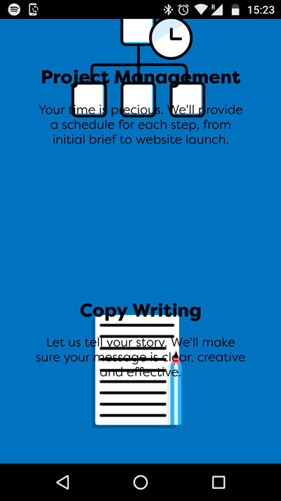
This is on an android phone. On my iPhone everything appears as it should be:
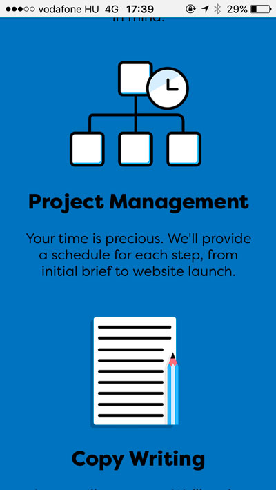
The elements in question are all pinned to be centrally aligned to the content area and have their sizes locked. These are exactly the same settings as I have on other pages where this is not happening.
Originally the elements were moving AND the text was also aligning to the left on android phones (not the iPhone) so I rebuilt the page from scratch. This solved the alignment issue for the text but not the random moving of text and images.
Any help or suggestions would be really appreciated.
Thanks,
Peter


 1 Correct answer

I see, you have a responsive layout from 1279 px to 320 px and an extra phone layout from 320 px to 380 px – what means, you have overlapping page width values. This may lead to interferences: Which layout should the browser at overlapping widths?
And: I don’t know the specifications of the Android phones, which mess up your site. But it is possible, that they don’t use your phone layout, because the logical resolution is higher than 380 px..
For further information, read my answer here.
I would
...
 10
Replies
10
10
Replies
10

Copy link to clipboard
Copied
Maybe there´s some "grouping" helpful?
Grouping of the elements which behave wrong?
Copy link to clipboard
Copied
Hi Fotoroeder,
I just checked and it doesn't seem to be anything to do with groups but thanks for the suggestion; before I double-checked I really hoped and believed that'd be it and the issue would be solved. Alas, no 
Thanks for your help,
Peter
Copy link to clipboard
Copied
On your mobile site you don`t need an additional breakpoint at 320. What do you want to break from there? I think you do not even need any breakpoints. Why not use only 320 or 380 as one size /site property? Normally muse and browsers are doing quite well if you use phone layout.
But anyway, I cannot see your issue, mentioned above. Do I miss something?
Uwe
Copy link to clipboard
Copied
I had a look at the area of your site, which you showed us in your screenshots. And, like Uwe, I couldn’t detect any of the issue, you mentioned in your initial post:

Copy link to clipboard
Copied
Hi Günter,
I just responded above but wanted to write and say thank you for your help and interest in this.
The issue is the phone layout for the site, which is broken into pages. It looks fine in Muse and fine on my iPhone but not on the 2 android phones it was tested on.
Anyway, thanks for your time on this.
Peter
Copy link to clipboard
Copied
I see, you have a responsive layout from 1279 px to 320 px and an extra phone layout from 320 px to 380 px – what means, you have overlapping page width values. This may lead to interferences: Which layout should the browser at overlapping widths?
And: I don’t know the specifications of the Android phones, which mess up your site. But it is possible, that they don’t use your phone layout, because the logical resolution is higher than 380 px..
For further information, read my answer here.
I would try to publish your site without the phone layout, and look, what happens. The simplest way to achieve this, is activating the phone layout, going to menu "Site Properties/Layout" and deselect "Redirect from Desktop".
Copy link to clipboard
Copied
Hi Günter,
Thanks a lot for that suggestion. Although I had hoped for a phone version that was separate from the desktop one your suggestion does provide a real solution. And I feel I've learned more about the working of Muse which is very helpful.
Thank you very much for your help,
Peter
Copy link to clipboard
Copied
Hi Uwe,
Thanks for looking into it. And you're right about the 320 breakpoint (these sorts of tips are really helpful for my learning, so thanks).
The issue is not with the Desktop version. I created a separate phone design as I wanted it broken into pages and not one long scrolling page like the desktop version.
It's the 'How We'll Work Together' page that, when displayed on an android phone (or at least the 2 different ones it was tested on) didn't work. On my iPhone the page looks as it does in Muse.
Thanks again for your help,
Peter
Copy link to clipboard
Copied
We discussed this kind of problem over and over again. Please give us a .muse file, which demonstrates the issue. The elements shown in your screenshot are enough! Upload this .muse file to Dropbox or a similar service and give us the download link. Otherwise we have to start an endless trial and error session.
Copy link to clipboard
Copied
Hi Günter,
I've uploaded the file to Dropbox. Here's the link:
https://www.dropbox.com/sh/op4evpuifv6j7au/AAAtq62IJMo1l_J3lKgfT1pXa?dl=0
Thanks for your help,
Peter
 AdChoices