 Adobe Community
- Home
- Muse (read-only)
- Discussions
- Re: Graphics/Objects move around on page.
- Re: Graphics/Objects move around on page.

Copy link to clipboard
Copied
I am having the same issue: I have a composition widget, image, and colored box. that keeps changing its position in my largest break point but is fine in all my other break points. I've tried multiple things and don't know why it has started doing that. My website has been published for months and it didn't do that before. I recently tweaked around with the tablet version of my website and that's the only thing that I can think of that I've done to change anything.
My website is JRock Construction & Concrete - Do More Be More Suck Less the composition widget underneath "Companies We've Done Business With"
Thanks,
Paul Barlow


 1 Correct answer

Group the all images in one row:
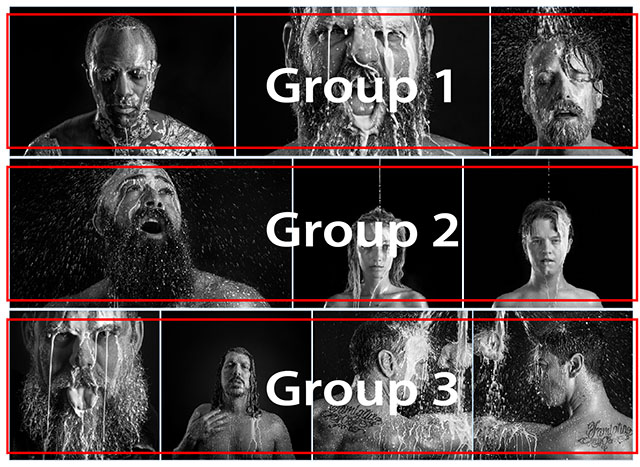
It is very hard for a visual web design tool to determine exactly, which element the creator intends to influence which other elements. Much room for misinterpretaions!  This is especially true, if elements of different sizes and scaling behaviour are in the game. In this case, the „confusing“ element is the menu. If you delete it test-wise, all works well.
Therefore grouping is one(!) important tool to tell Muse, which elements should be treated equally.
 12
Replies
12
12
Replies
12

Copy link to clipboard
Copied
Hey Paul,
I have branched out this discussion from previous thread as it was 3yrs old and maybe not very effective.
However, as per your issue description, I understand that a particular composition and its parts are changing their position in the largest breakpoint, correct?
For this I have checked your site but, unable to find any change in different breakpoints of the site.
Can you please point us to the exact issue and more helpful if you can post some screenshots showing that as we can try replicating it our ends.
Regards,
Ankush

Copy link to clipboard
Copied
I haven't gotten any help with the issue I posted on August 31st. I'm seeing all kinds of threads about this issue but no solutions. I need help to get this figured out so I can complete this work. Thank you for any help in advance!
Chick

Copy link to clipboard
Copied
I guess, nobody wants to see this. Please moderator, could you delete this link?
Couldn`t you use a placeholder for this question?
Really please, everybody can do whatever one wants to look at …
Kind Regards,
Uwe
Copy link to clipboard
Copied
Could you please give us a screenshot of this area in layout view and browser view?
Like ankushr40215001 I can’t see the issue, you are mentioning
Copy link to clipboard
Copied
Hi Everyone,
I'm having similar problems to this. While the formatting for all image filled rectangles is identical, I have a few images that seem to be behaving as though they have been pinned when they are not. They seem to be behaving as though they've been told they should be vertically aligned/pinned. As I said though, nothing has been pinned to the browser or content areas. Not sure why some of these get whacky when everything else is cool. Oh, and I should mention the whackiness commences between these breakpoints (1400, 1200 and 960).
If someone could go to this link and check out the purple image as you resize the browser (Chrome) and let me know if you have any ideas as to what the issue is? I'd appreciate it!
Chick
Copy link to clipboard
Copied
tchickmcclure: There are tons and tons of correct answers to this issue.
But, as this can have different reasons, a look at a .muse file is necessary. So please give us a .muse file with only one page, only the bad behaving elements ynd inly the necessary breakpoints to check. Please follow the instructions given here: https://forums.adobe.com/docs/DOC-8652
Copy link to clipboard
Copied
Hello Gunter!
Thank you so much for getting back to me. I really appreciate it and have tried MANY solutions to fix this issue with no luck. Hopefully, you'll see something very simple that is causing me the trouble.
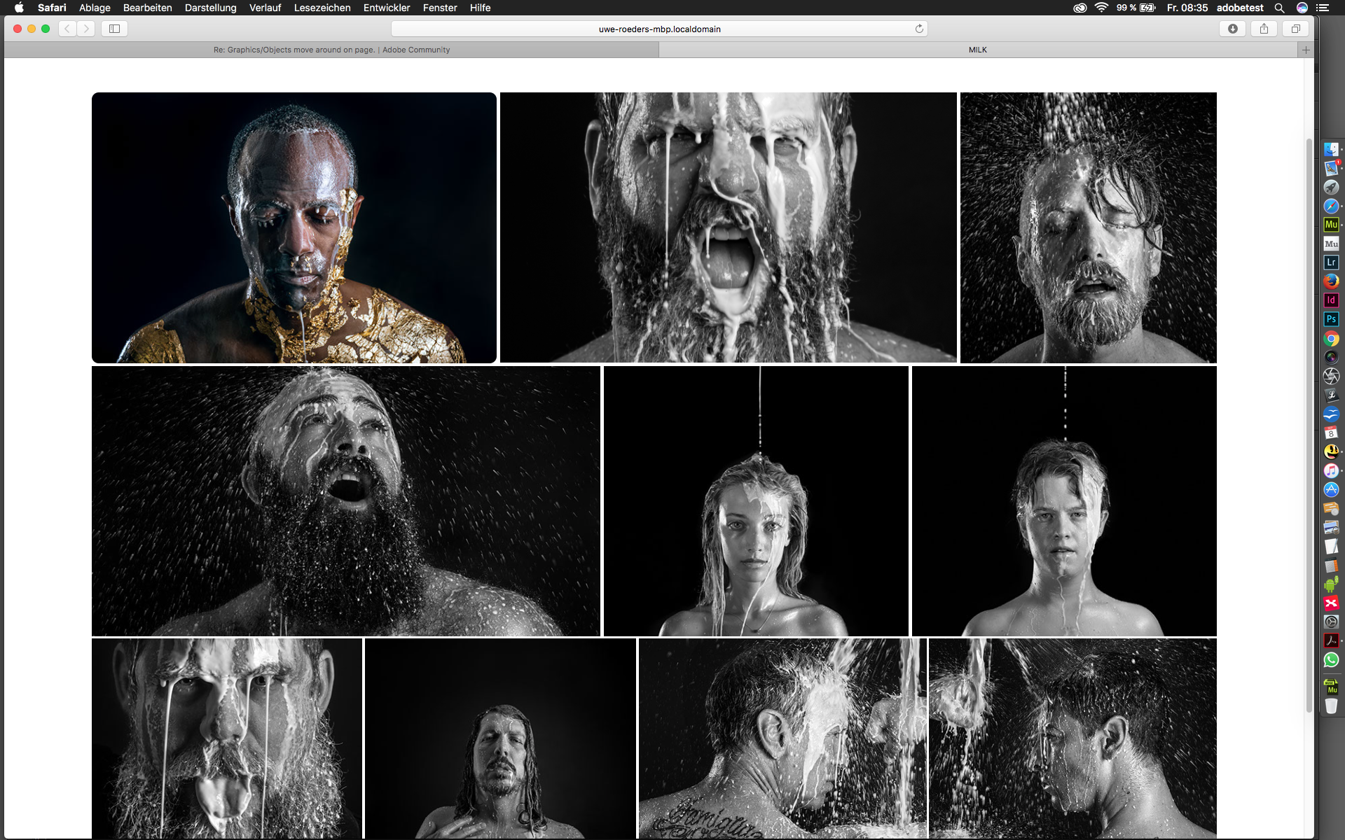
Here's the link to my site:
http://tchickphoto.com/milk
Here's a link to my .muse file:
Dropbox - 4ADOBEMUSETEAM
And here's a screengrab of the issue in action (which seems to be occurring after entering the breakpoints):
I think it's obvious, but just in case, the two images that behave as though they're pinned to the top in some way and break the bounds of my grid are, the woman in the center image and the man with his hand on his chest second from the bottom left.
Thank you in advance for your help!
Chick
Copy link to clipboard
Copied
Back again.
Starting with your master, I recommend to use breakpoints only when necessary and not by default.
In your case the master could look like this because, fortunately, very little that "breaks" your design, which I like, though.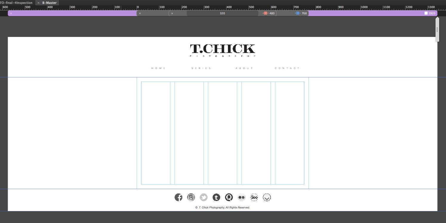
And there´s no breakpoint necessary at 320 as the devices, smaller than 320 are veryvery little  .
.
Advantage, the file gets much lighter and the appearance over all gets less jumpy, when resizing the browser.
Changing the Master lead to the fact, that I couldn`t see your error any more:
I have to admit, that I don`t know why this happens but now everything looks fine. I also changed the footer to be a sticky footer.
(checkmark in site properties).
Here´s my version of the .muse.
Dropbox - TCHICKPHOTO-final-4Inspection.muse
That´s just one way, maybe there are others, of course.
Best Regards,
Uwe
Copy link to clipboard
Copied
Group the all images in one row:

It is very hard for a visual web design tool to determine exactly, which element the creator intends to influence which other elements. Much room for misinterpretaions!  This is especially true, if elements of different sizes and scaling behaviour are in the game. In this case, the „confusing“ element is the menu. If you delete it test-wise, all works well.
Therefore grouping is one(!) important tool to tell Muse, which elements should be treated equally.
Copy link to clipboard
Copied
Gunter!
Thank you! I cleared out all the things you suggested with breakpoints, made that footer sticky and grouped. It's not breaking! Thank you, thank yoU!
Chick
Copy link to clipboard
Copied
Nice to hear that to works.
Uwe

Copy link to clipboard
Copied
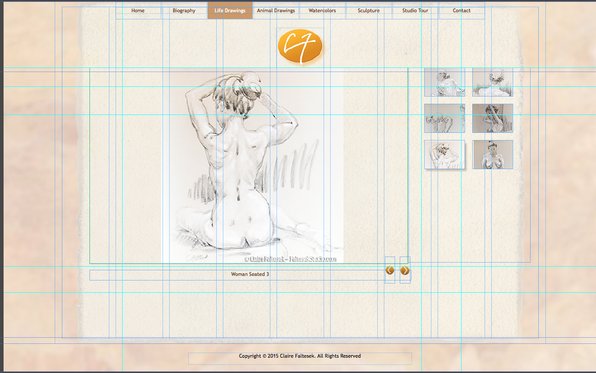
So similar problem. I have a site that has been working fine for quite some time. I just refreshed one of the images and now the images in the slide show thumbnails move on preview and publish for all but one of the pages. I do not see an difference between the page structures, so I'm not sure how to fix.
 AdChoices