 Adobe Community
- Home
- Muse (read-only)
- Discussions
- Re: reponsive design - At Smartphone, gaps between...
- Re: reponsive design - At Smartphone, gaps between...
Copy link to clipboard
Copied
Hello, I am editing a template which I have purchased on themeforest!
Everything works and looks great on the computer as well.
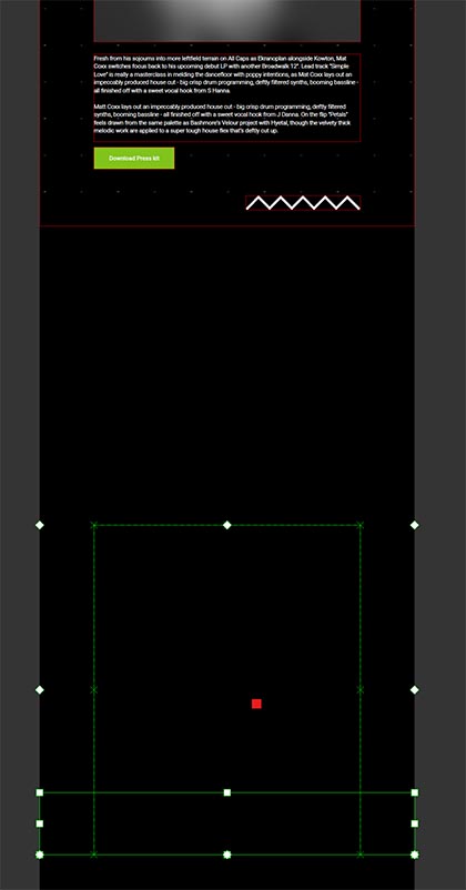
But as soon as I call it on my smartphone there are always big gaps between the blocks!
How can I fix this?
my site: CuePlay - DJ / Producer Personal Website Responsive Muse Template
my projectdata: Dropbox - DJ Palmi.muse
 1 Correct answer
Hey DJPalmi,
Thought to give a look at your site and found that there isn't anything can do for this, it's a flaw in design itself.
I don't even say it as a flaw but maybe slight misaligned settings which can be solved very easily but manually.
For ease of access you can reduce the page to 25 % and then try adjusting the contents as described above by our expert.


Hope this helps.
Regards,
Ankush
Copy link to clipboard
Copied
No secret about it! There are several simple issues:
1. Invisible elements:

Delete them.
2. Many elements „bleed“ outside the page/breakpoint width. This is forbidden, because it causes heavy issues on mobile devices. Read this document for further information: https://forums.adobe.com/docs/DOC-8953 Make sure, that no element in no breakpoint ever overlaps/is placed outside the page/breakpoint width.
3. You have to adjust the vertical position of your elements breakpoint-wise. If you do this, most issues will be gone:
- Go to the specific breakpoint
- Select the first element, which has a too large distance to the other elements.
- A double triangle appears at the right side of Muse’s application window:

- Drag it upwards, until the spacing is correct. This causes all elements below the icon to move synchronously up/downwards.
- Repeat that for every misplaced element in every breakpoint.
- You’ll find the reason for this behaviour and a way to avoid it, by reading my answer in this thread: https://forums.adobe.com/message/8749608#8749608
If these informations don’t solve your issues. Correct you document and share it again.
Copy link to clipboard
Copied
Hello Günter, thank you for your quick reply.
I have followed all your steps.
Unfortunately, there are still big gaps in the smartphone version.
my file after your tips: Dropbox - DJ Palmi.muse
please help me 😕 P.s. i'm not a expert i'm a newbie of this programm
Copy link to clipboard
Copied
I will have a look tomorrow! ![]()
Copy link to clipboard
Copied
Hey DJPalmi,
Thought to give a look at your site and found that there isn't anything can do for this, it's a flaw in design itself.
I don't even say it as a flaw but maybe slight misaligned settings which can be solved very easily but manually.
For ease of access you can reduce the page to 25 % and then try adjusting the contents as described above by our expert.


Hope this helps.
Regards,
Ankush
Copy link to clipboard
Copied
Thanks!!!! Its perfect.
Copy link to clipboard
Copied