 Adobe Community

Copy link to clipboard
Copied
Hello,
I have a problem concerning the menu on the mobile version of my responsive Muse website. Probably it's a simple setting, but I am quite new to using Muse so any idea to solve this issue is welcome 🙂
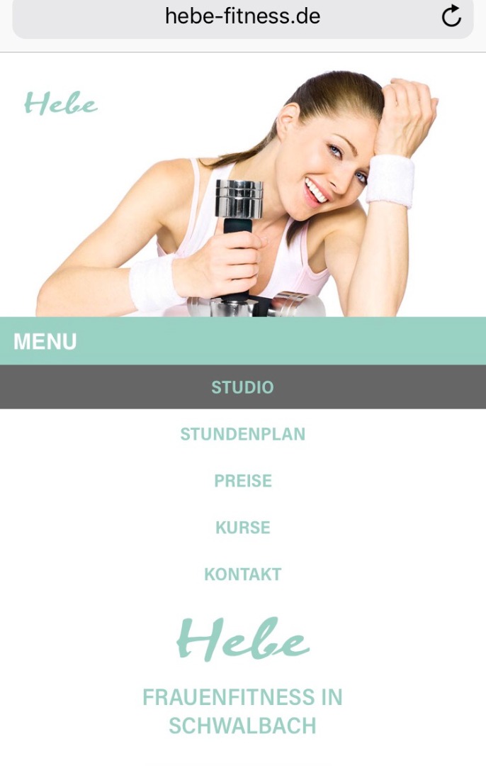
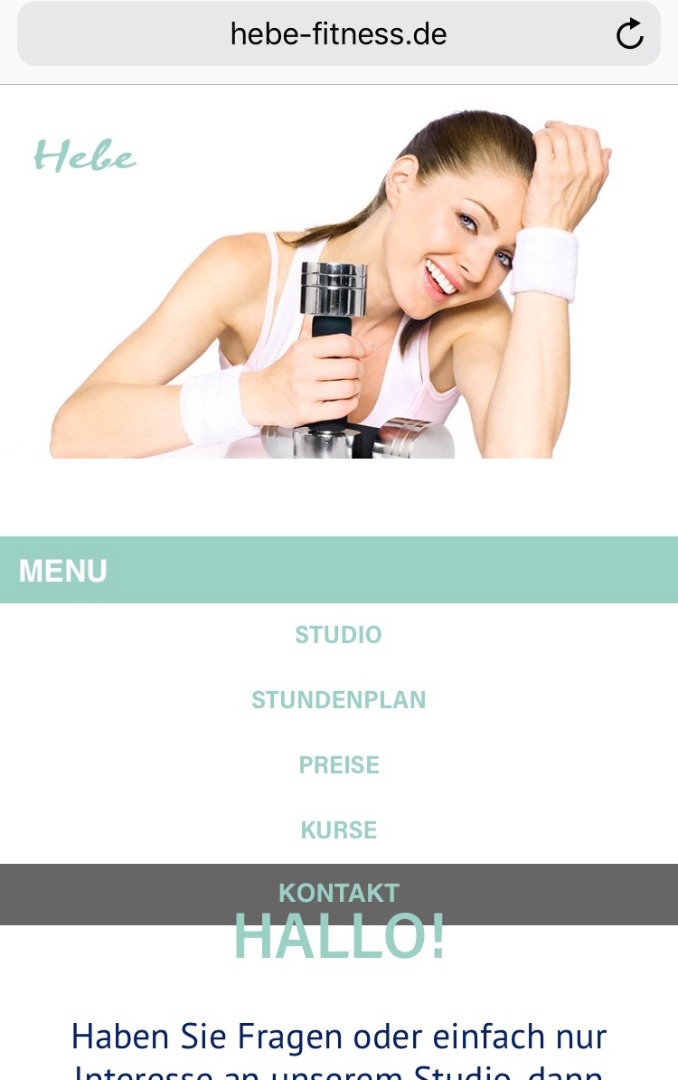
I created a master layout which includes at the mobile breakpoints a different menu than for the desktop version. My page has 5 main pages. Somehow on the mobile version (iPhone 7) the last page (Kontakt ... my page is in german) the menu is pushed down a little bit and as a result it's covering or melting with the text below. I can't figure out what setting is different on this page, because the master is continuously the same on every page.
Please see those two screenshots to get an idea of the issue:
Any idea whats happening? Or which setting I got wrong on the last page?
Thanks in advance ...
cheers 😄
Laura


 1 Correct answer

Thank you for sending your source file!
There are some issues, but not all are related to your „jumping accordion“ issue.
First the „unrelated“ issues:
- You have a responsive page, and you don’t need the alternate „tablet“ and „phone“ layouts any more. They only may confuse some browsers. Therefore I’d recommend to delete these layouts: Go to „Plan“ mode, right click onto the „Tablet“ and „Phone“ button, and select the „Delete“ command.
- You have a fluid breakpoint at 320 PX on master and layout page.
 7
Replies
7
7
Replies
7

Copy link to clipboard
Copied
Would it be possible for you to share the URL of your site so that we can test it at our end? If you are OK with sharing your muse site, upload it to a shared location, and share the link over a private message. To send a private message, click my picture and use the Message button.
Thanks,
Preran
Copy link to clipboard
Copied
Hi Preran, thank you for your response. The URL is shown in the screenshots I attached in my original question. It is www.hebe-fitness.de
I will send you in a private message the reduced muse site as Günter Heißenbüttel suggested.
Laura 
Copy link to clipboard
Copied
At first, one silly question: Is it possible, that the text "Vereinbare ein kostenloses und unverbindliches Probetraining! 06831-54991“ is still there in the smaller breakpoints, but set invisible by using „Colour: None“ or hidden behind the image? If so, the text could could flow in a new line, because the text box is reduced in width, when reducing the screen size?
If no, could you please do the following:
- Open your site in Muse.
- Delete all pages, but the master page and the „Kontakt“ page. (Reducing the .muse file in this way, will accelerate downloading and analysing the site considerably.)
- Save this .muse file under a new name.
- Share it with us using Dropbox, CC Files or a similar file sharing service.
- You may follow these instructions: https://forums.adobe.com/docs/DOC-8652
Ich denke, wir kriegen das schon hin!
Copy link to clipboard
Copied
Hi Günter,
thank you for your response and the nice instructions. Good idea to check the textbox. But I don't think the "Vereinbare ein kostenloses und unverbindliches Probetraining! 06831-54991“ is the problem. If so, why is it not happening on all of the other pages, too. This textbox is on all pages the same (master) and invisible for the tablet/mobile breakpoints.
I will send you the reduced site to download.
Dankeschön 
Laura
Copy link to clipboard
Copied
Thank you for sending your source file!
There are some issues, but not all are related to your „jumping accordion“ issue.
First the „unrelated“ issues:
- You have a responsive page, and you don’t need the alternate „tablet“ and „phone“ layouts any more. They only may confuse some browsers. Therefore I’d recommend to delete these layouts: Go to „Plan“ mode, right click onto the „Tablet“ and „Phone“ button, and select the „Delete“ command.
- You have a fluid breakpoint at 320 PX on master and layout page. Delete it. Is isn’t necessary at all: (a) you hardly will find a device smaller than 320 px screen width, and (b) even if there is such a device, the „minimal page width“ of this breakpoint is set to 320 px too! In other words: You tell the browser, to react responsively at a page width of less than 320 px, and at the same time you forbid the browser to do something like that, because he is told, that 320 px is the smallest possible width.
Now the important issues:
- Unpin the top image and the accordion in every breakpoint.
- Overlapping elements prevent each other to react truly responsive. So use the „Crop“ tool to drag the bottom edge of the top image exactly to the top edge of the accordion, so that it doesn’t overlap the accordion any more. Do this in every breakpoint.
- Above the accordion there are at least 2 elements which could be determined, to push the accordion up or down: The main image and the „Hebe“-logo. Muse is not a human and can’t know, which element is the „Master of Pushdown“. So help Muse, to understand, what you want: Group the main image and the accordion. So Muse has an idea, what you are trying to achieve.
- In a last step, pin this group in every breakpoint to the middle, using the „3-dot-icon“.
- You may now place the other elements below this header area upward, since there seems to be too much room. You even may configure the accordion, to push down the elements below.
As an example, I sent you a link to the modified, correctly working .muse file via personal message.
Copy link to clipboard
Copied
Wow! Günter, thanks so much 
really well explained ... awesome!
Beste Grüße
Laura
Copy link to clipboard
Copied
No problem!
 AdChoices