 Adobe Community

Copy link to clipboard
Copied
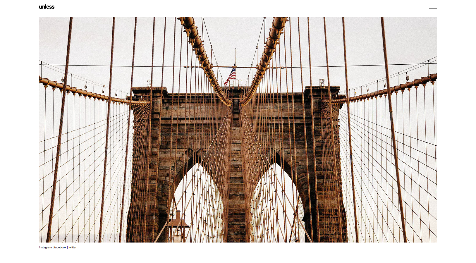
Hi there.
For my simple slideshow gallery, I followed painstakingly all the rules (I hope) of the responsive bible, but:
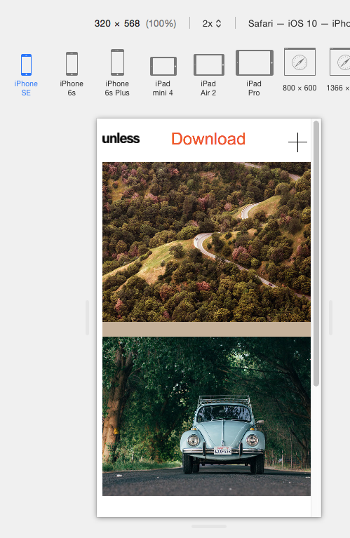
I have a problem with the last (smallest) one, set at 768 fixed + 768 fluid with minimum width of 320px.
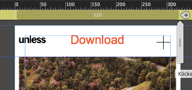
As you can see (attachments), the logo and the plus sign doesn't behave well aligned. I pinned it and I tried several ways to keep them aligned with the containers but no success. Also the don't keep the right vertical spacing in the small BP.
Please if you want to check the muse file: Dropbox - test.muse
Thank a lot for helping me.
Bart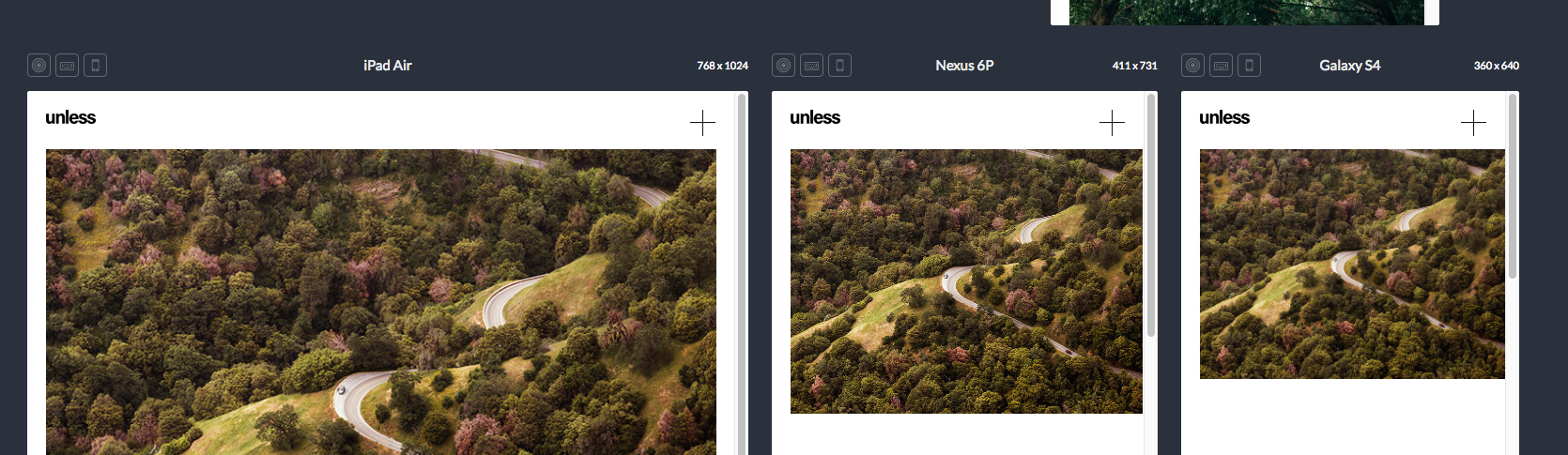


 1 Correct answer

It all works as expected. The problem is the same as very often: Pinning and scaling. Pinning isn’t relativ, scaling is.
And if pinned objects with no scaling shall align with elements, which scale proportionally, layout gets highly complex.
Therefore I suggest a much simpler way to get, what you want:
Try to simplify the layout by trying to combine equally scaling elements at (relative) equal positions.
In your layout:
- Assign no pinning to every element on your page in every breakpoint.
- Create two re
 27
Replies
27
27
Replies
27

Copy link to clipboard
Copied
On your master I realized you pinned the logo on some fixed width breakpoints, too.
This is not necessary. Don`t know, if this causes any issue at all, but ….
Master looks great though.
For some reason you pinned the all pictures to the top left corner of the browser?
From which rulebook did you get the info to pin elements on mobile to the browser?
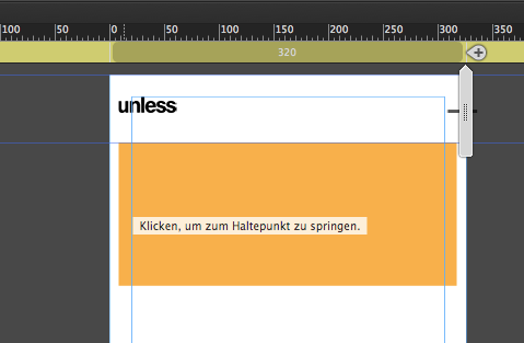
I added a light coffee filled rectangle (F) not (M). exactly between the first two pictures in order to let them keep the space.
You see the difference between the second and third picture without.
Set the minimum height to 800, instead of 1400, grabbed the "unterer Browserrand" lowest browser padding, so that there´s always a little space.
Watch this, if you like and need.
I hope you were not too fast – now the file is correct.
Best Regards,
Uwe
Copy link to clipboard
Copied
Let me face one point at a time:
- I pinned the logo where it needed to be pinned. I saw that if not pinned was not aligned
- now in a new version I didn't pin the containers and it's ok
- what do you mean with F or M?
- unterer Browserrand??
I need to understand why logo and + sign don't align well (damn!).
For me the most important view is from mobile.
Why if the image container act well, logo and + don't?
Copy link to clipboard
Copied
bartolomeo1888 schrieb
- what do you mean with F or M?
- unterer Browserrand??
You can create a rectangle with shortcut F (Frame tool) or shortcut M (Rectangle Tool).
Unterer Browserrand, watch the file and the guides for Footer, Padding and whatsoever in English.
On my master you can see what I did.
I need to understand why logo and + sign don't align well (damn!).
For me the most important view is from mobile.
Why if the image container act well, logo and + don't?
I cannot see any error? They align like you set them. Or is it that the picture is wider than the blue guides at 768?
Otherwise help us.
Copy link to clipboard
Copied
It all works as expected. The problem is the same as very often: Pinning and scaling. Pinning isn’t relativ, scaling is.
And if pinned objects with no scaling shall align with elements, which scale proportionally, layout gets highly complex.
Therefore I suggest a much simpler way to get, what you want:
Try to simplify the layout by trying to combine equally scaling elements at (relative) equal positions.
In your layout:
- Assign no pinning to every element on your page in every breakpoint.
- Create two rectangles (not image containers!) spanning from guide line to guideline, and set them to scale horizontally (in width only, not height and width). Check this in every breakpoint.
- Make one rectangle 15 px high and fill it with your logo ("unless"). Set filling options like this:
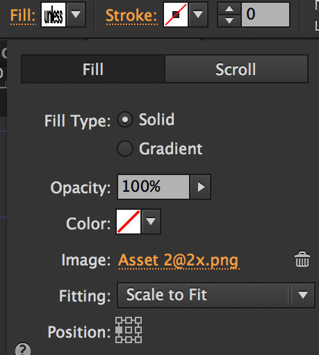
- Make the second rectangle 28 px high and fill it with the "+" icon. Use "Position: Centred/Right" in this case.
- Delete the old logo and plus images and place the two rectangles exactly at the top guideline of your layout.
- Check this in every breakpoint.
Now you should be done.
Here you can download this modified layout: https://www.dropbox.com/s/eyl3kv3iexvl9fj/bartolomeo1888.zip?dl=0
PS: UUUps a little bit late, but I hope, this helps though! 
Copy link to clipboard
Copied
- Assign no pinning to every element on your page in every breakpoint.
- Create two rectangles (not image containers!) spanning from guide line to guideline, and set them to scale horizontally (in width only, not height and width). Check this in every breakpoint.
- Make one rectangle 15 px high and fill it with your logo ("unless"). Set filling options like this:
- Make the second rectangle 28 px high and fill it with the "+" icon. Use "Position: Centred/Right" in this case.
- Delete the old logo and plus images and place the two rectangles exactly at the top guideline of your layout.
- Check this in every breakpoint.
The logo is much better now as it moves same was as picture.
But if you don`t pin the + sign to the right hand side of the container, the +sign moves far out of the canvas towards 320, doesn`t it?
Copy link to clipboard
Copied
I couldn`t find any error on "my" example, though. What am I missing?
Copy link to clipboard
Copied
I didn’t loook to your example, Uwe, because we wrote at the same time. Will have a look later this day!
My post refers to the original .muse file, not to yours.
Copy link to clipboard
Copied
And I was really faster?  .
.
bartolomeo1888 I changed the uploaded file so that DOWNLOAD doesn`t corrupt your logo and the +sign.
It looks almost perfect on my android as well. I don`t hink it`s a night mare any more.
If I miss something let us know.
Using the logo and plus in Guenters way is of course another appropriate way.
But I cannot see any big difference between those two ways.
I have to admit, that UNLESS and "+" at 320 is a little bit inside the border of the picture, but if this really a nightmare?
To put the logo with Guenters way is better for logo, for "+" I still think pinning to the right border of the container is better.
But you could just take away the pinning of the logo and you still would have text on mobile.
This looks good on my android, check your phones.
Best Regards,
Uwe
Copy link to clipboard
Copied
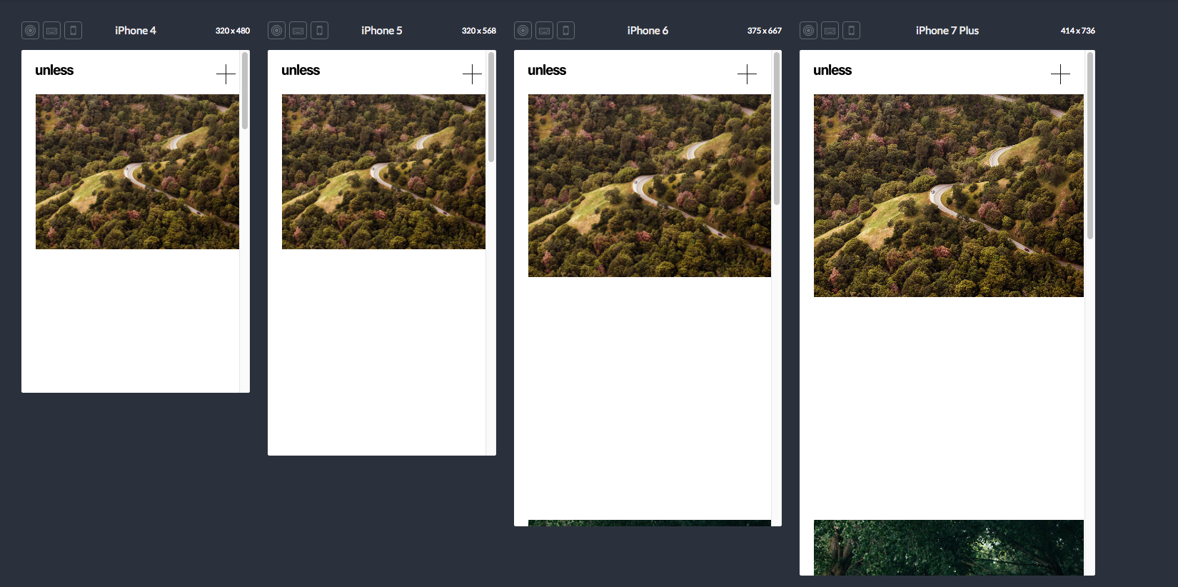
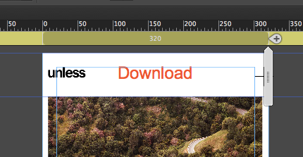
Thank you very much for your precious tip. I did it as you said with the logo and plus and it's ok but as you can see in the screenshot, at the smallest points, alignement do not behave well. No respect for the limit of the layout.
My goal is to have a "fluid" slideshow (centered) with fixed points as you saw in my .muse file but in the smallest point I change with boxes of each of my works and then each of them lead to a scroll page with all the images (only in mobile view).
I think that I'm almost there but I don't like this misalignement... 
Copy link to clipboard
Copied
Then have a look at the .muse file, which I have linked (answer post #3). There is no misalignment.
Copy link to clipboard
Copied
I don`t see any "BIG" disaster with "my" latest version: home . I unpinned the logo but pinned the "+" to container.
Android looks almost perfect.
Emulated looks all great:
Copy link to clipboard
Copied
I really don't know what to say.
This is an axample with the same setting as UWE's master page.
2 rectangles as in 3d thread, no pin, only resize width.
Copy link to clipboard
Copied
But do you see the difference between your screenshot and my screenshot from iPhone SE?
If you do not pin the logo the logo moves the same way than the picture (maybe not pixel perfect)
I only would recommend to pin the "+" to the right container border. I realize, no matter if you use a rectangle or a font, that they do not behave as the picture/frame.
But for me, as long as the logo is aligned I wouldn`t care too much about the "+".
That`s how my design looks like with logo unpinned and plus pinned to the right
That`s how it looks when "+" is unpinned as well.
That may sound like a compromise but one I could live with.
For some reason the pictures/frames do not keep the padding.
One way out could be to create white rectangle on each side, but I guess, even this would cause
some misalignment
That`s my latest version: home
Logo unpinned, "+" pinned.
The only way out would be to make the pictures on mobile full width.
Then the "alignment issue" is gone..
Go for it
Copy link to clipboard
Copied
Yes, there is a slight misalignment un Zwe's sample document, but there is an example file here in this thread without this issue.
But you seem to prefer ignoring this … Ok, your decision.
Copy link to clipboard
Copied
??
Copy link to clipboard
Copied
Im am out here! If nobody can say, what/who refers to what/whom, I really prefer having a coffee an ice cream .…
Have a nice day!
Copy link to clipboard
Copied
Sorry, I damaged your file and therefore it couldn`t work as your original file.
You set the frames to 728 on mobile and to resize, and so they behave the same way as the frames with pictures.
I got it, again. Thanks and again-sorry.
It´s all about the details.
Copy link to clipboard
Copied
Easy man.
I appreciate your help but I did exactly as in your file and maybe something is wrong.
You did it with the same container and I changed the container in the smallest breakpoint.
Now all the things is a bit confusing, I'm tired and I'll read again all the posts tomorrow morning.
What if I add a last breakpoint at 320px?
Copy link to clipboard
Copied
There´s no breakpoint necessary at 320. What do you want to "break" from there?
My excuse was meant for Günter Heißenbüttel. I corrupted his file.
His file works exactly as intented and expected for your alignment issue.
Please watch properly how he set the rectangles that content logo and "+".
They have the same width as your pictures - and like this they behave the same way,
For your pictures on mobile you could take the example with the coffee-coloured rectangle between the pictures.
This way the distance doesn´t get too wide.
Best Regards,
Uwe
Copy link to clipboard
Copied
What do youn want with a breakpoint at 320 px? Do you know devices which have 320 px and less pixel in width? What should be your minimal page width in this case? 20 px?
If my really simple sample file is not clear for you, I’d suggest, to have a break at this point, and take a close look into these tutorials https://helpx.adobe.com/support/muse.html before going on.
A forum like this can give hints and solve problems, but it never is able to replace learning the software, you are using.
PS: Again a little bit too late!
Copy link to clipboard
Copied
Ok.
Now it's all almost clear. I built a new master from scratch. It's working now.
Thank you both.
I have a last question, then I'll disappear and start to build my website, finally
I would like to put some social icons like in the example but I need them to stay always at the bottom left of the gallery in every breakpoint. I tried to put it in the master but they stay at the very bottom of the page, as a footer. I tried also to put it on the home page changing position on every BP but... no good.
Thanks
Bart
Copy link to clipboard
Copied
Can’t see the problem. I have updated my sample .muse file. Have a look: https://www.dropbox.com/s/eyl3kv3iexvl9fj/bartolomeo1888.zip?dl=0
Copy link to clipboard
Copied
Thank you both.
Do you guys live together or work in the same office
Copy link to clipboard
Copied
Just put a simple text layer below the picture and make it the same width as the picture, although this is not a must as I experienced.
Set it to responsive width and it should work.
If you want to have it resize as well accordingly you should use a graphic button.
Best Regards,
Uwe
-
- 1
- 2
 AdChoices