 Adobe Community
- Home
- Muse (read-only)
- Discussions
- Responsive objects moving vertically?
- Responsive objects moving vertically?

Copy link to clipboard
Copied
Hey all,
I'm really new to Muse, but I'm working on a super simple website so I figured I could get the hang of it. So far it has been going well EXCEPT now that all my objects are responsive my logo and text are moving vertically on the page, and even running into each other. I read through a thread about this same problem but it all got pretty confusing. Does anyone know the solution to this? I tried using the "vertical shift mulib" that was suggested on the other thread, but no luck.
Here is the current site so you can see the problem: http://bayerlefishing.businesscatalyst.com/index.html
Thanks in advance!


 1 Correct answer

Ok. That really hard stuff!
Please, don’t get my wrong: You are talking about a „client“. I personally don’t think, it makes sense to have „clients“ and sell him a service (= building a website), without having basic skills in building responsive sites with Muse. Hope, your client won’t see this thread! 
Your site literally has tons of issues, so I don’t really know, where to begin! But let’s try anyway:
- Ungroup every thing – really everything – on your page.
- Delete the „Vertical Shift“ widget, whic
 10
Replies
10
10
Replies
10
Copy link to clipboard
Copied
Please share your .muse file with us (–> Dropbox, CC Files, …). Please only the „index“ page and nothing else. You may follow these instructions: https://forums.adobe.com/docs/DOC-8652
The issue (or better: issues, because there are more of them) probably are easy to fix. Please forget the "vertical shift mulib". This has absolutely nothing to do with your issue.
Your issue simply is, not really to know, how Muse handles responsiveness. Therefore I’d strongly recommend to have a deep look at these tutorials: https://helpx.adobe.com/support/muse.html
Responsive web layout has really nothing to do with layouting a print flyer, because each element interacts with each other, what makes the whole thing quite difficult.
Copy link to clipboard
Copied
https://www.dropbox.com/s/kadbb8jaidohbhq/Justen%27s%20Website.muse?dl=0
My client specifically asked for his website to look like a flyer, but it is a website and not a print flyer. I also watched quite a few tutorials before I started, I thought I was on the right track up until this point. However, I couldn't find any tutorials that address this specific problem.

Copy link to clipboard
Copied
I also watched quite a few tutorials before I started
You need to look at even more tutorials. You have absolutely no understanding of Web design and how it is done in the technical plan as a whole. This is the same, if you tried to work as a mechanic, but you do not know in which direction the nut is unscrewed. Now you are working in Muse as in Photoshop, that the categorically wrong approach. Because of this, all the problems you have encountered. Unfortunately, it's not possible to teach you in one forum post. This is a long process with the study of a variety of materials.
And these are all not just Muse's questions. This is general knowledge.Such as, knowledge of screen resolutions and image quality on them, knowledge of web fonts, understanding of the mechanics of responsive design, understanding of block layout and much more.
For example - it's not right.
Instead of a lot of png images with a large transparency area in each, you need to create a single image of jpg in Photoshop. In this case, this whole image should be large enough to look good on large monitors. The minimum width of such an image should be 1920px. If you look at your site on a monitor 1920x1080 - it looks like an awful quality.
Never use system fonts. After export, they turn into images, look very poor quality, and are meaningless for SEO.
When creating a responsive design, it is best to avoid layering objects in the stream

Well, as for the main question with which you started this topic - I suggest you first fix the entire site, and then return to this issue
Copy link to clipboard
Copied
- Better answer twice, than never, Pavel Homeriki!

Copy link to clipboard
Copied
This is exactly, Günter
Copy link to clipboard
Copied
I use the term “client“ very loosely seeing as I'm doing this for a friend in order TO LEARN Muse and I’m definitely not getting paid for this. I never claimed to be an expert, in fact I stated I’m very much a beginner.
I’ll learn as I go I guess, even if it means asking strangers on the internet for help, and having them make me feel like a complete idiot.
But thanks for the help, I’ll give your tips a try.
Copy link to clipboard
Copied
Has nothing at all to do with „being an idiot“. We all are „idiot“ to some extend!
The weird problem is: Muse looks that easy (and it is, if one know, how to use it), but since the output isn’t sent to a simple piece of paper, but via browser to millions of differently sizes and/or resizable displays, it can be very difficult to satisfy the „individual“ demands of this output devices.
And – as I said – the hardest thing is, that in responsive design one – even very small – element top right of a page, may have drastical impact of elements way down your page. Differently sized and differently scaling element often are really complex to synchronise, and sometimes people even try to achieve something, what is logically impossible.
Therefore: Don’t give up! Try to figure out, why Muse does something in this way, even if you expect, it should be done in a different way. And very often you will see at the end, that all this „strange“ behaviour has sort of "deeper sense".
Copy link to clipboard
Copied
It really does seem much easier than it is. Even the tutorials make it look so easy. I’ll keep at it though.
Thanks again!
Copy link to clipboard
Copied
You’re right I don’t have an understanding of it, which is why I’m trying to LEARN. This site is meant to be a learning experience for me and it has been, even if I failed miserably.
I’ll learn as I go I guess, even if it means asking strangers on the internet for help, and having them make me feel like a complete idiot.
But thanks for the help, I’ll give your tips a try.
Copy link to clipboard
Copied
Ok. That really hard stuff!
Please, don’t get my wrong: You are talking about a „client“. I personally don’t think, it makes sense to have „clients“ and sell him a service (= building a website), without having basic skills in building responsive sites with Muse. Hope, your client won’t see this thread!
Your site literally has tons of issues, so I don’t really know, where to begin! But let’s try anyway:
- Ungroup every thing – really everything – on your page.
- Delete the „Vertical Shift“ widget, which you weirdly an made span over the whole page. The widget isn’t necessary at all, because it only fixed an issue in a former Muse version.
- Replace your fonts! You are using system fonts, what causes many issues! The most important one: Your text has to be converted to an image during output, what ends up in unpredictable scaling issues, iof you don’t know exactly, what you are doing. Just read my answer #4 in this thread: https://forums.adobe.com/thread/2357163
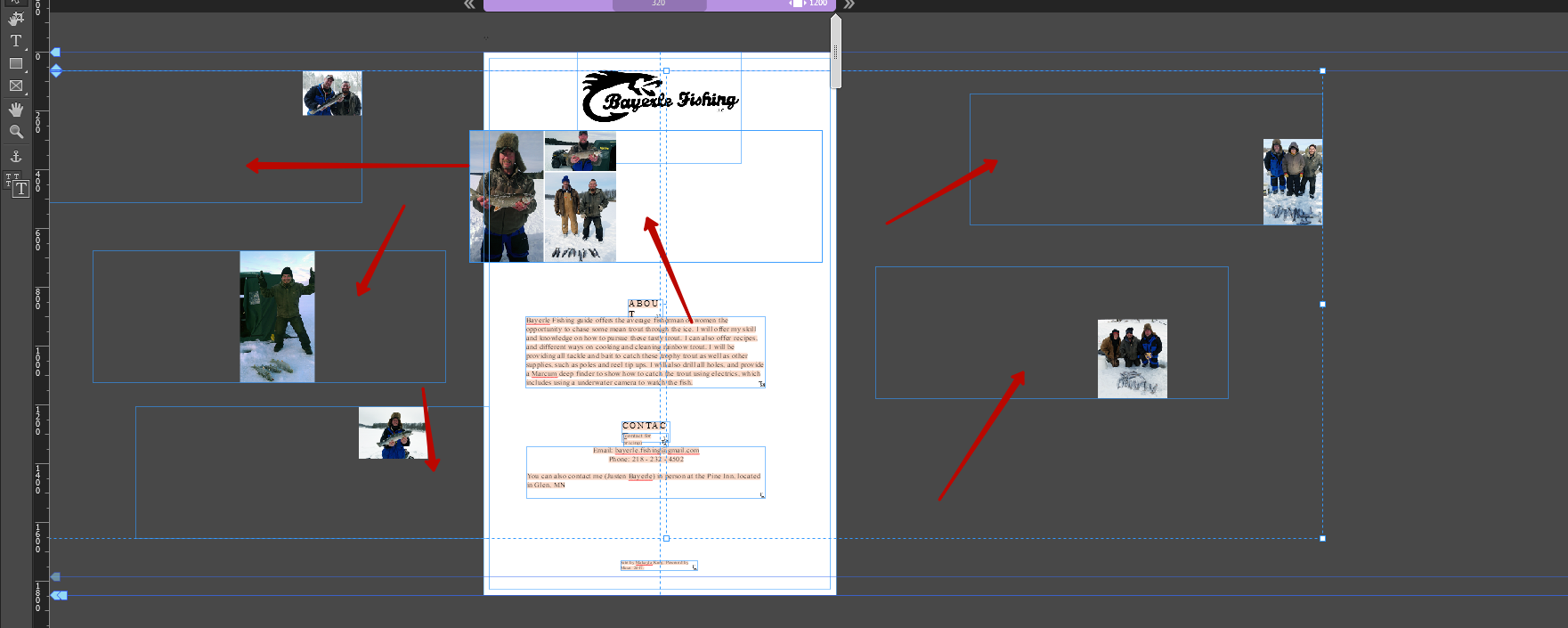
- Your logo at the top of the page overlaps the image grid below. Use the „Crop“ tool to reduce the height of the logo’s container, in order to not overlap the image grid. (Overlapping elements are the reason, why Muse can’t identify, which element should push which other element downwards. This can be fixed, of course, but in your case the actual height of the logo container isn’t necessary at all, because at the bottom area of the container is simply blank.
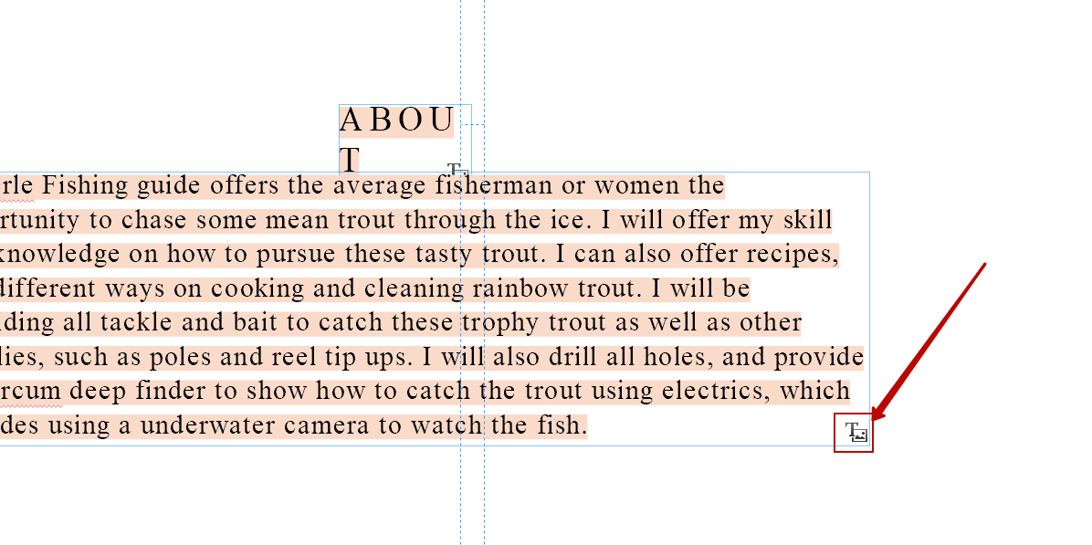
- Since text frames only resize vertically, you have to make them wide enough to not cause the text reflowing into a new line.
- The heaviest issue – the image grid! Why on earth did you built it this way: Very (unnecessarily) big, multiple overlapping image containers with small images within? If you don’t know, what I am talking about, just look at this small screencast:
Delete this construction completely and create a neat image grid by simply placing the images.
Here you find a modified .muse file, to show you, how your layout may be realised in a very simple way.
https://www.dropbox.com/s/uym3jrye892lsa8/Justen%27s%20Website_Mod.muse?dl=0
And please: Learn Muse, by studying the tutorials, I linked above. You may also have a deep look at these excellent jam sessions by Dani Beaumont, the Muse product manager: https://www.youtube.com/results?search_query=dani+beaumont
 AdChoices