 Adobe Community
- Home
- Muse (read-only)
- Discussions
- Re: Responsive site design does not run breakpoint...
- Re: Responsive site design does not run breakpoint...

Copy link to clipboard
Copied
Hi everyone, basically i designed this demo url and i have exported. When i checked on with desktop internet browser everything's fine but on iPhone plus it does not load (or render) mobile breakpoint of design (i mean phone version of design), is it a bug of Adobe Muse? Adobe Muse Version: 2017.0.4.8, CL 805099
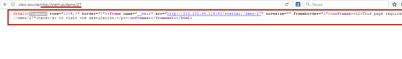
Demo url: http://steth.ai/demo/27


 1 Correct answer

Why simply don’t you give us the .muse file? (->Dropbox, CC files, …). instead of involving us into a never ending question and answer game?
 12
Replies
12
12
Replies
12
Copy link to clipboard
Copied
You have a site containing no fluid breakpoints, but extra designs for desktop and phone? Did you try to export to HTML on your machine, and check, if there is a „Phone“ folder containing the data?
Is in „Site Properties/Layout“ the „Redirect" option from desktop checked?
Copy link to clipboard
Copied
Thanks for your feedback. I designed site as a "Fluid Width" (not Fixed Width) and not responding at mobile devices.
After that I did a basic website for test and it has 960, 414, 375 and 320 px breakpoints. When I export design and test it with online resizer tool such a Screenfly / Test Your Website at Different Screen Resolutions or with chrome, it works with breakpoints and when I test it with real device like iPhone 6+ it always show 960 px version of design, not 414 px version of site.
You should check demo url: http://steth.ai/demo/27 it does not work. Is it a bug of Adobe Muse?

Copy link to clipboard
Copied
Responsive breakpoints are set only when the design is broken, but not under the resolution of the devices. In addition, you do not consider the scroll bar. Try to make 400 instead of 414. In addition, your demo site can not be guaranteed to work properly, since it is not a direct link to the site, but is in frameset. Use businesscatalyst for demo.

Copy link to clipboard
Copied
https://forums.adobe.com/people/G%C3%BCnter+Hei%C3%9Fenb%C3%BCttel schrieb
You have a site containing no fluid breakpoints, but extra designs for desktop and phone? Did you try to export to HTML on your machine, and check, if there is a „Phone“ folder containing the data?
Is in „Site Properties/Layout“ the „Redirect" option from desktop checked?
I guess, you still have what Günter Heißenbüttel already asked/assumed. You have adaptive design, haven`t you?
You have to decide wether to use responsive design – decide fluid width breakpoints or fixed width breakpoints
OR adaptive design – desktop/tablet/phone .
It will not really work together as long as you do not know what you want to achieve.
Copy link to clipboard
Copied
I use responsive design and I set breakpoints to 960, 414, 375 and 320 px to simulate device.
I mean please go to Responsinator and paste http://steth.ai/demo/27 see the numbers of that simulate devices, after that visit same url any of your real phone device, it is not showing phone's breakpoint number that has to be render. Example here(it has to be show 414 with iphone 6 plus);

Copy link to clipboard
Copied
Why simply don’t you give us the .muse file? (->Dropbox, CC files, …). instead of involving us into a never ending question and answer game?
Copy link to clipboard
Copied
Here ıt is: WeTransfer
Thanks a lot.
Copy link to clipboard
Copied
?? -> https://www.dropbox.com/s/xlmwsh9bkbr8s9z/breakpoints.mov?dl=0
Very weird choice of breakpoints:
• Why 320 px? Almost no devices on the market which can go „under 320 px.
• Why that much breakpoints from 320 to 424 px? We don’t create breakpoint for specific devices, we create breakpoints, when the design falls apart.
Copy link to clipboard
Copied
It is designed for just a simulate mobile devices, just a test files, it does not matter. I am looking to solve problem that, when I export responsive design as html and check at my iPhone it has to be show mobile response but it is not working...
It's working some kind of third party online tool like here: Responsinator - steth.ai/demo/27 but real life like a device iPhone it always render as a computer size of design. It has to be responsive mobile capable.
Copy link to clipboard
Copied
This website works really bad. That`s true. It has nothing to do with real life web. If you need it for that, good luck.
Copy link to clipboard
Copied
Publish your "test site" (whatever should be the "test" here) as a free businesscatalyst test site (the "Publish" menu top right of Muse's application window) and test it on real devices. I bet, all works as expected. Or do you really think, a simple responsive text container doesn't work responsively and no Muse user has noticed this before? 
Copy link to clipboard
Copied
From your sample site we can’t decide anything, because we absolutely don’t know, how this singe number „960“ should look like. It looks like „960“, when I resize the screen. What’s wrong with this?
 AdChoices