 Adobe Community
- Home
- Muse (read-only)
- Discussions
- Re: Site desktop, tablet and phone not working pro...
- Re: Site desktop, tablet and phone not working pro...
Site desktop, tablet and phone not working properly published

Copy link to clipboard
Copied
I've tried several times to get this to work. I designed a landing page that contains a desktop, tablet and phone segments with the appropriate breakpoints in place (380, 768 & 1024) in a single file. The 3 elements work fine in preview but when published in either Business Catalyst or HTML only the desktop and tablet work properly the phone layout does not show when the window is condensed to that size. What am I not doing correctly? Completely frustrated as deadline looms. This the first time using the program. Attached are what the pages look like in Muse and on the web.
In Muse
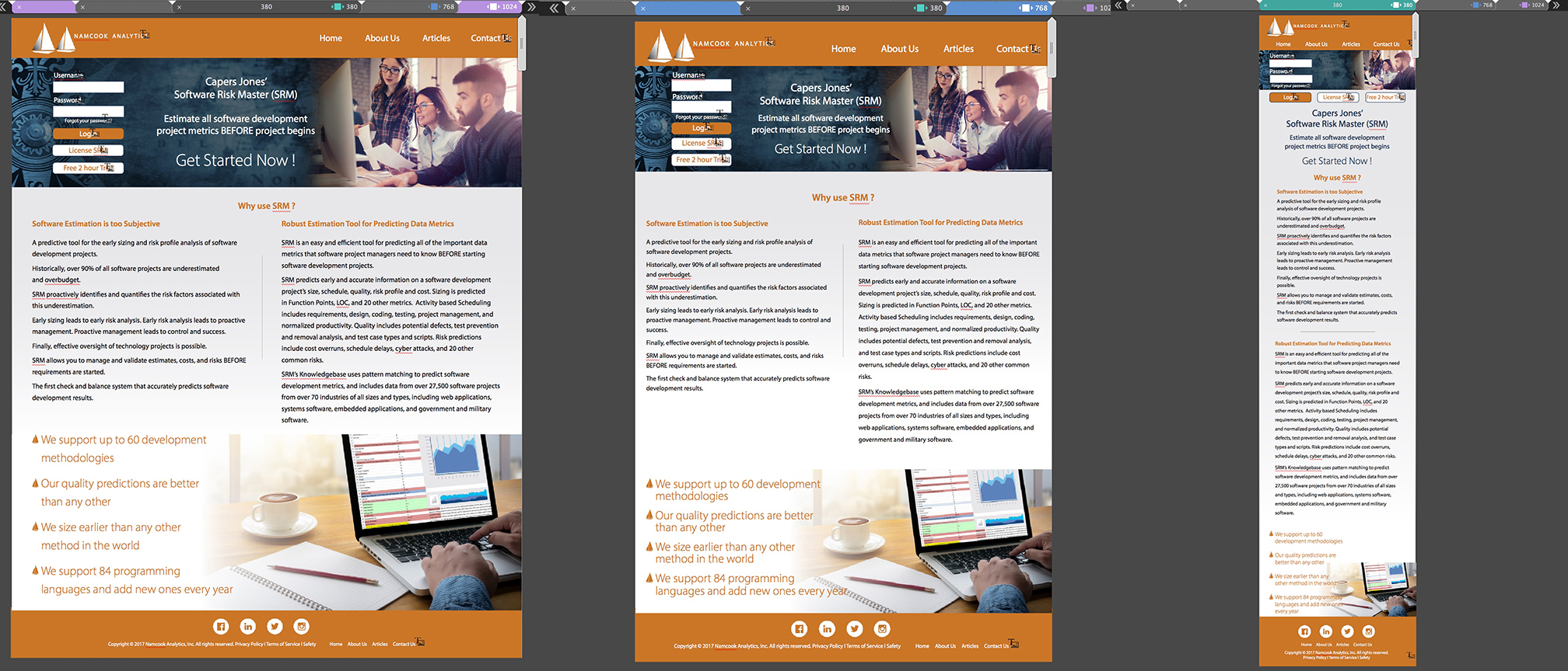
On the web - note phone pg


 17
Replies
17
17
Replies
17

Copy link to clipboard
Copied
try removing the custom font and test with websafe fonts... also post a url to this Adobe BC site so we can test with different phones
Copy link to clipboard
Copied
The font I used was Myriad Pro a websafe font. Should i use another? Here's the BC link Home
Copy link to clipboard
Copied
Copy link to clipboard
Copied
Thanks, To be safe I'm going to swap them all out for a font similar in appearance. I'll let you know what happens.
Copy link to clipboard
Copied
I swapped out all the fonts and I'm still having the same problem. What else should I be looking for? Here's the link again Home

Copy link to clipboard
Copied
You should change the text resizing instead "None" to this:
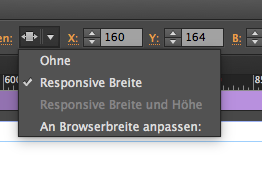
Otherwise muse does not know what you want.
Copy link to clipboard
Copied
Thanks, everything works now. Quick question though are there particular breakpoints to use to accommodate when a phone is turned horizontal or do I do something with the type at the bottom within the current breakpoint? Here's the link Home
Copy link to clipboard
Copied
I am not really sure, …?
gdesign schrieb
Thanks, everything works now. Quick question though are there particular breakpoints to use to accommodate when a phone is turned horizontal or do I do something with the type at the bottom within the current breakpoint? Here's the link Home
1900 px

around 1000:

around 530:

There seems to still be a lot of work to – sorry
Copy link to clipboard
Copied
I had set specific breakpoints for desktop (1024), tablet(768) and phone (380). I see what you talking about though 1900 seems oversized for most browsers.
Copy link to clipboard
Copied
So you could make it a fixed width breakpoint for this, right?
Copy link to clipboard
Copied
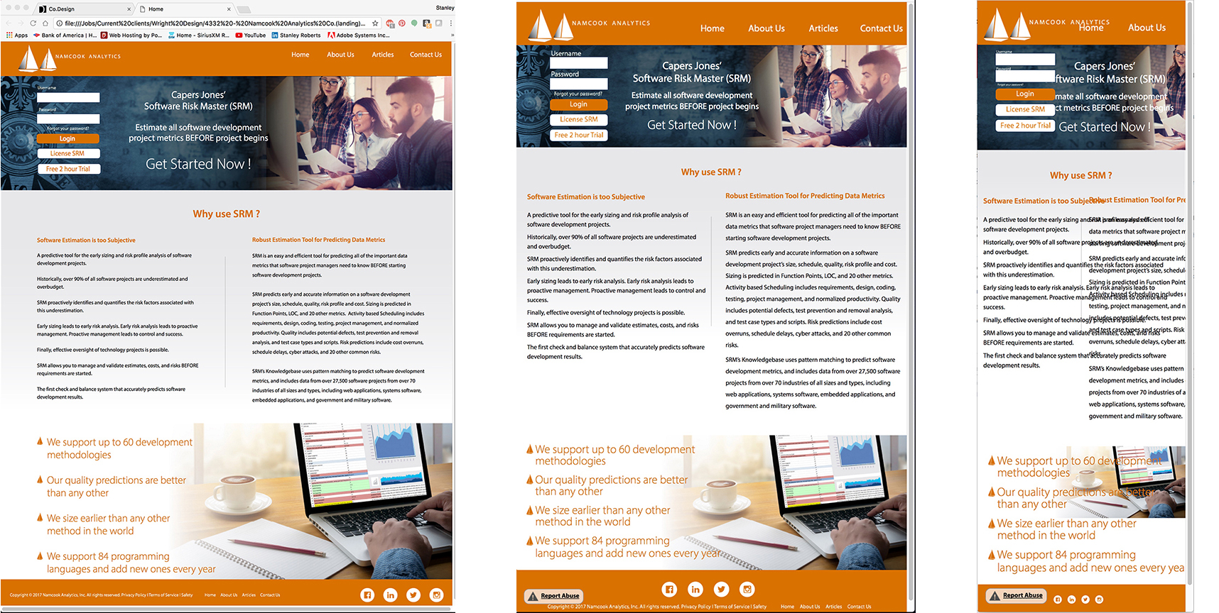
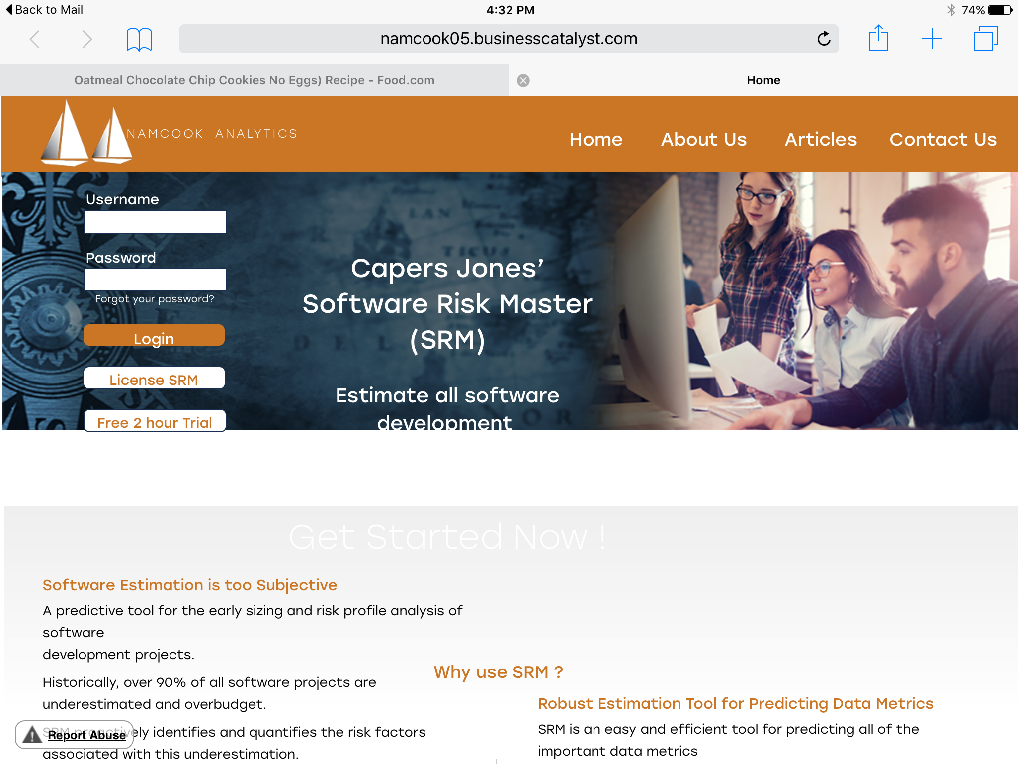
Yeah I'm going to try that, as it apparently isn't working now on any of the platforms. I wondering if the 3 levels should be fixed at this point as I can't understand what happened or is happening. Attached screenshots are from BC link Home
Current screen widths desktop 1366px tablet 768px and smartphone 380px. Help!!
From ipad screen
From IE screen, full screen

Copy link to clipboard
Copied
Well, I think you should set the header to resize only in width, non in width end height.
Because this form in the header screws up the top.
You should group the right columns text and picture, so that the text pushes down the picture. As of this reading it still overlaps each other. From 1024 upwards you still use fluid width breakpoint and not fixed width. It is not satisfying, I guess, to ostracize larger screens

But to get deep into it, I would need a .muse. Very reduced to one page. If you have concern, create a placeholder for your pictures.
Uwe
Copy link to clipboard
Copied
How can I send you the .muse file? All I'm looking for will be the steps to correct what's not working regarding the breakpoints and any reformatting if necessary.
Copy link to clipboard
Copied
It takes too much time, to inspect step by step, what´s wrong. It´s much more easy to look at one or two certain issues, fix them, pass this file back to you and you keep on finishing the work.
It starts, that you think, too little people use big screens. It is an extraordinary racicsm to ostracize big screens.
While this is very easy to "repair" (use fixed width breakpoints) we can make suggestions much more easy and you don`t have to follow by reading, instead you can see and experience live how to solve your issues step by step.
If you want to share: Upload your site to BC as a provisionally site, before you place a download button onto the page and link this to your file (copy of file, if reduced).
Or, share via dropbox.
Uwe
Copy link to clipboard
Copied
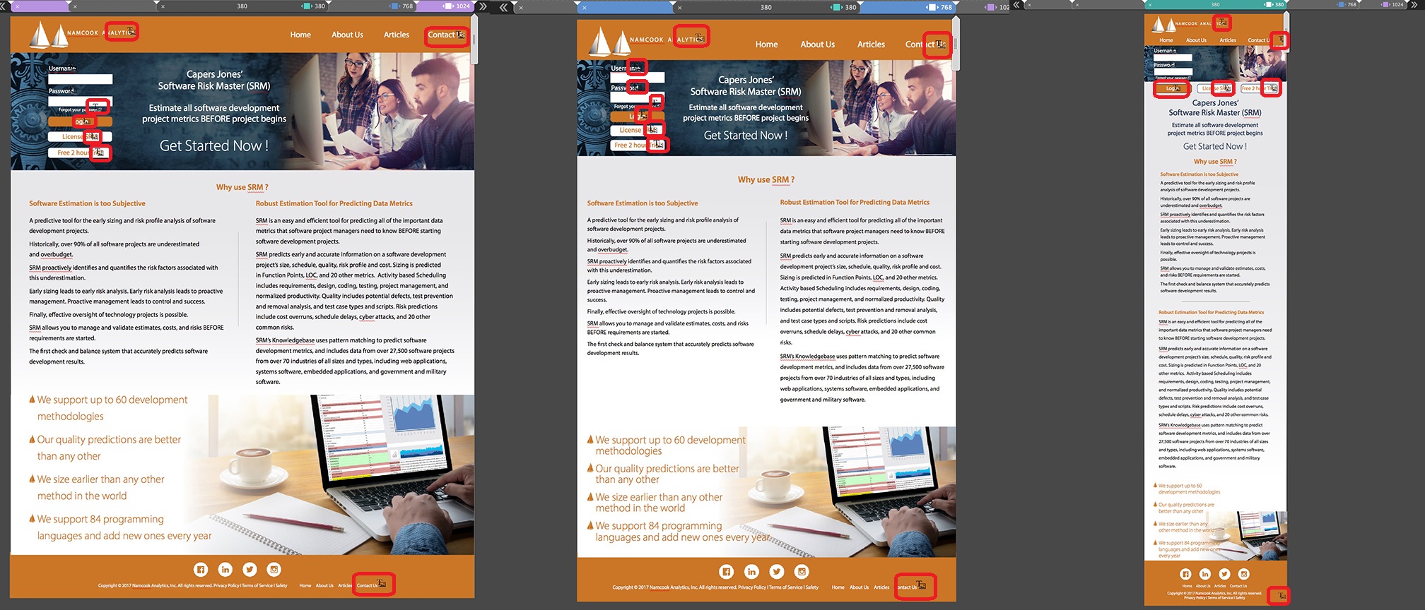
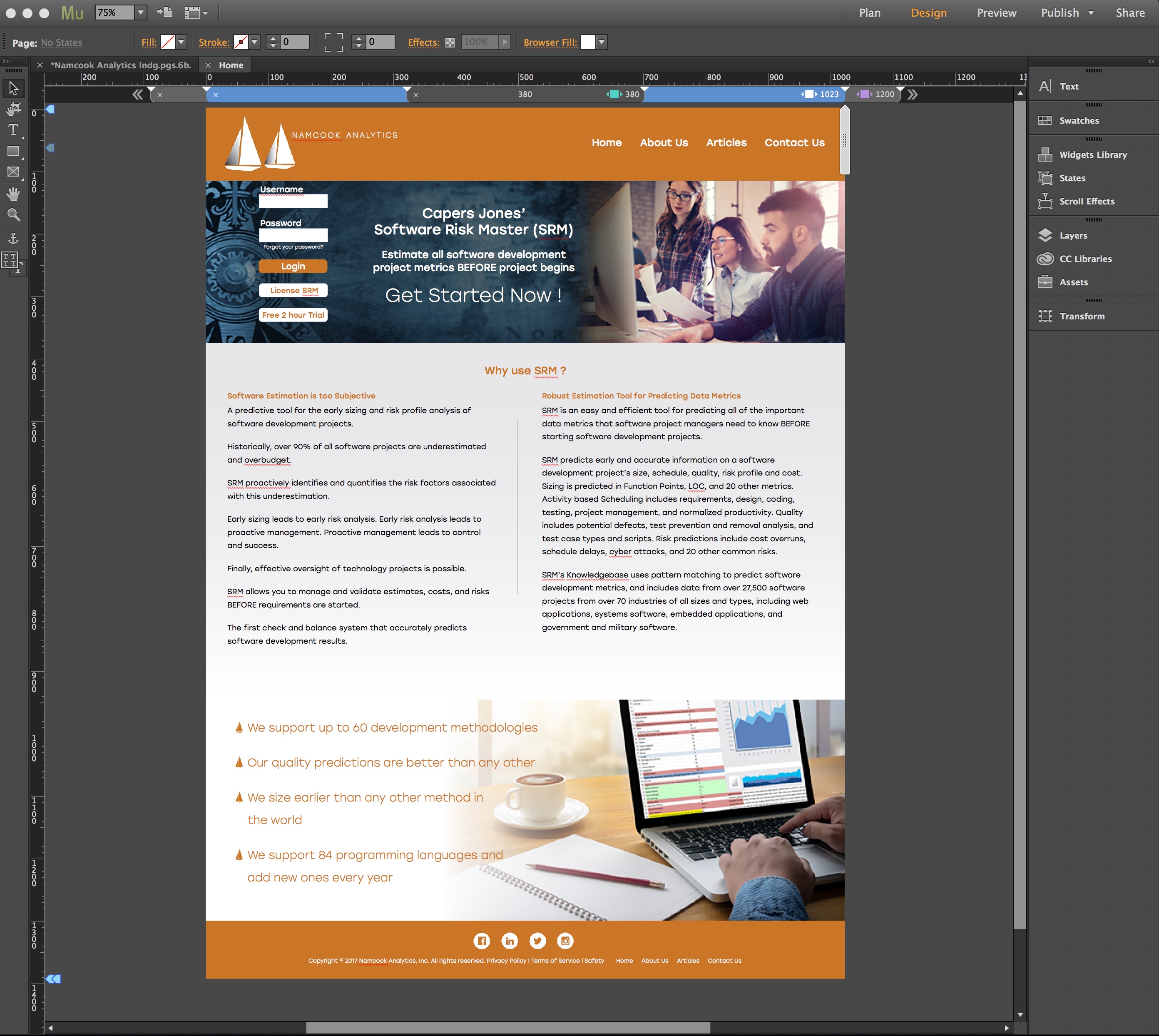
Alright figured out the large screen issue as well as the phone sizing. Having problems with the tablet (1024px w) after several tries nothing seems to be working whether fixed or fluid, responsive width, or responsive width and height. There's some combination I'm missing. Attached are the Muse file and the tablet top and bottom shots.
Muse screen shot
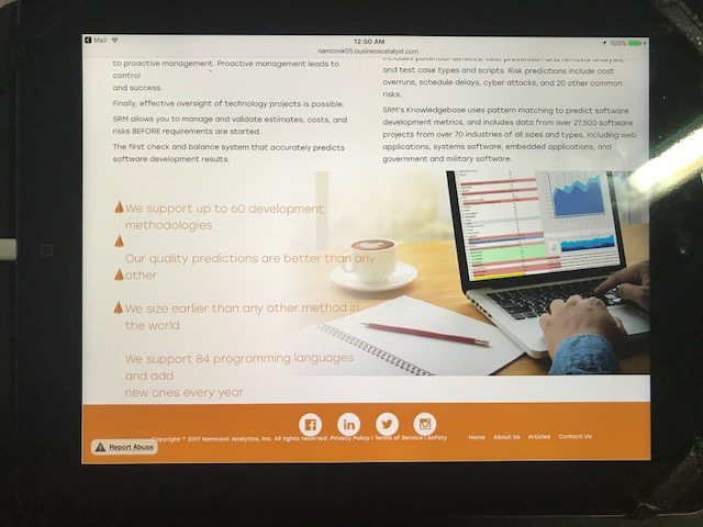
Tablet shot TOP note gap between bottom button and gray background

Tablet shot BOTTOM note gap between footer and photo and type and bullets issues
Copy link to clipboard
Copied
I cannot see the .muse file? Screenshots look fine, so far.
Copy link to clipboard
Copied
I've got the desktop and tablet layouts working properly and now the phone which was fine initially looks fine when vertical but when in horizontal its a mess. Do I need to create a separate layout for horizontal with breakpoints or is there a way to modify the existing phone layout. Visually it appears to lift the look from the tablet is that what it supposed to do?
 AdChoices