 Adobe Community
- Home
- Muse (read-only)
- Discussions
- Betreff: Site displaying wrong on Phone - web link...
- Betreff: Site displaying wrong on Phone - web link...
Copy link to clipboard
Copied
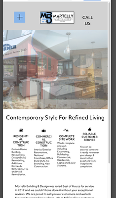
Hi, something strange is happening when viewing my site on my phone. It only displays the Master page, the content is blank. Also, the Master that's displayed is an old version that I have since changed. When I tap on the company Logo that is linked to bring you back home, it rights itself and all looks good - Master & content are visible and correct.
So, in an effort to fix this, I copied and pasted all my Master content to a new Master page. Sadly it did not fix the problem.
Looking further, I thought maybe this is a browser issue. So I deleted all browser history and manually typed in the website name instead of clicking the "suggested" site name, and it came up looking correct! However, when I click on one of the suggested site names it brings me back to the incorrect Master page. I copied the full web links for both the incorrect and correct - they are below:
CORRECT LINK: https://martellybuilding.com/index.html?devicelock=desktop
GLITCH LINK: https://martellybuilding.com/phone/index.html
Is there anyone that is savvy with web links or html lingo- I think this is something deeper than I can understand and fix myself. THANK YOU in advance!!!!
 1 Correct answer
I understand that phone versions are different on most websites and you use both the responsive approach and the adaptive approach which is bad for browsers (as I told you already), The responsiveness is done quite bad in your site (I guess you use(d) a template for it and the breakpoints are set for less menu items?) - means, as you shrink the browser window, menu items on the right leave the canvas, so breakpoints should get set in a different way or the design has to follow the breakpoints.
O
...Copy link to clipboard
Copied
You simply should delete the phone version from your adaptive site/page. As you did the site responsive already, the phone version is not necessary at all and further more distracts browsers of course.
One more advice for your professional photography - try to keep vertical lines verical with no converging lines.
In another step and only if you can do that or ask the photographer - try to eliminate that chromatic aberration.
It just looks better.
Kind Regards,
Uwe
Copy link to clipboard
Copied
Thank you for your comment but my phone layout is different from the desktop version as most phone versions of websites are. I have a sandwich menu on the phone version, images are bigger on the phone version, etc - why would I delete that? Also thanks for the photography critique, I'll do better next time lol.
I'd like an answer to my question if anyone else can offer any insight into why this is happening, thank you!
Copy link to clipboard
Copied
I understand that phone versions are different on most websites and you use both the responsive approach and the adaptive approach which is bad for browsers (as I told you already), The responsiveness is done quite bad in your site (I guess you use(d) a template for it and the breakpoints are set for less menu items?) - means, as you shrink the browser window, menu items on the right leave the canvas, so breakpoints should get set in a different way or the design has to follow the breakpoints.
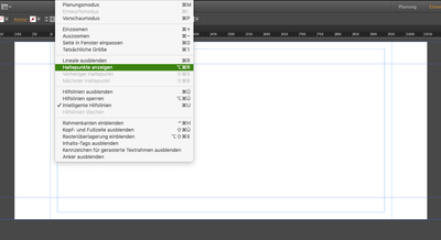
Obviously you don`t know about breakpoints on your site so to get them visible click here:
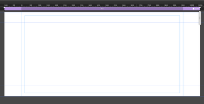
to get this view:
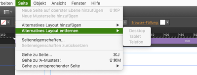
after that check this:
You may ask, where I can see the responsiveness? Well, here it is:
I promise, I didn`t do it.
On your phone versíon (which is bad for SEO as well, btw) you created indeed a hamburger menu but forgot or
didn´t realize so far that your site is kind of responsive already - it may sound ridiculous to you and I don´t take it personally but I can almost promise, that you will not get any other answer here in this forum and for sure not from any Adobe employee, if you waited for that - sorry.
Let me add (Nancy will do anyway, I guess), that in your status quo I can not recommend to keep on with Muse, as browsers OS will change someday (and your client won`t like it) and that can cause some issues - at least all kind of contact pages with forms may get critical as most "Captcha" will not work as intended maybe.
Kind Regards,
Uwe
Copy link to clipboard
Copied
I certainly do know what breakpoints are, thank you, and based on the Muse Tutorials I have made 4 breakpoints for 4 different screen sizes. All breakpoints appear as they should on different devices, the only issue I'm having is (as stated already) how the phone version displays the wrong home screen. Should I not have made breakpoints and instead let Muse do it with their alternate layouts? I did attempt that initially but nothing looked correct and it was more of a headache. I was taught to add my own breakpoints manually and design for each per the Muse Tutorials on Lynda.
I'm also very aware that Muse is going to be obsolete someday and that Adobe Support no longer replies on here. It took me many hours to build this site, that I guess looks like crap- oh and the photography too, thanks for your fancy opinion I didn't ask for, so I'm going to keep the site up as long as I can and in the meantime find an alternative.
Copy link to clipboard
Copied
You must delete the phone version means you should uncheck the alternative design means you should uncheck the adaptive approach. With breakpoints your site is already responsive and does not need a designated phone version as browsers cannot "know" which version to use and as you setup a phone version and a small breakpoint your issue is coming up.
Copy link to clipboard
Copied
Success! I have figured out my problem and it did have to do with the adaptive phone version. My responsive phone version wasn't showing up correctly because the adaptive version was showing instead. I modified the adaptive version to match the responsive and it looks good now, I just have to do some minor tweaking in the slideshow. I suppose now I can delete my breakpoints I designed to lessen any browser issues you mentioned?
Thank you
Copy link to clipboard
Copied
After you were told three times to delete the phone version this is indeed a great success.
Again - it is way better for SEO and for the overall browser campatibility to use responsive instead of adaptive design. But of course this is a free world and everyone can (almost) do whatever one likes. For the images - what I adviced, can be done in PS quite easily.
Kind Regards,
Uwe
Copy link to clipboard
Copied
1. DELETE the phone version!!! It's not helping you, it's hurting you. You're taking a penalty from Google because you have 2 URLS (one for desktops and one for phones) containing identical content. This is very bad for your site's SEO and page ranking.
2. Ideally, you should have one URL that fits ALL devices. That's what responsive means. Adaptive means different URLS for different devices. Well-creafted websites do not use adaptive layouts anymore for reasons already mentioned in #1. Use Bootstrap's mobile-first responsive framework. It's free and used by millions of websites worldwide.
https://www.w3schools.com/bootstrap4/
"I'm also very aware that Muse is going to be obsolete someday..."
===========
3. Someday is already here. The code that Muse generates has not been updated in more than 2-1/2 years. Meanwhile, browsers and web technologies continue to change. Use Muse at your own risk.
ALTERNATIVES:
-- Adobe Behance (free) - https://help.behance.net/hc/en-us/articles/204483894-Guide-Intro-to-Behance
-- Adobe Brackets (open source) - http://brackets.io/
-- Adobe Dreamweaver CC - https://www.adobe.com/products/dreamweaver.html
-- Adobe Portfolio (free with a paid Creative Cloud Plan) - https://portfolio.adobe.com/
-- Bootstrap Studio - https://bootstrapstudio.io/
-- Pinegrow - https://pinegrow.com/
-- Squarespace - https://www.squarespace.com/
-- Visual Studio Code (open source) - https://code.visualstudio.com/
-- Webflow - https://webflow.com/
-- Without Code - https://www.wocode.com/
-- Wix - https://www.wix.com/
-- WordPress (open source) - https://wordpress.org/
Alt-Web Design & Publishing ~ Web : Print : Graphics : Media
Copy link to clipboard
Copied
So I just deleted the Phone Adaptive version and after publishing it and viewing it on my phone there was nothing except a "FILE NOT FOUND" message. Luckily I was able to undo deleting the Phone adaptive version and I'm re-publishing it now. So.... now what?
Copy link to clipboard
Copied
I am currently using Without Code for another website however I own the whole Adobe Suite. Would you recommend one over the other? I have no coding experience. Re-designing the site will be painstaking, but I guess I have no choice.
Thanks for your help and information.
Copy link to clipboard
Copied
" I have no coding experience."
=============
You wouldn't perform surgery without training would you? You wouldn't re-wire your house without training would you? It's the same with web development. Start learning what you don't know. Read chapters, do code exercises and take quizzes at the end.
- https://www.w3schools.com/html/
- https://www.w3schools.com/css/
- https://www.w3schools.com/js/
Dreamweaver & Brackets are the only desktop code editors Adobe offers.
Adobe Portfolio, Spark and Behance are online services.
Good luck! 🙂
Alt-Web Design & Publishing ~ Web : Print : Graphics : Media


