 Adobe Community
- Home
- Muse (read-only)
- Discussions
- Site not redirecting to Tablet on Ipad pro and odd...
- Site not redirecting to Tablet on Ipad pro and odd...
Site not redirecting to Tablet on Ipad pro and odd screen alignment

Copy link to clipboard
Copied
Hi users.
So I have a site designed with fixed width, that works nicely on a desktop.
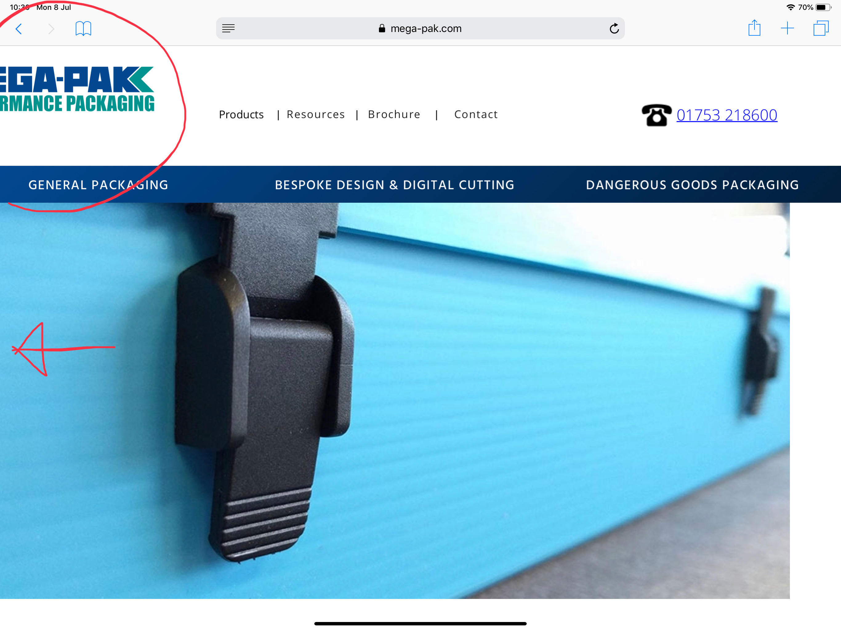
I recently added a tablet version (just the homepage) but upon opening on my ipad pro 12.9 gen 3, I notice it doesn ot redirect to the tablet version.
On top of this, the desktop version displays, but the page is aligned off the left side of the screen.
I have checked over my site for objects outside the oage width, and it all seems to be ok.
Is there anyone that can help me fix the view on a tablet, and get the redirect to work?
site: www.mega-pak.com
Many Thanks


 2
Replies
2
2
Replies
2

Copy link to clipboard
Copied
Your desktop and tablet version seems to be completely out of bound. There are many elements, which are placed (partially) outside of your page boundaries. Please fill your page background (not the browser background!) with a color and look, if there are element outside the coloured area.
And: Your site is adaptive (different layouts for different devices. The new Chrome for Android doesn’t support redirects any more, so these kind of sites won’t work any more on the newest version of Android Chrome.
Here you find a temporary workaround: https://forums.adobe.com/thread/2629798
To avoid this basically, you have to re-build your site responsively (what I wouldn’t do, because Muse isn’t developed any more)
Copy link to clipboard
Copied
Thank you for your reply.
I am testing on an ipad pro using safari, and the redirect is not occurring.
I think I have figured out the off screen issue though from reading your comment about the site being designed 'out of bounds'.
I have a breakpoint at 1224 with a min width at 1024. The desktop site seems to be dafaulting to the min width bounds on my ipad.
I will redesign and see how I get on.
Many thanks Gunter.
 AdChoices