 Adobe Community
- Home
- Muse (read-only)
- Discussions
- Re: Synchronized Text not retaining style across b...
- Re: Synchronized Text not retaining style across b...
Synchronized Text not retaining style across breakpoints
Copy link to clipboard
Copied
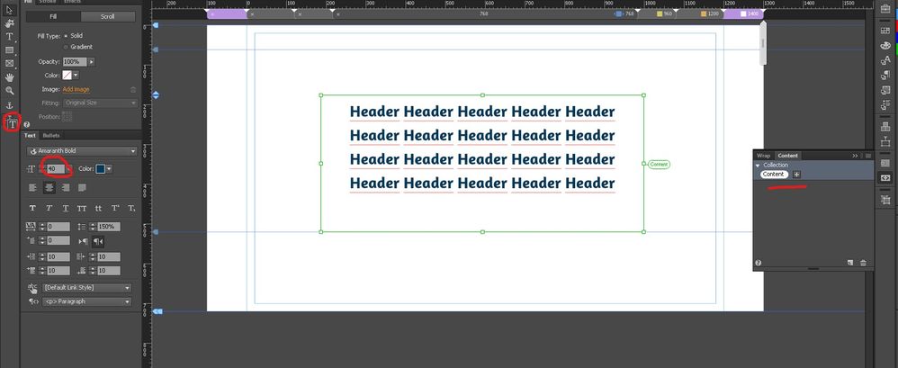
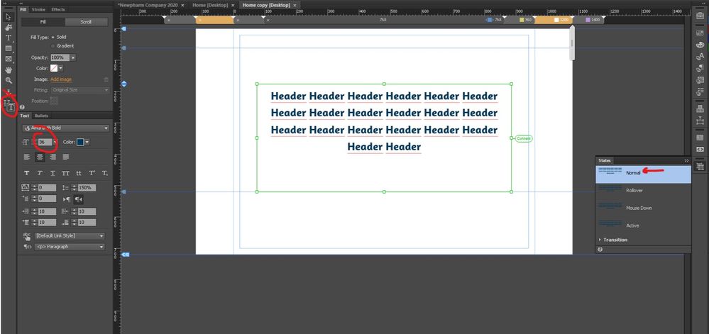
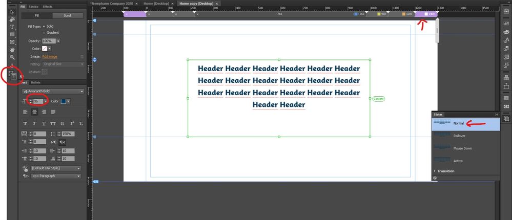
My problem is simple: I want to change text size in diferent breakpoints, but for some reason while using Synchronized Text all the texts in all breakpoints retain the same size.
I made sure to click Format text on current breakpoint button, cheacked that I am workin on the normal status and I even made a new text frame to test the Synchronized Text.
Nothing worked and it's DRIVING ME CRAZY. Changing the text size in one breakpoint changes it in all breakpoints.
What am I doing wrong?
Copy link to clipboard
Copied
Muse is discontinued & unsupported. You shouldn't be using it for new projects.
Scalable fonts are nothing complicated with HTML & CSS code. As an example, copy & paste this into a plain text editor (not Muse) and save as text.html. View in your browser and resize the handles to see what happens. NOTE: No breakpoints (aka CSS media queries) were used here.
<!doctype html>
<html lang="en">
<head>
<meta charset="UTF-8">
<meta http-equiv="X-UA-Compatible" content="IE=edge">
<meta name="viewport" content="width=device-width, initial-scale=1">
<title>Rescale Fonts to Fit Any Screen Size</title>

<style>
body {
background:#000 url(https://placeimg.com/900/900/arch) no-repeat center center fixed;
background-size:cover;
font-family:
Calibri, Candara, Segoe, Segoe UI, Optima, Arial, sans-serif;
font-size: calc(16px + 1vw);
line-height: calc(1.1em + 0.5vw);
}
.container {
width:80%;
margin:0 auto;
background:rgba(0,0,0,0.5);
padding:2% 4%;
color:#FFF;
}

</style>
</head>
<body>
<div class="container">
<h1>Heading 1</h1>
<h2>Heading 2</h2>
<h3>Heading 3</h3>
<p>Lorem ipsum dolor sit amet, consectetur adipisicing elit. Consectetur nostrum similique, dolores enim quam provident, deserunt tempora molestias. Nisi laboriosam quam dolor, officia magni error? Sint nihil dolore debitis doloremque.</p>
</div>
</body>
</html>
Alt-Web Design & Publishing ~ Web : Print : Graphics : Media


