 Adobe Community
- Home
- Muse (read-only)
- Discussions
- Tablet layout misaligned and images different size...
- Tablet layout misaligned and images different size...
Tablet layout misaligned and images different sizes
Copy link to clipboard
Copied
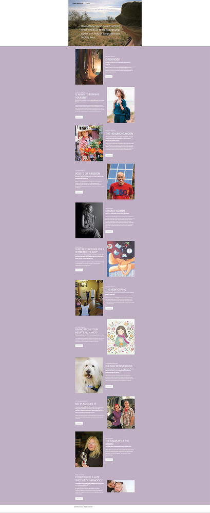
Please comment or offer suggestions on the video showing a webpage Tablet layout in Muse Preview, and then showing how it looks on an iPad Air where images and text frames are misaligned, and images are different sizes; same sizes on Muse layout.
Copy link to clipboard
Copied
I cannot recommend Muse preview but instead use preview in browser. Then you will see all the issue as you see them on tablet devices. Your frames/sections/elements seem to be overlapping in Muse as well what you may see when using this vertical "we call it scrubber" and might be able to see when the design fails - just to then add a new breakpoint.
Kind Regards,
Uwe
Copy link to clipboard
Copied
Thank you for your comment. I built this Muse page on my desktop Mac. The Desktop version viewed in the browser is just how it was intended to be. Is there a way to view a Tablet design in browser on a desktop Mac? Of course, when viewed in the iPad's browser (Safari) it is discombobulated.
Copy link to clipboard
Copied
See screenshots from Firefox on desktop.
Fig 1. Browser maximized. Too much wasted space.
Fig 2. Browser minimized (right handles dragged in to make browser window smaller). Colliding elements circled in red.
I would rebuild as a mobile-first layout. More users are on mobiles & tablets than desktops.
Alt-Web Design & Publishing ~ Web : Print : Graphics : Media


