 Adobe Community
- Home
- Muse (read-only)
- Discussions
- Text box not pushing down content
- Text box not pushing down content

Copy link to clipboard
Copied
I know this is a common issue and I;ve read all the posts on here, however non of the suggestions fix my proble,
I have a series of text boxes with images below them and the text boxes arent pushing the images down.
Ive tried pinning, unpinning, grouping, ungrouping all to no avail! Ive been on this ALL DAY
HELP!


 1 Correct answer

320 should not be a breakpoint as there are no smaller devices than 320. It´s the minimum width 
On Master you even added a mimimum width of 317  .
.
This white box simply is the end of the pages contnet and pushes down the footer. As soon as you take it away it lets the content come up to the next element.
The biggest issues come from: most elementes are "checked" to be footer elements.
Uncheck it and it should work pretty well.
Best regards,
Uwe
 17
Replies
17
17
Replies
17
Copy link to clipboard
Copied
I suggest to share a .muse with us. Simply one page with one or two typical elements. Best way if you save it with a new name into your Creative Cloud Files and by Right Click share this link with us.
Best Regards,
Uwe
Copy link to clipboard
Copied
Thank you, I will do this. I 'think' I got it working late last night, I did: group all elements below text box that needed to be pushed down (in that section) then centred both, then attached the grouped elements (to see blue line) then grouped both together, then repeated for the other sections below.
HOWEVER I do have another issue now with some pictures moving around along with a box in the background - they arent grouped at all!
Will sort the file and post a link here when done
Copy link to clipboard
Copied
YEP.
Uwe
Copy link to clipboard
Copied
Hi Uwe
Ok so please see link below, go to breakpoint 320 and grab the white box (the top one) behind the word services, it is meant to go all teh way to the bottom of the screen, but not set it yes as I am experirncing the 'thing' again, where if I move this box it changes everything else on the page. Grab it and pull it around and see what I meant.
I'm sure there is a simple explanation but I cant find it!
Also in this file all the push down sections are ungrouped - I didnt realise that it ungrouped them in all breakpoints!! So I will have to do the push down set up all over again!
Thanks
Copy link to clipboard
Copied
320 should not be a breakpoint as there are no smaller devices than 320. It´s the minimum width 
On Master you even added a mimimum width of 317  .
.
This white box simply is the end of the pages contnet and pushes down the footer. As soon as you take it away it lets the content come up to the next element.
The biggest issues come from: most elementes are "checked" to be footer elements.
Uncheck it and it should work pretty well.
Best regards,
Uwe
Copy link to clipboard
Copied
I have no idea how the 317 got there! I've changed it thanks. Ahhh footer elements!! No idea how that happened either but that makes sense why things are getting jumbled - damnit now I have to ungroup everything again after I just re-did the push down!
Thanks for you help

Copy link to clipboard
Copied
Keep in mind that grouping does not affect reponsiveness. Helps you in Muse for moving objects around and organizing.
Copy link to clipboard
Copied
I've wasted yet another day on this, I am beyond fed up 😞 Muse keeps crashing every hour or so and no matter how many times I re-set the objets in order to push down they revert to jumbling up again. I have re-done the services page about 17 times now!
I set the objects, load on the test server and all ok, then next time I load they have all jumbled up again. I really am at my wits end 😞
Ive also got a menu widget on the mobile sizes and thats not working properly either, even though ive set it on a layer above everything it reverts to underneath in some areas.
If anyone can help I would be so grateful.
Test site is here Services
And file is here (28MB) Dropbox - Ecom April 23 2018.muse
Copy link to clipboard
Copied
Its also just taken me 4 attempts to post this!! Error messages galore!
Copy link to clipboard
Copied
Watching the master, I am wondering that it looks not too bad for me.
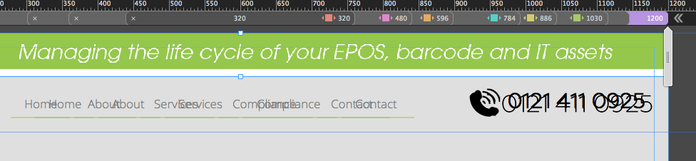
The right element is leaving the canvas. This should not happen at all in no breakpoint:
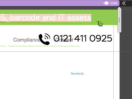
Phone number is overlapping other element and you still use systemfonts, indicated by this tiny little "T" in the right bottom corner of the text box:
Having fixed these "small" issues I use this scrubber (1) and get these two misplacements, which you should set up correctly.
(2) Your menu leaves the canvas, the phone number have several linebreaks:
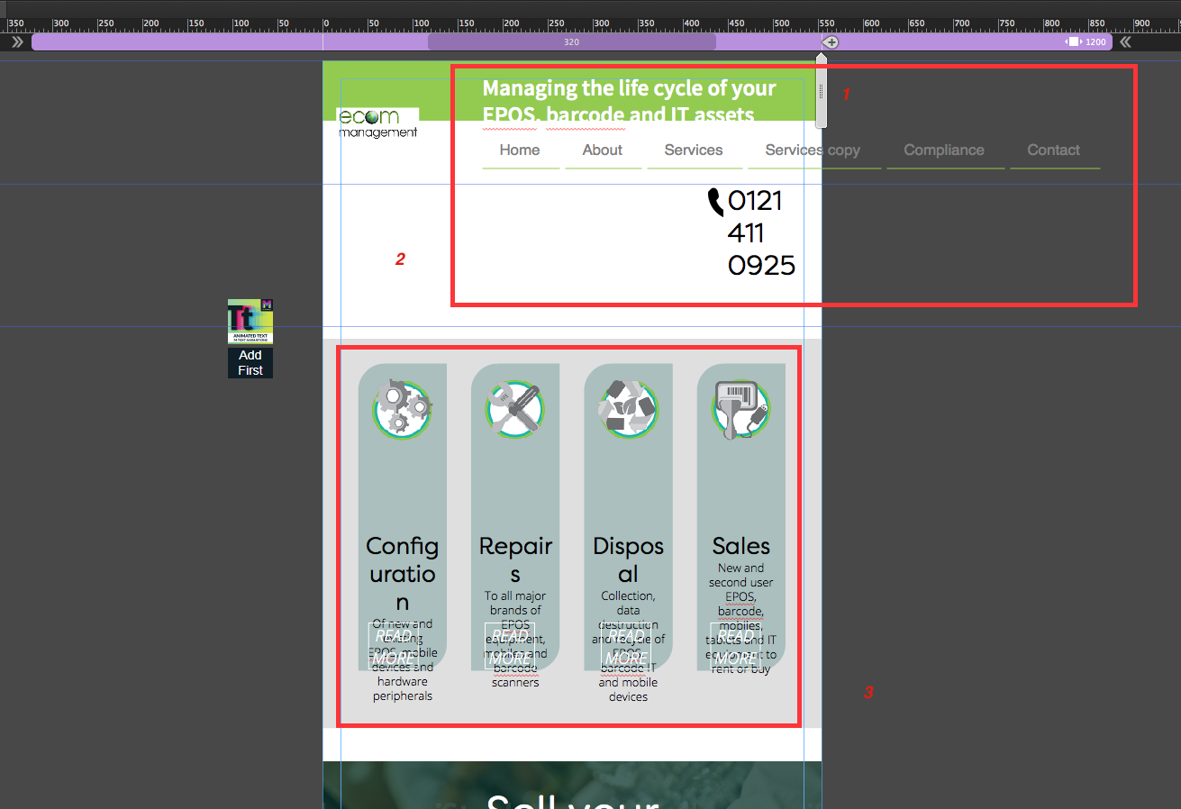
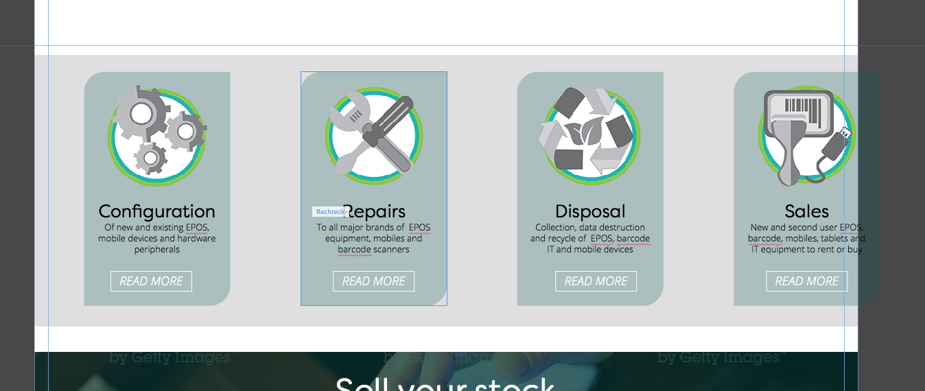
(3) These four boxes with text would need some breakpoints and should be placed differently, so they do not get too narrow and don`t have any chance to show text properly.
I recommend to use fixed width breakpoints instead – watch this file: https://adobe.ly/2Jo1Rdg
Be aware that I replaced all other pages with empty pages (for automatic menu purposes), I deleted one 3rd party widget, I hided the menu in breakpoint at 768. You would replace it with a mobile menu of course.
I would also think about the logo and set it to not resize as it gets very small on mobiles – your decision.
I also recommend to leave the eye candy stuff till the end in the box. This could cause some struggle, especially if you mix 3rd party vendors on your site.
Best Regards,
Uwe
Copy link to clipboard
Copied
Thank yuo so much for taking the time to look at thie Uwe, the master ty screen captured isnt used in the site, its a previous version I kept in there at design stage in case I needed any elements. You can see which masters are used from the plan view. But its the services page I linked to that is causing me issues,
Copy link to clipboard
Copied
Even in this master you set up strange elements. Deleting the white header background shows two menus and two phone numbers:
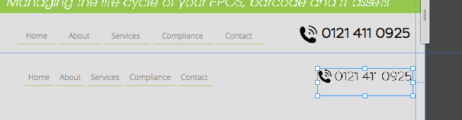
I just moved one of them down to show it.
You should really try to do it with less breakpoints though. Same situation on your B-Master:
Still 320 should be used as a breakpoint but as the minimum width.
I was able to reduce the masters breakpoint from 7 to 3 (the largest one is actually no breakpoint).
Anchors should be aligned on the left side as browsers try to put anchors in their top left corner of the browser window:

It´s another question why the top anchor is not at the top?
Watching those issues towards mobiles, …


… I keep with my recommendation to go with fixed width breakpoints.
Also because of this huge amount of backgrounds across almost the whole page and other rectangles placed on top of it, grouped and so on. I also recommend to accept those padding guides as they might be quite usefull for scroll bars to just name one.

It seems to be inspired from print design which loooks nice but simply kind of "must" fail in fluid responsive designs.
Best Regards,
Uwe
Copy link to clipboard
Copied
Thanks for looking again Uwe and for spotting the duplicates hiddedn. I will disable the view in those breakpoints.
Now, my understanding is that it is better for a site to appear well all the way through every size of screen. Tis is what I have tried to do hence a lot of breakpoints. Which way do you work with breakpoints then? I am happy to be guided! As far as I am aware there are no set breakpoint widths, plus device sizes changing all the time...
I dont understand your comments on the 320, do you mean I dont need to add a breakpoint here? If not why not please.
Thanks for helping! I have only completed one site in Muse so far and have two in progress. I am keen to learn!
Julia
Copy link to clipboard
Copied
You don´t need the 320 breakpoint because there are no smaller devices than 320. So the breakpoint should be the minimum width and that´s it. Breakpoints are set as soon as the design "breaks"/fails. Then you set a new brakpoint in order to rearrange elements for the next smaller resolutions.
For your approach, as you may have seen in my last example with the "wrong" master, I recommend to go with fixed width breakpoints.
That gives much better and easier control over the design, especially with your four boxes and your menu and phone numbers and logo.
In that case I would use the "classic" breakpoints with 1200, 960, 768 and 320 as the minimujm width.
Beside the unpredictable appearance with your overlapping elements it is also common sense that each breakpoint makes the site heavier. It´s like there´s one new page for each breakpoint. So these should be used as little as possible.
Best Regards,
Uwe
Copy link to clipboard
Copied
Hi Uwe
Thanks for your help on this and the info. I also watched a few videos on break points. I then deleted all my break points and started again! I have used 1200. 960, 768, 320 but also 480. I am pleased top say I have also managed to adjust the design on the masters so that they can remain fluid. I've just been re-designing the problem page breakpoints below 1200, so my boxes below that size are on top of each other and not side by side. So far so good, but time for a break!
This has really helped me think about the way i design responsive sites - its a bit like chess.... you always have to think a few moves ahead!
I am ready to start adding breakpoints to a HUGE site I have just built, so this learning curve has been great - thank you 🙂
PS I'm sure I will be back again with another rant soon ha ha!!
Copy link to clipboard
Copied
Try to go with fixed width breakpoints. Fluid width breakpoints are really not necessary for all sites out there.
Best Regards,
Uwe
Copy link to clipboard
Copied
Thats for your help Uwe 🙂
 AdChoices