 Adobe Community
- Home
- Muse (read-only)
- Discussions
- Text elements on Master not transferring to attach...
- Text elements on Master not transferring to attach...

Copy link to clipboard
Copied
What would keep fonts and size of text in a Master from displaying correctly on a page using the Master? I set up a Master with a certain font and size. However, on some of the pages that use that Master, the font is different. Stumped! Thanks for any suggestions.


 1 Correct answer

Text ticker! Thanks Günter Heißenbüttel.
This text ticker thing could be done with a composition, right? Not exactly the same approach, but not really bad.
Even better, if you use tool tip, users see, how many of the news come up:
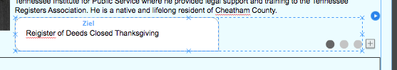
Feel free to design as you like.
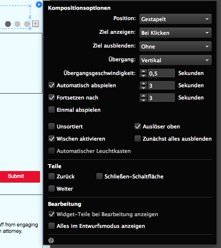
The options palette could look like this (German version):
Best Regards,
Uwe
 12
Replies
12
12
Replies
12

Copy link to clipboard
Copied
Please post the name of the program you use so a Moderator may move this message
-A program would be Photoshop or Dreamweaver or InDesign or Premiere Pro or ???
Copy link to clipboard
Copied
Sorry. I’m using Adobe Muse.

Copy link to clipboard
Copied
Can you post some screenshots?
As for the page itself did you create it from a Master or did you apply the Master to an already created page?
Copy link to clipboard
Copied
I've tried creating the pages both ways...
Here's the site: www.dalemccarver.com
Look at the dropdown submenus on the HOME page, then go to ELECTED OFFICIALS and REGISTER OF DEEDS... Now look at the same dropdown menu on the Register of Deeds Page and you'll see they are very different. Just an odd occurrence...
Any thoughts?
[Moved from the non-technical Lounge Forum to the Program forum... Mod]
[Here is the list of all Adobe forums... https://forums.adobe.com/welcome]
Copy link to clipboard
Copied
Best way to help, if you share the .muse.
Normally we would ask for a reduced file, but in your case it might be ok to show us the file as it is.
Best Regards,
Uwe
Copy link to clipboard
Copied
I don't see a way to attach the file.

Copy link to clipboard
Copied
Use a file sharing service and post the download link here.
Copy link to clipboard
Copied
Copy link to clipboard
Copied
Copy link to clipboard
Copied
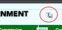
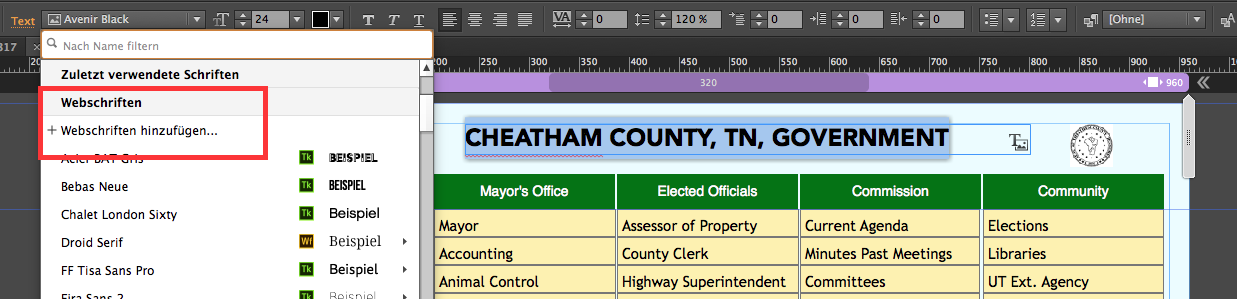
1) Mostly I see your issue, that you use system fonts instead of web fonts or web-save fonts.
This is indicated by this tiny little "T" – they behave like an image instead like text so it will get very small towards mobile devices:
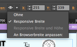
you could change it by using the command "add web fonts":
2) If you use the scrubber on your master, …
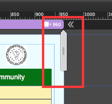
… you realize, that your menu scales quite unreadable:
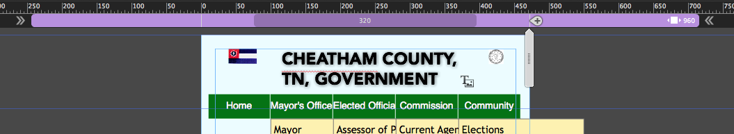
That´s the point at around 600, where you should think of a mobile menu.
It´is quite common, to use 768 as a breakpoint for mobile devices but with all the responsiveness this is not a strict rule anymore.
It is not a mistake though to follow these old school rules.
You use a lot of system fonts, you see the difference, if you use this scrubber, as system fonts scale in width and height, while webfontskeep its size but the text box scales in height, if you do not keep it as resize to none (here you set it to responsive in width):
I must admit, that I have no idea at the moment, why the menu appears that differently on REGISTER OF DEEDS.
As you use only one master, … hm!?
Best Regards,
Uwe
Copy link to clipboard
Copied
It is always the same!
1. The menus use system fonts as fotoroeder already stated.
2. The page „Register of Deeds“ is using the 3rd party widget „Text Ticker“. Delete it, and the menu will work as expected. Why risk issues like these only to present some glittering, sparkling eye candy effects?
Copy link to clipboard
Copied
Text ticker! Thanks Günter Heißenbüttel.
This text ticker thing could be done with a composition, right? Not exactly the same approach, but not really bad.
Even better, if you use tool tip, users see, how many of the news come up:
Feel free to design as you like.
The options palette could look like this (German version):
Best Regards,
Uwe
 AdChoices