 Adobe Community
- Home
- Muse (read-only)
- Discussions
- Re: Text frame overlaps the objects or shifted dow...
- Re: Text frame overlaps the objects or shifted dow...

Copy link to clipboard
Copied
In the Plan Phone section... There is a Lifestyle file that has a text frame and composition overlaps or shifted down and plus a lot of space in between. How to solve this problem? Thanks.


 1 Correct answer

The fix or better: the fixes is/are quite simple:
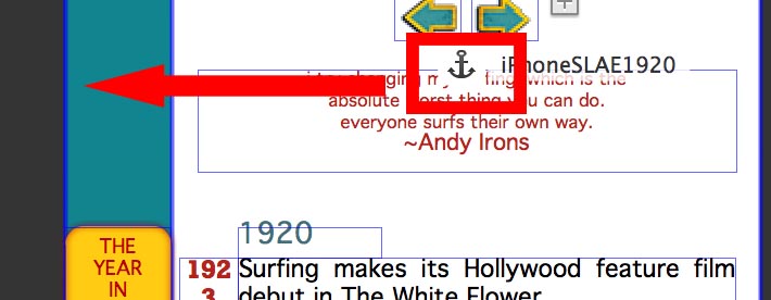
- You have constructed very strange, unnecessary groups and
- you marked many elements – above all the compositions – unintentionally as „Footer“ elements. this causes these elements to behave wrong.
- Elements – especially text and compositions – are overlapping:
Since text flows differently in every browser, on your page it often disappears behind the images. This won’t happen, if there is no overlapping: The elements are then shifting each other dynam
 6
Replies
6
6
Replies
6

Copy link to clipboard
Copied
Hi Kirsten
Thanks for the sharing your .muse file beforehand, it's very helpful.
However, I am still unable to predict your issue. For me your site is working as designed.
What exactly do you want to achieve?
A screen shot depicting your issue will be much more helpful here.
Thanks,
Ankush
Copy link to clipboard
Copied
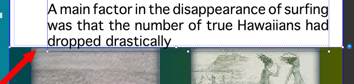
Here are the issues on phone layout.... Its overlapping, the images should be below the text frame and also the big empty space in between the image and the text.

Copy link to clipboard
Copied
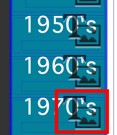
I think, there are elements overlapping each other (text frames, images)
But to find a valid answer, it would be necessary to have a look at your .muse file.
- Please delete all pages except one,
- delete all elements, which are not related to your issue,
- save the document under a new name,
- upload it to Dropbox or a similar file sharing servive, and
- post the download link here.
Then we can have a look.
Copy link to clipboard
Copied
Copy link to clipboard
Copied
The fix or better: the fixes is/are quite simple:
- You have constructed very strange, unnecessary groups and
- you marked many elements – above all the compositions – unintentionally as „Footer“ elements. this causes these elements to behave wrong.
- Elements – especially text and compositions – are overlapping:

Since text flows differently in every browser, on your page it often disappears behind the images. This won’t happen, if there is no overlapping: The elements are then shifting each other dynamically up or down.
So do this:
- Please ungroup everything
- Check every element for the „footer“ attribute and deselect it.
- Make sure that your single elements don’t overlap each other.
And two more things:
- Make sure to use standard fonts or web fonts. You often are using system fonts (Rockwell Extra Bold), which have to be converted to an image during output, what causes heavy problems! Why? Read my answer 4 here: https://forums.adobe.com/thread/2357163
Since you have installed the web font Rockwell, I think, you unintentionally used the system font Rockwell Extra Bold instead of its web font representation. - If you jump to an anchor, browser try to place the anchor at the top left edge of the browser window. When your anchor is placed in the middle of the page, browsers will therefore shift horizontally to follow this rule. So please place your anchors at the left edge of your page:
PS: Please excuse my question to share the ,muse file. I simply overlooked, that you already did this in your first post!
Copy link to clipboard
Copied
Success! I follow your instructions and more by giving more space in between elements and removing the long rectangle shape on left side. Thanks for the help!
 AdChoices