• Global community
    • Language:
      • Deutsch
      • English
      • Español
      • Français
      • Português
  • 日本語コミュニティ
    Dedicated community for Japanese speakers
  • 한국 커뮤니티
    Dedicated community for Korean speakers
Exit
Locked
0

Text Overlap with Smaller Smartphones

New Here ,
Jun 08, 2017 Jun 08, 2017

Copy link to clipboard

Copied

I have designed and uploaded a website in desktop and phone format. The site looks great on the desktop and on iPhone 7 but on a 6 and a 5 the text overlaps and part of the header is cut off. Here are the two examples. Any help is appreciated. Thanks, Jack

Mobile-Website.jpg

Views

151

Translate

Translate

Report

Report
Community guidelines
Be kind and respectful, give credit to the original source of content, and search for duplicates before posting. Learn more
community guidelines
LEGEND ,
Jun 08, 2017 Jun 08, 2017

Copy link to clipboard

Copied

LATEST

How did you create your phone layout?

Adaptive or responsive? What is your minimum width? I hope 320?

If you use a mac you can watch at "Developer" - "Change to Responsive Design":

Bildschirmfoto 2017-06-09 um 00.58.30.png

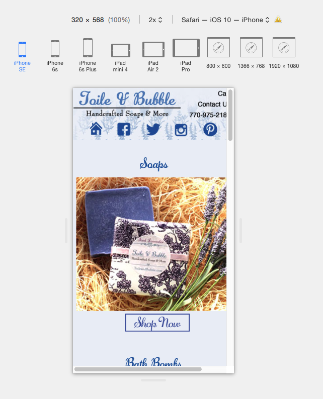
I searched and found out that you use adaptive design. By default the page width is set to 380. But as you see for iPhone SE you would need 320 instead. I assume, that some elements are set to be be responsive in width and height and like this it could happen that elements "float" and some do not. But without a .muse, reduced to one page , we can`t be really sure.

Watch this as well: Width for Iphone 7 responsive breakpoint? and

Screenfly / Test Your Website at Different Screen Resolutions

I hope this helps?

Uwe

Votes

Translate

Translate

Report

Report
Community guidelines
Be kind and respectful, give credit to the original source of content, and search for duplicates before posting. Learn more
community guidelines