 Adobe Community

Copy link to clipboard
Copied
I have textboxes under photo's on my site. How do I keep them together?


 1 Correct answer

Only to show, what is possible, look at this second sample file: https://www.dropbox.com/s/fh62zalx6skjdlq/Metmateman__Mod2.muse?dl=0
The whole thing is nailed together quick and dirty, but you see, what tricks are necessary, if you want to create such a site.
Generally spoken, is is very difficult to build a horizontally layouted page with small, differently scaling (horizontally, vertically, proportionally) element side by side. In this case, Muse can’t decide any more, which element should infl
...
 33
Replies
33
33
Replies
33
Copy link to clipboard
Copied
If you use images with responsive width and height, then I'm afraid it's not possible to keep them together.
P.S. Your site is very heavy, so I could not test it. Too much content for one page of the Muse.
Copy link to clipboard
Copied
In this case, you obviously didn’t it „the same way“. 
Copy link to clipboard
Copied
That's what I thought, but I can not find any difference between the backgrounds.
Background: both sites: responsive width
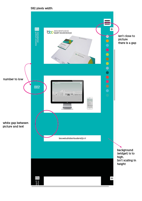
When I scale the site, the colored backgrounds are too large: better to make it responsive width and height?
The pictures and the url textboxes are separate when I scale the site. How come, is that what Pavels means: that it's not possible?
Copy link to clipboard
Copied
As always: Give us a file with only one page and only one of the problematic sections.
I, for my part, don’t have the time, to look through a complete page/site again and again.
Take time until Monday. I can’t look at it during the weekend.
Copy link to clipboard
Copied
Did my best to kopy your file, but some items in this document behave different. Maybe you want to take a look at it.
Thank you.
Copy link to clipboard
Copied
Just wondering how long you will be tortured before using my simple tips above?
I can tell you for sure, the responsive opportunities in Muse - is hell. They are very difficult to work with, there are a lot of glitches, and because of them a very heavy website is obtained. This has never been so that a simple html page worked slower than the CMS page. But now it is so, because in the Muse appeared responsive design . Responsive opportunities should be used very limited. Use a fixed layout and fixed breakpoints.
Look at this jam session. Muse Jam: Fixed Breakpoint Responsive Design - YouTube. This is the best practice in the Muse. If you want to fully responsive website, you should look for another platform, where it is much easier and correct. But personally, I do not see anything in your design that would be required to use responsive features. Your design is ideal for fixed breakpoints.
Copy link to clipboard
Copied
Thank you for your comment. Maybe I have to stay at the current site metmateman.nl
Copy link to clipboard
Copied
Only to show, what is possible, look at this second sample file: https://www.dropbox.com/s/fh62zalx6skjdlq/Metmateman__Mod2.muse?dl=0
The whole thing is nailed together quick and dirty, but you see, what tricks are necessary, if you want to create such a site.
Generally spoken, is is very difficult to build a horizontally layouted page with small, differently scaling (horizontally, vertically, proportionally) element side by side. In this case, Muse can’t decide any more, which element should influence which other, and you have to work with transparent „guiding frames“.
If you are not really experienced in using Muse, I’d really suggest to follow Pavel’s advice and build a site with fixed width breakpoints, and gather experience by doing this.
As Pavel said: There is absolutely no reason for responsiveness in this site – apart from visual gimmicks.
Copy link to clipboard
Copied
I am several weeks further with trying to make a responsive site with the new Muse and appently the best thing I can do is go back to my current site. But that site is not easy to place new work and make changes.
Anyhow, I appreciate the help from you and Pavel.
Kind Regards
-
- 1
- 2
 AdChoices