 Adobe Community

Copy link to clipboard
Copied
Hi there, When I preview my page from muse on safari in between break points my images spread apart. Ive grouped them as suggested. At the breakpoints the images butt up t0 each other. So how do I stop the images spreading apart between break points?
Thanks..


 1 Correct answer

I now found the time, to have a deeper look at your site.
As I said: If you follow all 3 advices (using standard or web font, avoid overlapping of your image filled rectangles, delete the „Animated Hamburger“ widget) all works fine.
I can see the „tiny gap“ you mentioned, But these „gaps“ are not „between“ your image filled frames, they are „within“ these frames, simply caused by using the „fill“ option „scale to fit“ instead of „scale to fill“. This, by the way, aggravates the gaps „between“ your
... 9
Replies
9
9
Replies
9
Copy link to clipboard
Copied
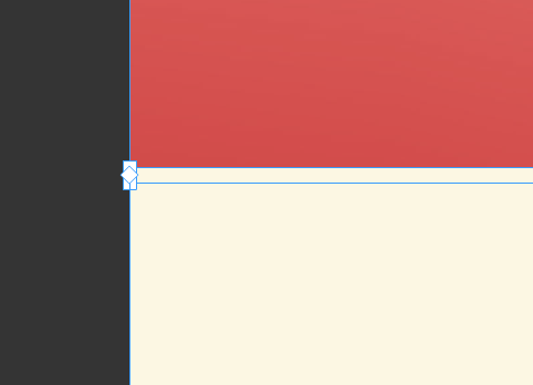
you can see the gap in my 2 shots as Ive reduced the web browser,
Copy link to clipboard
Copied
No chance to help without having a look at your .muse file. Please follow these instructions: https://forums.adobe.com/docs/DOC-8652
Copy link to clipboard
Copied
Copy link to clipboard
Copied
Thanks for your help
Copy link to clipboard
Copied
Your problems should be gone if you:
- don’t use system fonts, but standard font or web fonts in every breakpoint(!). Why? Read my answer here: https://forums.adobe.com/thread/2357163
- reposition your images in every breakpoint exactly, so that they definitely don’t overlap. Overlapping causes the resizing logic of Muse to fail:
If there are issues remaining, test-wise delete the widget „Animated Hamburger“ by „Creativated.com“, and look, what happens.
If your issues persist, please give us a new .muse file containing the corrections, I mentioned.
Copy link to clipboard
Copied
Hi Gunter,
Thanks for spending the time to help. The other pages Ive created don't do this, I have them overlapped cause when I butted them up there was a tiny gap appearing when I viewed them on the browser. I thought open sans was a web font. Also the hamburger is on the other pages and they work, I have noticed that the only difference with the page I'm having trouble with runs longer than the others. Could this have something to do with it?
. Ill try and create a new page with your tips and see what happens.
Thanks,
Copy link to clipboard
Copied
I now found the time, to have a deeper look at your site.
As I said: If you follow all 3 advices (using standard or web font, avoid overlapping of your image filled rectangles, delete the „Animated Hamburger“ widget) all works fine.
I can see the „tiny gap“ you mentioned, But these „gaps“ are not „between“ your image filled frames, they are „within“ these frames, simply caused by using the „fill“ option „scale to fit“ instead of „scale to fill“. This, by the way, aggravates the gaps „between“ your images, when scaling them down.
I can’t say, why your 3rd party widget doesn’t work correctly. But it is quite usual, that widgets may work in one environment and fail in another. The layout situations are too different and the output code is too complex to find a precise explanation, if we are not deeply involved in coding.
With regard to „Open Sans“: Yes, "Open Sans“ exists as a web font, but did you install it as such by using the Muse font menu and selecting the web font under the category „Edge Fonts“? To use simply the system TTF font „Open Sans“, which you have eventually installed on your machine doesn’t make this font a web font! You can see this, because this little font conversion icon shows up bottom right of all of your text boxes:

Copy link to clipboard
Copied
Thanks Gunter,
I butted up the images no overlap and that worked a treat and also the burger was affected a certain break point I deleted the burger and it fixed that problem.
As Im new to muse is there any good tutorials you know to help me create my own burger menu?
Thank you very much for all your help.
Copy link to clipboard
Copied
I’d try to build your menu within Muse using the standard menus. The standard menus of Muse are much more customisable as one might think at first glance!
Here you find some examples. The .muse file can be downloaded directly from the sample sites. (Don’t forget to resize your browser window:
http://menu-tap.businesscatalyst.com
http://menu-tap-2.businesscatalyst.com
And here an example using a light box. In some aspects not THAT comfortable, but …
 AdChoices