 Adobe Community
- Home
- Muse (read-only)
- Discussions
- Two columns great but footer too long.
- Two columns great but footer too long.

Copy link to clipboard
Copied
Hi there,
naturwerksteingutachter that´s my recent project. It seems easy to see what I want. As well, if one is kind enough to download and watch the .muse.
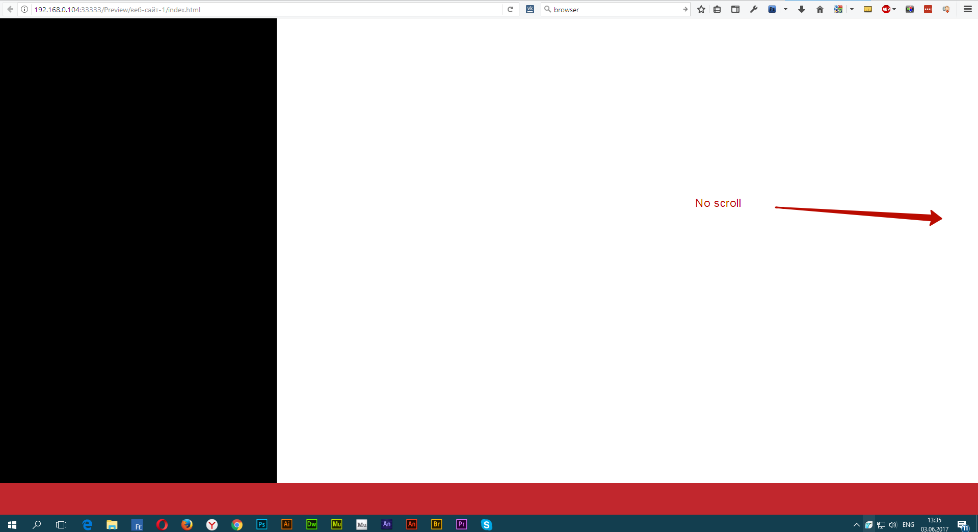
If I move the scrubbers everything works out fine, but the appearance on BC is weird.
I kind of understand why I can scroll that much upwards (what I do not want), because of the black column on the left side.
But if I create it smaller, it obviously creates a blank space once I shrink browser.
I did it now with a master and the picture on its page. Could this be done like this or do I have to skip master and do it only on the page?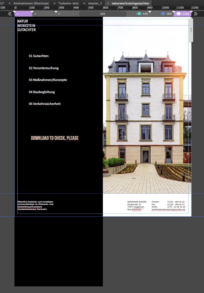
I normally highly recommend not to do pages like this, thanks to Pavel, but I can not see any other way to deal with these two columns without fluid width breakpoints.
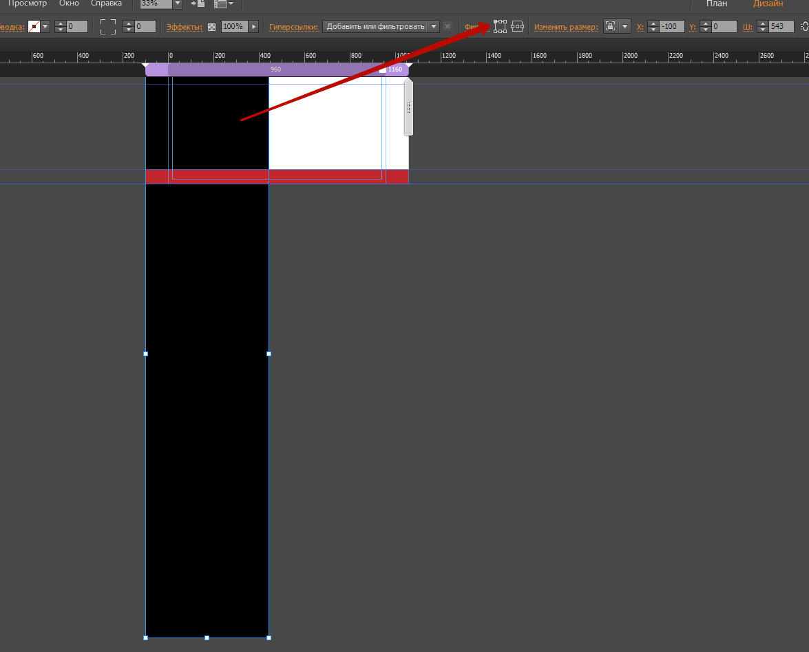
I hope you can see from the screenshot , that everything inside the canvas should obviously be viewable.
I can`t get the footer to be always at the bottom, even if I use an empty/colourless rectangle.
How is this done the right way? Is there a way?
Last exit for me, if I want to be stay to be determined to my way, I also think about one image black to the left and picture on the right and set this resize in width.
But of course I like to be able to change pictures from time to time.
Thanks in advance
Uwe


 1 Correct answer

Seems to be a mathematical rounding error.
Try this:
- Set the y-position of the horizontal rectangle from 1000 px to 999 px, or
- Deselect "sticky footer" on your master page or your layout page. If you don’t want to change this:
- If you don’t like 1. or 2., fill your page background black. In this case you can set the other black rectangles to "transparent".
- Or expand the left rectangle considerable in its height, drag it upwards, until it’s bottom edge meets the top edge of the horizontal rectangle and
 21
Replies
21
21
Replies
21

Copy link to clipboard
Copied
Hi Uwe,
I am getting a thought if we can Photoshop the background and combine them into one single image!
This image can be set as browser fill for a page.
What say?
Regards,
Ankush
Copy link to clipboard
Copied
fotoroeder schrieb
Last exit for me, if I want to be stay to be determined to my way, I also think about one image black to the left and picture on the right and set this resize in width.
But of course I like to be able to change pictures from time to time.
Thanks in advance
Uwe
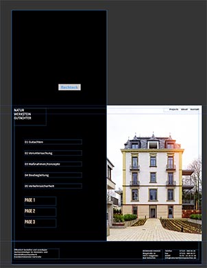
That was part of my "last exit". I found now, starting from scratch without messing up too much – fluid width 1400 ( could be any size ), column left with half of it ( 700 in my case ), responsive width, right column same settings but using a picture fill instead of color.
I also found, that starting from scratch doesn`t let´s me mess up everything. The footer works as expected and intended.
You can watch the same address as before: naturwerksteingutachter .
I added 2 more pages. With the white footer it looks pretty good, with the black footer, I realize this thin blue line between footer and content. Where does this come from?
Uwe
Copy link to clipboard
Copied
Hi,
Cool, you have fixed the footer issue and it looks good now.
However, I don't see any line at my end.

Did you check in other browsers?
Regards,
Ankush
Copy link to clipboard
Copied
On my site page 3 has a black footer. There I realize the white line between the footer and the content.
On the other hand, your screenshot shows page 2, right? "Your" black column appears longer than the left column.
On which screen did you watch the page 2? And how appears page 3 on your screen?
No I didn`t check other browsers. I watched only on Safari.
I realized, your screenshot show page 1? Is that right?
Thanks in advance
Uwe
Copy link to clipboard
Copied
Hope, I understood correctly.
I only inspected the first page, perhaps this already may be sufficient. My suggestions:
Drag the black rectangle in every breakpoint upwards, so it overlaps the page area only at the top, not at the bottom. This avoids the growing footer area.
Not the issue here, but place the textbox "Öffentlich bestellter …" at the smallest breakpoint within the page area. 
Set the black rectangle in every breakpoint to "Resize: Responsive Width", not "Width and Height".
Copy link to clipboard
Copied
Originally, yes you are completely right,that´s why I finally changed this on my pages 2 and 3.
I set left and right column to responsive width only. That helped a lot.
Do you know, where I get this white border between content and footer on my page 3 (black footer).
Thanks for the advice with "Öffentlch bestellter ..."
Copy link to clipboard
Copied
Seems to be a mathematical rounding error.
Try this:
- Set the y-position of the horizontal rectangle from 1000 px to 999 px, or
- Deselect "sticky footer" on your master page or your layout page. If you don’t want to change this:
- If you don’t like 1. or 2., fill your page background black. In this case you can set the other black rectangles to "transparent".
- Or expand the left rectangle considerable in its height, drag it upwards, until it’s bottom edge meets the top edge of the horizontal rectangle and its top edge exceeds the top of your page, and define it as a "Footer" object:
Copy link to clipboard
Copied
- If you don’t like 1. or 2., fill your page background black. In this case you can set the other black rectangles to "transparent".
So, I didn´t want to make you wait so long, but to finish more than just the original request took my quite a bit.
I wanted it to look good as well at the same time.
I took option No.3 and filled the background (I did this before but with rectangles resize in width and height looked really awful, believe me). For now I renounced to put rectangles on my master page. Using the scrubbers I could not see any advantage.
I also set the left footer element in smallest breakpoint and I am still not sure if this is my final solution.
But maybe, leaving the rectangles on master away, I see a huge error with my accordion which again give it a try to put it at the bottom for my mobile menu. I set the accordion upside down – it seems that I did something wrong but have no clue what.
I didn`t want to use a composition which I did in former times but had more often issues with that.
So I am near to the solution but the mobile breakpoints solution is lacking of a functional mobile menu so far..
And yes I know pinning to the browser should be avoided, I only had to pin the right footer objects to the right of the canvas, in order to make them stay in their relative position, especially as I had to separate the phone numbers from the "Telefon: … .
For now I didn`t find something to put this in into one text layer.
naturwerksteingutachter Don`t care about this page1 | page 2 | page 3 misalignment, as these menu items were only for
testing purposes in the beginning. But the misalignment is strange anyway.
I hope the only mistake lays in my accordion settings 
Any further suggestions are highly welcome as you know.
Uwe
P.S. there´s one more from DamianToczek You tried to send me a file through CC or did you try to link to it?
I just see this:
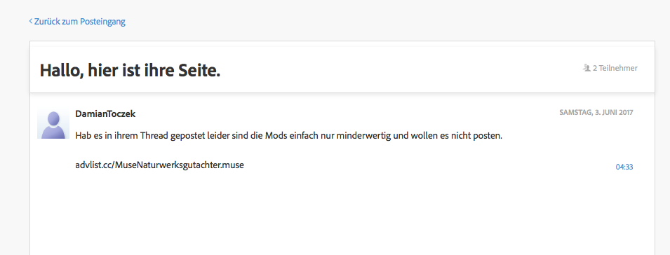
but I cannot find a link?
Copy link to clipboard
Copied
Uwe, I'd forget this. This isn't the way, we normally talk to each other in this community.
Copy link to clipboard
Copied
Sorry, just wanted to help Damien to find an error on his side maybe.

Copy link to clipboard
Copied
There are no errors on any of my sites that i've created.
I started with Notepad++ now i do the basic stuff with muse, "advlist.cc" is a website link if you didn't realize, but what so ever i had this file in my FTP for like 3 Weeks now it's gone, not my problem when you're not able to see a link without "http://" at the front.
Copy link to clipboard
Copied
DamianToczek schrieb
… i had this file in my FTP for like 3 Weeks now it's gone, not my problem when you're not able to see a link without "http://" at the front.
Do you think, it is our problem? We didn't ask for assistance.
Copy link to clipboard
Copied
DamianToczek schrieb
There are no errors on any of my sites that i've created.
I started with Notepad++ now i do the basic stuff with muse, "advlist.cc" is a website link if you didn't realize, but what so ever i had this file in my FTP for like 3 Weeks now it's gone, not my problem when you're not able to see a link without "http://" at the front.
Long time no see …
I didn`get a PM, we didn´t see any link. But life could be so easy with "Sharing via CC or dropbox"!?
I think this question is solved ( Bernhard Binder ) ( thanks Günter Heißenbüttel ) and I´ll open a new thread with some other questions soon, regarding this website.
Best Regards,
Uwe
Copy link to clipboard
Copied
fotoroeder
If you would first start coding, with your notepad, HTML5, CSS3, Javascript etc, you would fix all your problems. Because you would know the code, we are here to help you, if you want "dropbox" stuff you can pay me 40$ for each hour i work on your website.
Best regards.
Copy link to clipboard
Copied
To make a Footer, create a rectangle that will act like a container, On the top right there will be a [ ]Footer checkbox, check it and everything else that you want to have inside your footer. Also make sure that you set your Footer container to be pinned to the bottom of the browser.
Copy link to clipboard
Copied
DamianToczek: I think, Uwe knows, how to pin objects. Especially he will know, that "Footer" objects can’t be pinned, as you suggest.
Pavel Homeriki: Pavel, I think, if you enlarge the black rectangle over the top, it looks quite smoother, when you reach the bottom of your page – especially using iOS devices with this "rubber band" effect at the bottom of the page.

Copy link to clipboard
Copied
Pavel Homeriki: Pavel, I think, if you enlarge the black rectangle over the top, it looks quite smoother, when you reach the bottom of your page – especially using iOS devices with this "rubber band" effect at the bottom of the page.
Yes, Günter, but this is not a universal solution if you have many pages and some of them will be longer than the black rectangle. For example, your page will be 10,000 px long, in which case you need to make this rectangle more than 10,000 px. But if you use pinning, you just need to make a black rectangle with a length of 1500 - 2500 px and it will overlap any monitors and page length.
Copy link to clipboard
Copied
This is done. And this is not right. 
Copy link to clipboard
Copied
Copy link to clipboard
Copied
I send you the project in a PM, because mods are mods, they don't allow downloads.
Copy link to clipboard
Copied
DamianToczek schrieb
… mods are mods, they don't allow downloads.
???
 AdChoices