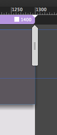
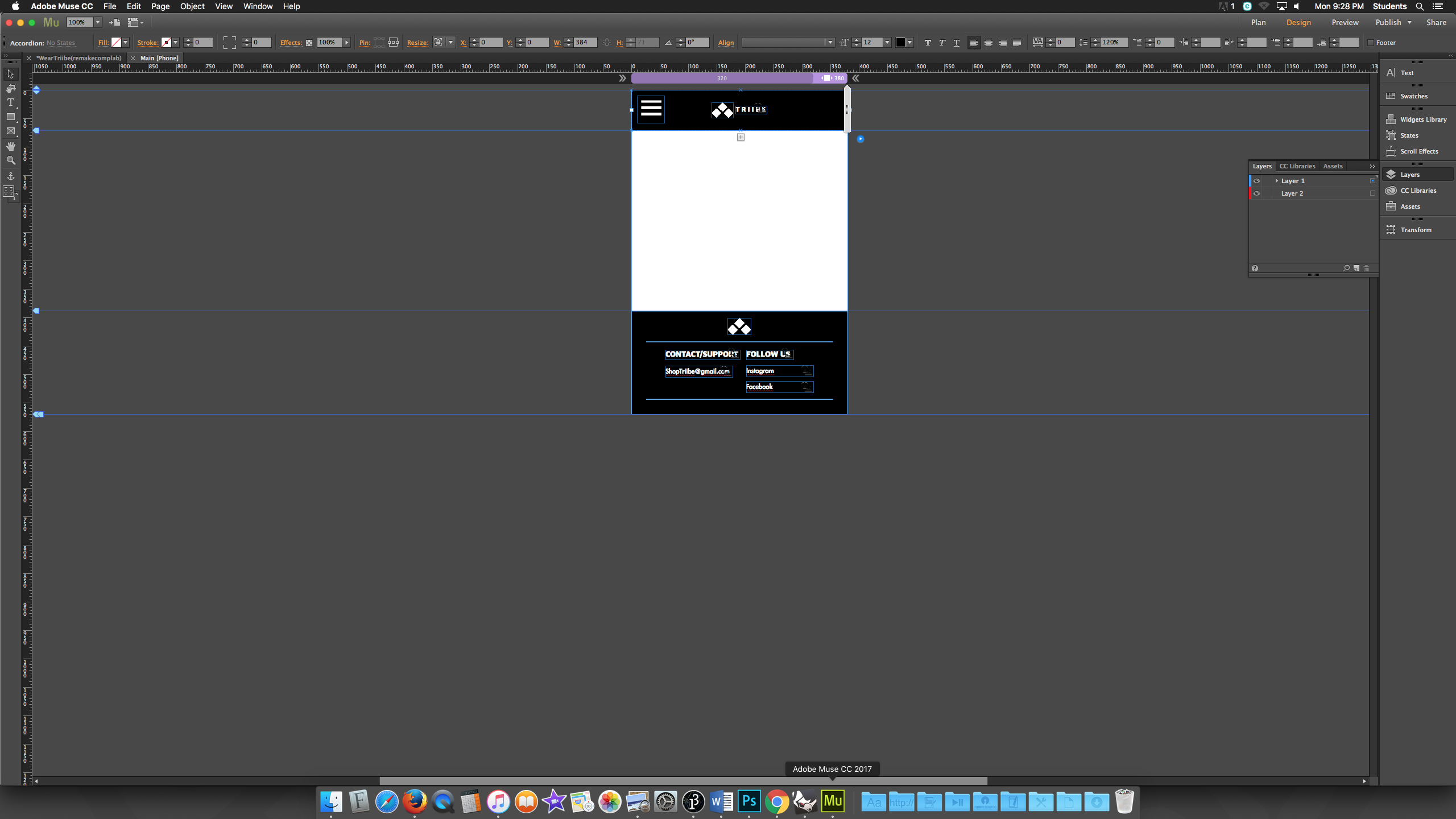
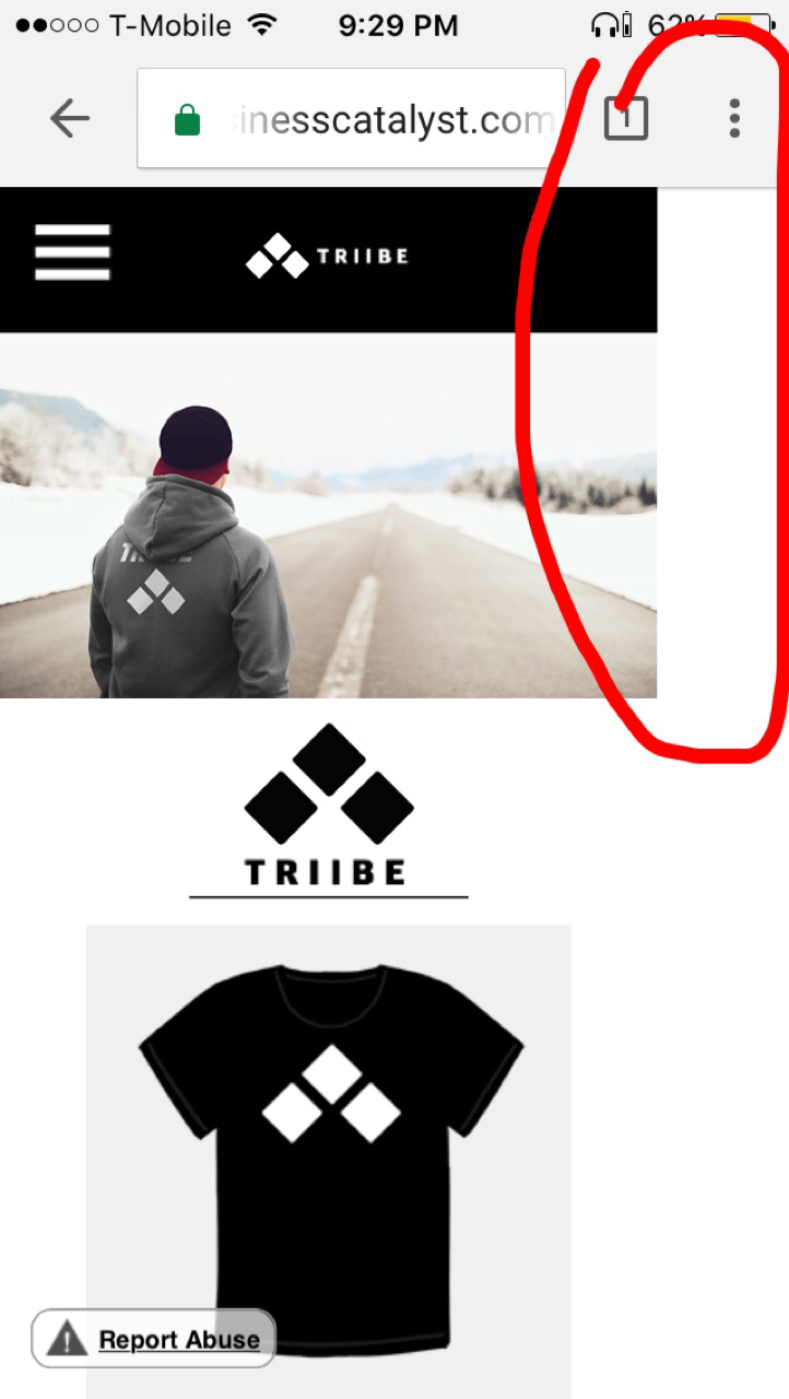
In most cases some elements or at least one element is placed outside the canvas between the smallest breakpoint and the minimum width of your site.
To watch out for this you have to use the scrubber, the grey vertical "thing" on the right hand side on the page in design view.
Best Regards,
Uwe


 1
Reply
1
Reply
 AdChoices