 Adobe Community
- Home
- Muse (read-only)
- Discussions
- Re: Website issue with header element in Master Pa...
- Re: Website issue with header element in Master Pa...

Copy link to clipboard
Copied
Hi,
I am having an issue on smaller desktop only breakpoints say 1366 resolution. My logo in the center of the header which is hyperlinked to the home page gets cut off like the below picture.
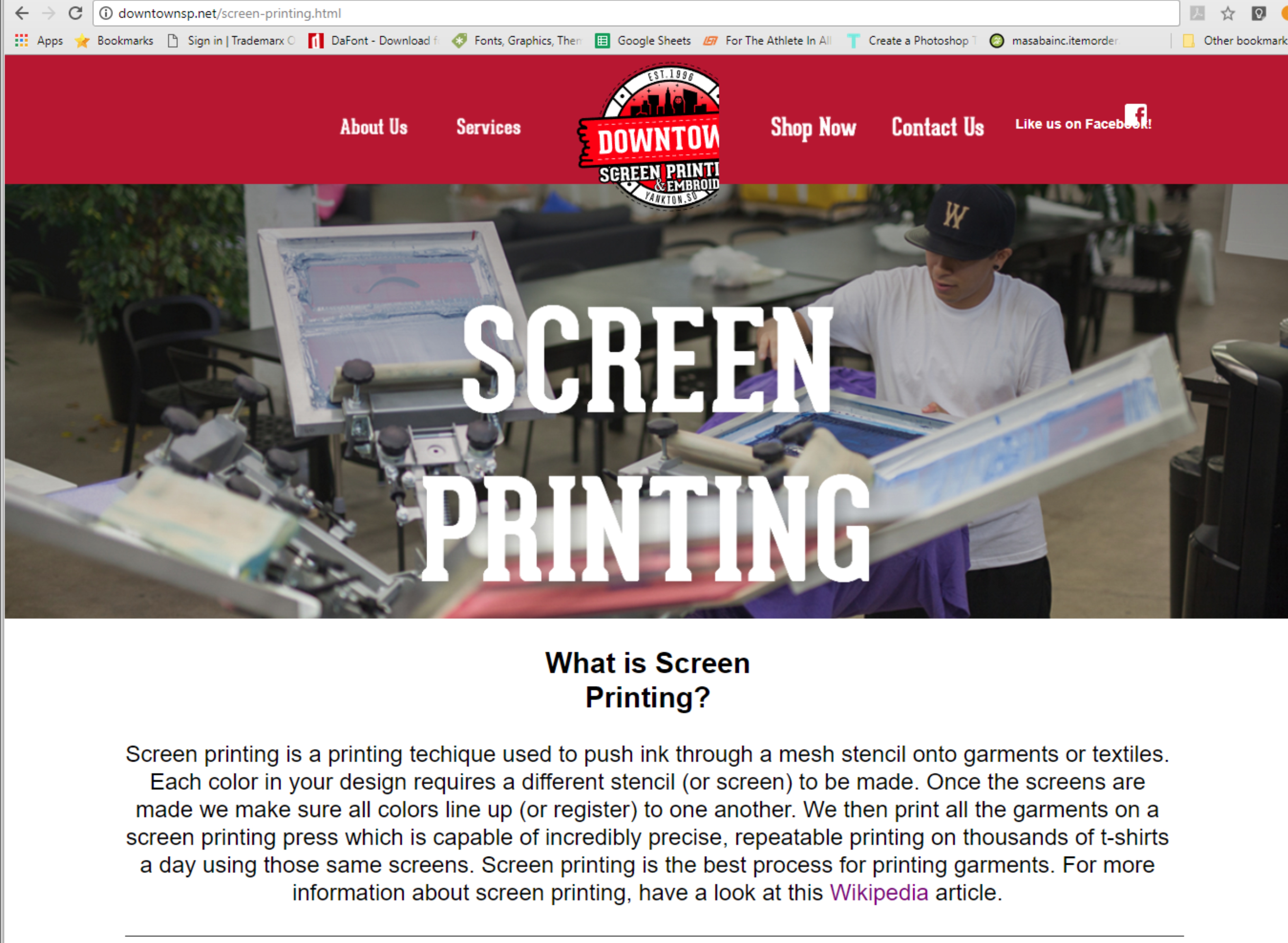
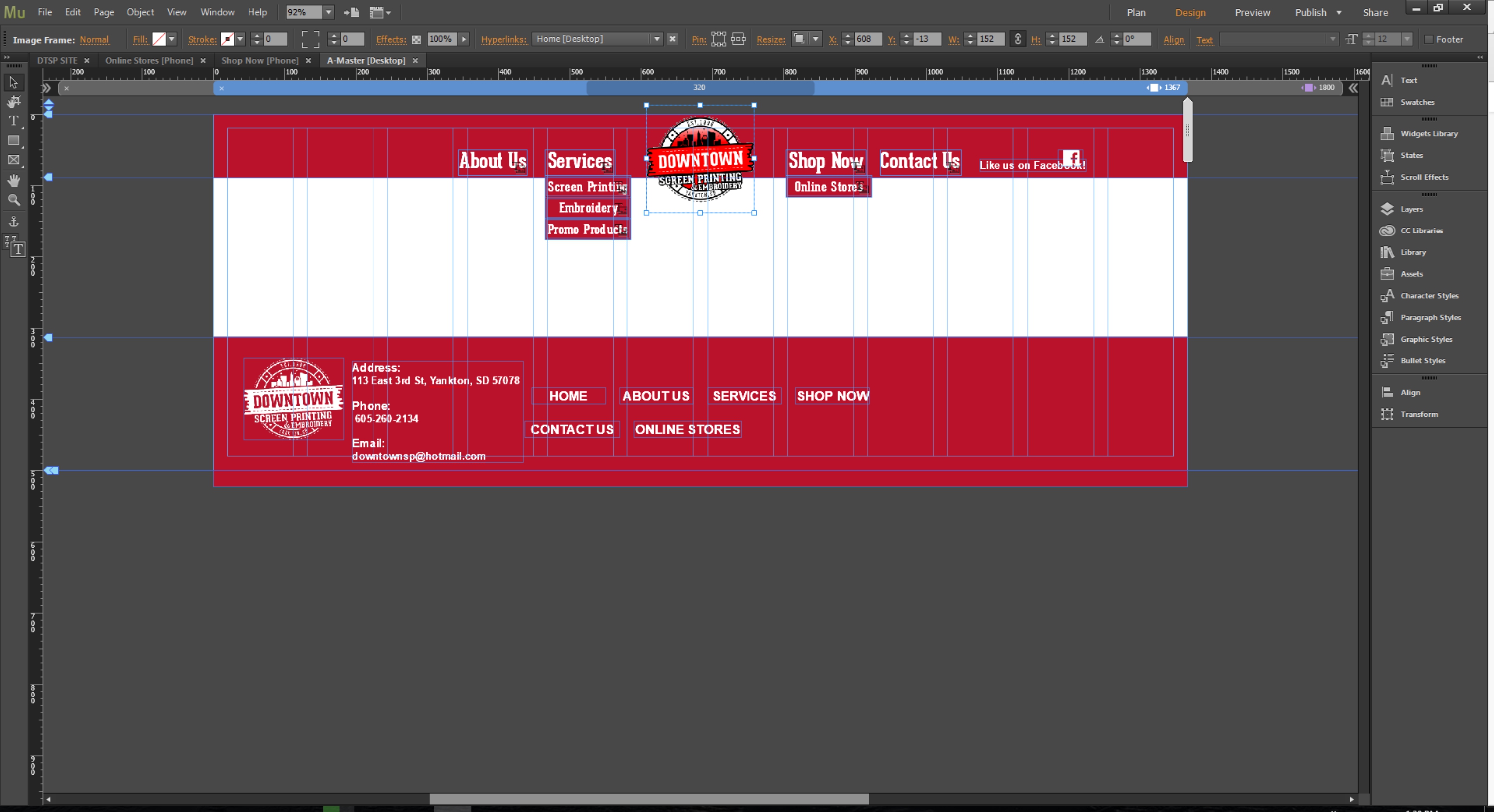
The below picture is a screen shot of my master page work space with the .png in question about getting cut off. The link to the website is www.downtownsp.net if you want to try it out for yourself and see the problem live.
Any help would be much appreciated as this is my first web design project for my full time employer.


 1 Correct answer

You should not use system fonts in your menu. It behaves like an image in this case. Images scale differently than text.
This leads to unintended scaling.
Your menu buttons had a colour fill, that´s why this overlapping happens to your header elements.
I changed some settings and show, how it could be done. I recommend to use breakpoints, especially on master pages, only if the design needs one. Of course you have to change the font to your needs but use a webfont, please. I used BEBAS NEUE.
... 11
Replies
11
11
Replies
11

Copy link to clipboard
Copied
Very strange..
Pin your logo to the top center and remove responsive width and height, set that to none.
give it a shot.
Copy link to clipboard
Copied
Trying it now.
Copy link to clipboard
Copied
No luck on that fix unfortunately. I'm still trying to figure out what's causing it.
Copy link to clipboard
Copied
Something is overlapping your header elements.
I guess the fluid design is set very strange as all elements behave differently and content is not responsive at the moment:

Copy link to clipboard
Copied
fotoroeder I have moved the logo to the very front of the top most layer so nothing can be overlapping it? I also mistook it for a .PNG and it is actually .SVG could the fact that it's a scaleable vector graphic have anything to do with it?
Copy link to clipboard
Copied
Normally no.
Could you share a .muse with us: Please Provide a .muse File to Help Us Fixing Your Issue!
Only one page, only head?
Best Regards,
Uwe
Copy link to clipboard
Copied
fotoroeder Here is a link to a single page muse file just was copied then downsized so nothing has been changed or recreated from the original file, just copied.
Copy link to clipboard
Copied
You should not use system fonts in your menu. It behaves like an image in this case. Images scale differently than text.
This leads to unintended scaling.
Your menu buttons had a colour fill, that´s why this overlapping happens to your header elements.
I changed some settings and show, how it could be done. I recommend to use breakpoints, especially on master pages, only if the design needs one. Of course you have to change the font to your needs but use a webfont, please. I used BEBAS NEUE.
Dropbox - CHANGED HEADER FILE.muse
Uwe
Copy link to clipboard
Copied
I did take less care of your footer. 
Uwe
Copy link to clipboard
Copied
Thanks so much for the advice! Checking out the file you changed around now.
Copy link to clipboard
Copied

 AdChoices